

Jeff Kellar’s paintings are pared-down, hard-edged geometrical abstractions. If you enjoy this type of art, you’re in for a treat. If you’re not comfortable with it in general, then you’re the person who really should see the show currently on view at Icon, because Kellar just might lead you to appreciate a world of spiritually poised and quiet beauty.
Most of Kellar’s works are solid monochromes with a few hard-edged lines. Others are divided between pairs of colors (most often black and white) to create a dialogue between forms in space. The works are all on aluminum panels backed by birch ply so that they float off the wall, and they are covered with a mixture of resin, clay and pigment. Kellar makes his lines by incising the base color and filling in the cuts with the other color. He buffs and polishes the surfaces so they have a beautifully even but boldly material finish.
Additional Photos
“Wall Drawing #15” is a 30-inch-by-40-inch red panel with line drawings of single-fold screens in the center. The forms feel large because our viewpoint is in the very middle. (having a viewpoint above the forms, “Wall Drawing #19” seems to be looking down on an unsolvable maze of office cubicles). This point of view coupled with the centered image and the spare margins gives the piece the feel of an architectural drawing, but with a surprisingly comfortable focus on space rather than some monolithic object.
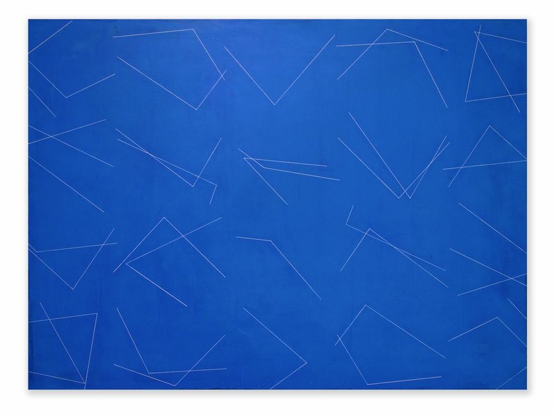
Kellar’s large blue “37 Corners” immediately struck me as the witty complement to “Wall Drawing #15.” The jumpy angles serve as pizzicato reminders that our brains are constantly filling in lines where we can’t see — especially in architectural spaces. I think Kellar’s insights about our connect-the-dot logic underscores an interesting disconnect between our senses and perceptions. Moreover, he has found a way to play with the idea so that we can grasp it on our own.
I imagine most people first see Kellar’s work as concerned with space or even optical illusion. After all, many of the visual narratives play out in the difference between the literal surface and the spaces created by the perspectival gestures of his geometrical forms. But Kellar quietly takes us beyond that. His extraordinary craftsmanship and confident eye allow us to savor the push and pull between the physical painting and the aesthetic object. His precision allows us to confidently follow subtle variations of details as paths for meaning.
“Location 346” is a long, slender diptych of two white panels. Each panel has a pair of intersecting black lines and a black form occupying one of the “quartered” spaces. Similar to how one of the four spaces is black rather than white, one of the lines is actually a slight curve. Since it is the line starting the farthest to the right, it makes you go back and question whether the other lines are straight. The forced re-reading with an eye to revisionism is particularly witty since one black form is in the upper left, with the other in the lower right — following the logic of a written page.
All four “locations” diptychs are extremely elegant, so it never feels like Kellar is trying to smugly outsmart the viewer. The handsome, beautifully crafted and highly finished pieces are dutifully respectful to the experience of the viewer, which makes them pleasantly enjoyable despite their heady possibilities.
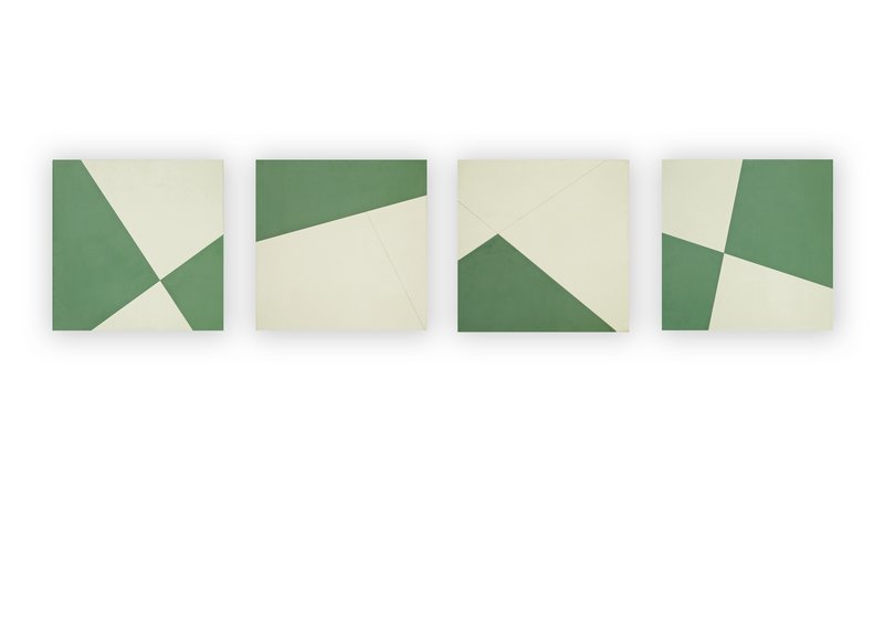
For using such a reductive visual vocabulary, the 22 works of “Locations” vary greatly. “Lines Cross,” which feels like an earlier work, is a green and white work with four squares; that one line in one element doesn’t continue through a solid form makes for a fascinating discovery.
“Wall Drawing #4” forces your eye to fill in a line to complete a diamond shape, while the trapezoidal form masquerading as half of the black and white field folds the painting before your eyes.
Kellar’s two small, architectonic “groups” remind me of similar sculptures by Kasmir Malevich, the Russian who painted a black square on a white canvas in 1913 and changed the history of art. Because his ideas are everywhere in Kellar’s show, I see the groups as reverent monuments to Malevich.
The orange “Wall Drawing #12” features five sets of jumpy white line segments — until you accidentally notice there would be four sets of eight if the piece were bent into a cylinder. This is one of those pieces that makes you question everything else you have seen: Was the system calculated with meaning, or was it the unintentional result of the artist’s sensibilities? While you can’t disprove intention, Kellar’s focus on perception and visual experience lets any doubt float away. Even if there is some secret system, it’s not the meaning of the piece or the driving content, so there’s nothing to worry about.
“Locations” is an extremely smart and elegant show filled with exquisite paintings. Don’t miss it.
Freelance writer Daniel Kany is an art historian who lives in Cumberland. He can be contacted at:
dankany@gmail.com
Send questions/comments to the editors.

Success. Please wait for the page to reload. If the page does not reload within 5 seconds, please refresh the page.
Enter your email and password to access comments.
Hi, to comment on stories you must . This profile is in addition to your subscription and website login.
Already have a commenting profile? .
Invalid username/password.
Please check your email to confirm and complete your registration.
Only subscribers are eligible to post comments. Please subscribe or login first for digital access. Here’s why.
Use the form below to reset your password. When you've submitted your account email, we will send an email with a reset code.