

One of Tom Crotty’s paintings in his Frost Gully Gallery in Thomaston is a view of the Orr’s Island bridge.
It is highly detailed and realistic. And it’s beautifully painted. Superficially, it looks like a Rackstraw Downes painting, insofar as it’s a technically superb landscape with a few active lines delineating the human presence, such as the power lines and the curve of the guardrail.
Additional Photos
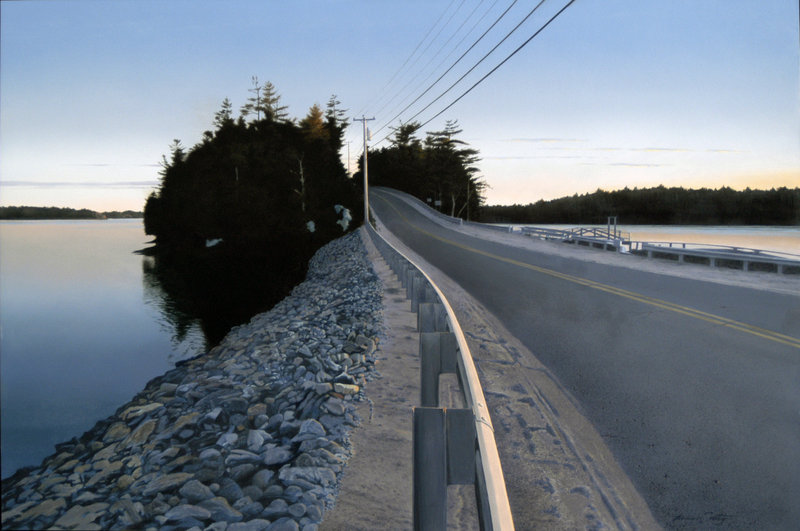
But while Downes works to show off his erudition and artificially forces his technological curves to make it look like he thinks about things like math and photographic distortion with an all-powerful intellect, Crotty handles the curves in a way that is fitting to anyone who knows this scene.
And I happen to know this scene very well. I once lived nearby, and still visit often.
What Crotty has done with the scene, however, is very interesting, warm and welcoming.
The curve of the guardrail marks a comfortable place for you to stand. A nicely painted tree at the top of the island warmly glows with the last vestiges of the light of the setting sun. A telephone pole placed at the “V” of the trees marking the roadway carries your eye from its partner pole just at the knot of the bridge and island. The sky is fading from perfect summer day blue to crepuscular pink with a credibly impressive softness.
And yet the water on the left is way higher than the water on the right. It’s a trick right out of the Mona Lisa, and it’s wonderful.
Whereas Downes shows off what he knows, Crotty is concerned with what we feel, and so makes paintings that are compelling as well as appealing to the viewer. He hides his strokes, but when they appear as the tiny details of branches, etc., they prove that — unlike Downes — Crotty isn’t afraid to be pretty.
Crotty’s paintings largely hide their technique and brushwork with the idea of putting the viewer’s experience of the image before the critical process of seeing the object as a painting. Most great landscapes have a dialogue between these two oxymoronic values.
Modernism prioritizes the literal painted surface. And traditional realism like Crotty’s (using the brush to hide its own tracks) tends to value the image over the object.
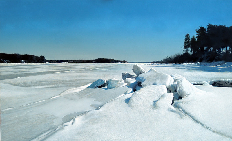
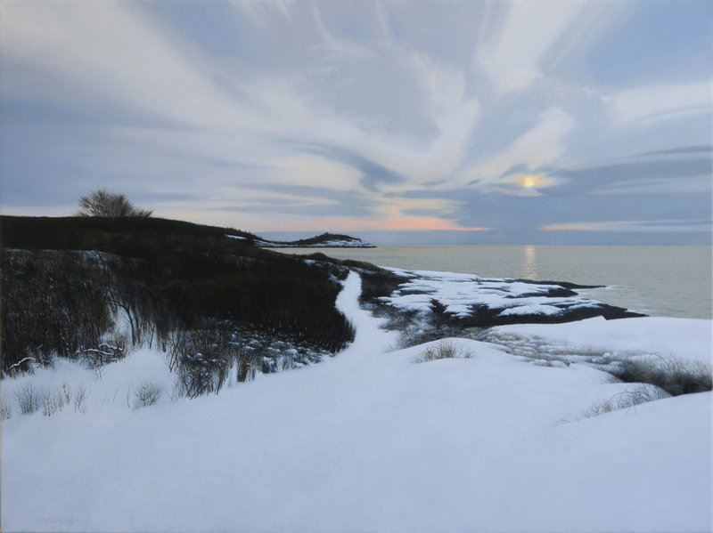
I am particularly taken with Crotty’s winter landscapes. They have a meditative feel very familiar to those of us who are still in love with the way our state wears winter.
“Above Drift In Beach” is a spare twilight winterscape with a virgin expanse of snow to the midpoint of the 4-foot landscape, soft sky above and a gorgeous sliver of island marking the sea horizon. The side of the image is filled with bare, scratchy brush edging in symmetrically from the right. Despite its startling detail, the brush’s sideways “V” shape pushes your eye to the far island on its left.
A subtle quality shared between this and a group of Bailey Island seascapes (featuring the area around the Giant Steps — one of my favorite places in Maine) is that the snow depicted by Crotty is pristine. The effect is something that doesn’t exist without snow. No one — including the viewer — has yet stepped into that space. You aren’t looking back. You aren’t following anyone. And so the sense of solitude is palpable, while the familiarity of the scene drives a sense of memory.
Why else would you be there in winter but to be alone with your thoughts and the quiet majesty of the snow-blanketed scene? I suppose some people could see it as lonely, but to many of us, Maine’s winter landscape whispers of the divine.
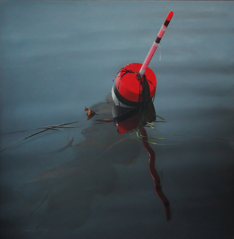
The alternative to Crotty’s complex but compelling landscapes is a set of smaller images of single lobster buoys on the ocean. These have no hint of land, but employ snapshot logic as though taken from a boat.
The lack of data about the point of view gives us no place to feel our bodies. They are more optical, with the issues of reflection and underwater refraction. They are more about visual interest and issues of representation usually associated with photographic realism.
“Yellow and Green Buoy” is about horizontal reflections broken by the fractured surface of the water. “Buoy with Reflection” is about how a sun-bleached pink buoy recaptures its original saturated red as reflected in the water.
And “Red, Black and White Buoy” is a comparison piece of shadow, reflection and under-surface refraction with buoy as nexus. It’s a complicated and interesting piece, but the foreshortening of the shaft is awkward (you can feel it).
I can see why Crotty makes the buoys — and affordable Giclee prints of them — but his true strength is as one of Maine’s best and most ambitious landscape painters.
Because most of these paintings are already owned by private collectors, “Paintings” is a most worthy show to visit.
Freelance writer Daniel Kany is an art historian who lives in Cumberland. He can be contacted at: dankany@gmail.com
Send questions/comments to the editors.

Success. Please wait for the page to reload. If the page does not reload within 5 seconds, please refresh the page.
Enter your email and password to access comments.
Hi, to comment on stories you must . This profile is in addition to your subscription and website login.
Already have a commenting profile? .
Invalid username/password.
Please check your email to confirm and complete your registration.
Only subscribers are eligible to post comments. Please subscribe or login first for digital access. Here’s why.
Use the form below to reset your password. When you've submitted your account email, we will send an email with a reset code.