

Graphic designer Sarah Mohammadi earned her degree from Maine College of Art on Saturday, capping an educational experience that she hopes will yield travel abroad and the chance to work professionally overseas.
She got some real-world experience by pitching in with MECA’s recent design process that resulted in a new logo for the Portland art school. The college unveiled the logo last week, just in time for Art Honors on Thursday and graduation on Saturday.
Additional Photos
The logo went up on the school’s Congress Street facade on Thursday.
The design process involved students and faculty, as well as a team of professional designers.
“The experience was pretty amazing,” Mohammadi said. “It was a professional setting, so it set us up for what we can expect in the real world. We do projects in classes, but the research phase and the design phase are much longer. In the real world, it’s not going to be like that.”
The students and their collaborators had three days to research the logo, develop a concept and present ideas to the school administration. The final result is a modern, sleek logo that works literally and symbolically, Mohammadi said.
“I think it’s clean, it’s playful and it embodies what MECA is all about,” she said.
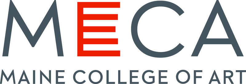
The logo presents the school’s acronym in four capitol letters, with “Maine College of Art” spelled out in small caps below. While the other letters are shaded in gray, the large “E” is red-orange, with five horizontal bars instead of the usual three.
The bars beg the obvious question: What do they mean? The answer is layered, and is embedded in the school’s mission and history. On one level, the five bars represent the five floors of the Porteous Building, the school’s downtown campus.
The five bars also symbolize the school’s educational philosophy, which encompasses community, ethics, place, studio and agency.
And, they represent the five educational tracks, which include the Bachelor’s of Fine Arts and Master’s of Fine Arts programs, art education, continuing studies and pre-college.
The red-orange color choice reflects the stairwell that binds the college together and links the Porteous building to its historic past.
To the outside world, coming up with a logo might seem like a straight-forward process. And lord knows, there are enough badly designed, confusing and ugly logos out there to suggest that many firms and companies present them with little forethought.
That is not the case with MECA. The new logo was four years in the making, and the process spanned multiple administrations.
Way back when, the school hired the Portland design team of Charles Melcher and Margo Halverson, who work together as husband and wife. Both have long associations with the college. They engaged the services of Eddie Opara, a partner at the New York-based design firm Pentagram and a college buddy of Melcher from their days together at Yale.
As a trio, they came up with a plan for MECA. In the meantime, Don Tuski joined the school as its new president.
You might imagine what happened: Different administration, different ideas. Melcher, Halverson and Opara presented their work, and MECA said no. The school asked them to start over.
“It got a little sticky at this point,” Melcher said. “Eddie was still interested, which surprised me. Margo was still interested. But I was fed up with the whole thing.”
Halverson prevailed on her husband to stay with the project. Her reasoning was that a new logo and visual identity for the school offered the chance to create a lasting legacy. They love MECA, and care about its well-being.
Opara suggested convening students and faculty to drive the new process.
For three days in February, a group of students, faculty and real-world experts gathered in Portland and hammered out concepts. They began by considering the school’s mission and its place in Portland, then drew up ideas, first by hand and later on the computer.
They worked individually and in groups, and eventually came up with 10 solid ideas. “We put it all on the backs of the students,” Melcher said.
Eventually, 10 ideas became six and six became two. The final two were then presented to the school.
Halverson said the process was instructive for everyone, most especially the students.
“By making it all happen in 72 hours without interruption, that’s pretty close to the real world,” she said. “This wasn’t a semester-long class project. This was coming up with an idea, creating something from scratch and presenting it.”
She’s obviously pleased with the result.
“I like the logo very much,” she said. “I think it’s successful. It’s visually memorable, and I think it’s unique. It’s memorable because it asks questions, and it includes multi-layers of meaning.
“I took to the abstract more than the emotional quality of it. It feels like a ladder in a way, and it’s open on the right side, which means you can grow into the world. It has a lot of steps.”
Raffi Der Simonian, director of marketing and communications for the college, is now tasked with getting the logo out into the world.
He’s especially proud of the work of the students.
“It shows how much faith and trust we have in our students,” Der Simonian said. “They have the skills and passion to execute a project of this scope and nature. It will serve them well in their careers.”
Staff Writer Bob Keyes can be contacted at 791-6457 or:
bkeyes@pressherald.com
Twitter: pphbkeyes
Send questions/comments to the editors.

Success. Please wait for the page to reload. If the page does not reload within 5 seconds, please refresh the page.
Enter your email and password to access comments.
Hi, to comment on stories you must . This profile is in addition to your subscription and website login.
Already have a commenting profile? .
Invalid username/password.
Please check your email to confirm and complete your registration.
Only subscribers are eligible to post comments. Please subscribe or login first for digital access. Here’s why.
Use the form below to reset your password. When you've submitted your account email, we will send an email with a reset code.