

I was struck by something Jeff Epstein said about his work during the art walk. When I told Epstein I wanted to compare his work with the picture I saw in the paper, he explained that he consciously manipulates the distinction between what you see in his works in person as opposed to reproductions.
No one should be surprised that a painter is concerned both with easy-to-see-and-reproduce graphic qualities and subtle surface textures that can only be seen in person.
ART REVIEW
• "JEFF EPSTEIN: PAINTINGS"
WHERE: Art House Picture Frames, 61 Pleasant St., Portland
WHEN: Through Nov. 30
HOURS: 10 a.m. to 5 p.m. Monday to Friday; 10 a.m. to 4 p.m. Saturday
INFO: arthousepictureframes.com; 221-3443
• PAINTINGS BY HENRY ISAACS: “NEW WORK”
WHERE: Gleason Fine Art, 545 Congress St., Portland
WHEN: Through Nov. 30
HOURS: 11 a.m. to 6 p.m. Wednesday to Friday; 11 a.m. to 5 p.m. Saturday
INFO: gleasonfineart.com; 633-6849
Additional Photos
Yet, from a conceptual standpoint, art rarely puts in play the difference between seeing it on a computer screen, then on a postcard and then in person. Moreover, nothing can handle such an experiential/perceptual range with the refinement, subtlety or intellectual back end of painting.
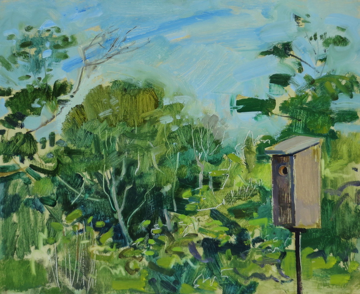
Epstein’s paintings are small and executed with a confident hand. They feature low key images of suburban or rural domestic landscapes: a birdhouse, the artist’s blue Subaru parked by hostas, a view between a house and shed, a half-mowed lawn and so on.
Epstein’s expertly energized marks are impressively economical and varied: drawing back through the oil with the handle point of the brush, paint-clearing slashes of the palette knife, winding strokes, staccato rhythms and more – all in the service of well-textured clarity.
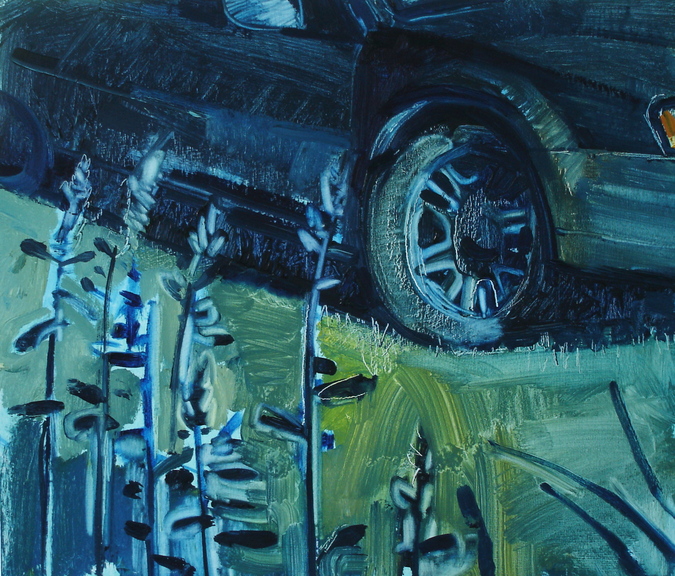
I first saw “Sam’s Car” printed. Parked in a dark field under a starry, starry night, a humble sedan plays the part of a lantern – its interior is flooded with light that it spills into the field around it. Such a beacon leads to graphic clarity, but it also hints of an untold narrative within: Our interest draws us in to look closely and read the marks of the painting.
“Half-mowed Lawn” also features a vehicle and the sense of subtle narrative. The ride-on mower with unfinished business leaves us with a contemporary landscape and a study in contrasts. The cut undergrowth is scratchy chartreuse compared to the lush green grass. The textures differ in a way that can only be seen in person. And this is true of Epstein’s brush handle drawing as well: He tends to render man-made things by pulling the handle of his brush back through the oil to create chiseled white lines – which pop most notably on a computer screen.
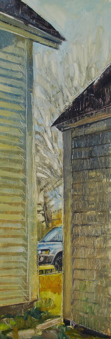
“The Space Between” is a tall, slender panel peering between a rural house and shed towards a partially-seen car and tree. While the image funnels your eye through the narrow space, the textures of the two buildings act like flat screens we must look past (like, maybe, the media of print and screen?). While they look the same, the two weather-wizened buildings are painted quite differently by combinations of loose strokes over knife work, removal processes (paper towel?) and even sanding. Such processes make you re-think their seemingly freshly-made appearance;
on close inspection, they are well-considered paintings.
With his focus on self-aware legibility, Epstein is consciously responding to the contemporary viewer whose sensibilities are formed by digital photography, postcards, online and print newspaper publication no less than standing in front of paintings.
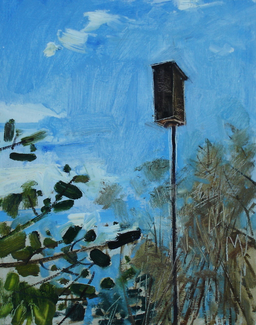
We associate seeing a painting in person with a corporal experience of scale, brushstroke and texture but one thing that cannot be translated in a static image is the way pigments interact with shifting light. Epstein’s “Shepherd’s Hook with Telephone Pole,” for example, seems simple enough at first glance: pink flowers, green growth, blue sky and a puce pole. But as you move around a painting, it’s easier to notice light qualities of different pigments – and I quickly counted at least six different greens. RGB and CYMK processes (screen and print) simply can’t deliver that kind of (sculptural) information about paintings.
THE MAINE ARTIST whose color work mobilizes the most forceful distinctions between color and light now also has a show in Portland: Henry Isaacs.
Isaacs combines the painterly joy of Matisse with the value and surface integrity of Cezanne. (That might like sound like soaring praise, but acknowledging masters doesn’t put you above anyone.)
Isaacs is a great colorist, but he is even more dedicated to pushing paint around on the canvas. This is easier to see in person than to explain, but color is only one of Isaacs’s key elements, which include: texture, opacity, transparency, overlap, glazing, scumbling, brushmarks, paint build-up and – above all – value relationships.
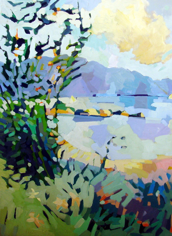
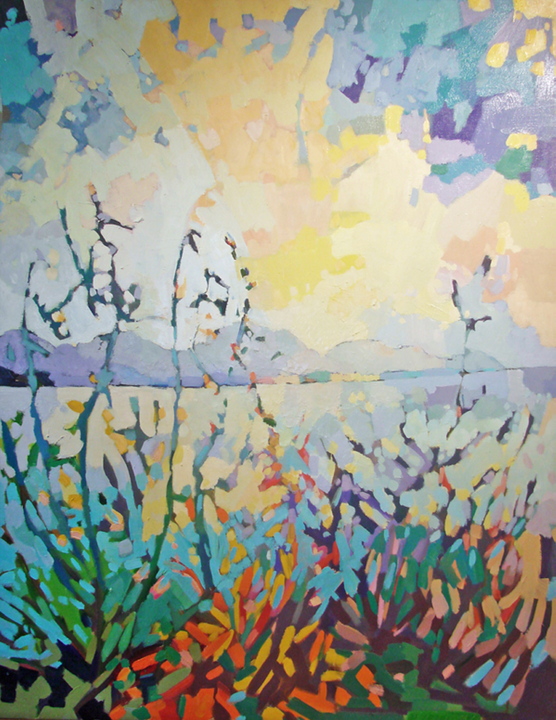
Isaac’s “View to Mt Desert from the Marsh” is a vertical seascape looking past plants rendered in saturated greens, purples, oranges, pinks and other bright colors. On the show postcard, flora sparkle with color before a sky with virtually no material presence at all. In person, the negative space of the sky dominates the picture as the thickly-painted creamy clouds and buttery sunlight reach over the edges of the plants to re-carve their shapes from above.
This kind of thick and chewy density is a rare thing; most of the time that much paint feels piled-on. Like Epstein, a close look makes you realize the fresh-feeling Isaacs makes very well-considered paintings; and there is no doubt about the extraordinary time and energy Isaacs puts into his work.
Epstein’s and Isaacs’s paintings reveal real depth of conception, technique and consideration of the viewer experience. This last point is crucial because these artists remind us that painters often consciously respond to our tech-age visual sensibilities that PMA director Mark Bissier described at a public forum on Oct. 8th as “more intelligent than ever.”
It seems that the more imagery and design we consume, the more painting has to say about how we see.
Freelance writer and art historian can be contacted at:
dankany@gmail.com
Send questions/comments to the editors.

Success. Please wait for the page to reload. If the page does not reload within 5 seconds, please refresh the page.
Enter your email and password to access comments.
Hi, to comment on stories you must . This profile is in addition to your subscription and website login.
Already have a commenting profile? .
Invalid username/password.
Please check your email to confirm and complete your registration.
Only subscribers are eligible to post comments. Please subscribe or login first for digital access. Here’s why.
Use the form below to reset your password. When you've submitted your account email, we will send an email with a reset code.