

Featuring the work of Clint Fulkerson and Kim Crichton, “Pulling Light” at Ocean House in Cape Elizabeth is a reminder that small works presented in intimate spaces often invite the closest scrutiny.
While both Fulkerson’s and Crichton’s works are impressively detailed, they do very different things to achieve interesting scale-oriented content. In either case, it’s no secret that looking closely at art often leads to big rewards.
ART REVIEW
WHAT: “Pulling Light” – Works by Clint Fulkerson and Kim Crichton
WHERE: Ocean House Gallery & Frame, 299 Ocean House Road, Cape Elizabeth
WHEN: Noon to 6 p.m. Wednesday to Saturday; through April 30
INFO: oceanhousegallery.com, 956-7422
And “Pulling Light” is a rewarding show.
Fulkerson’s drawings generally act abstract because they use geometrical logic based on simple, straight marks that evolve. And generally, rather than following arithmetical sequences, they follow fractal or binary logic.
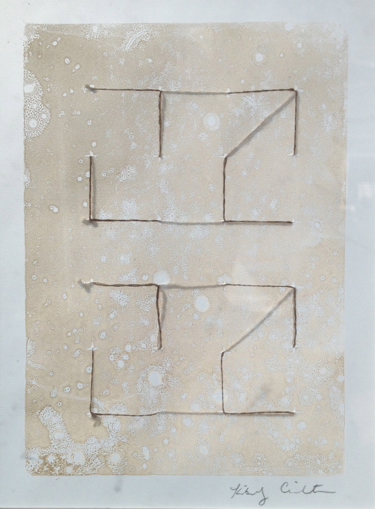
Crichton’s pictorial work in this show is a major shift from her fiber work I have seen in the past. Her new pieces are based on reductive, printed (lino?) rectangles with tiny crosses set regularly upon them to map out 5-by-7 grids of 35 1-inch boxes. She then adorns these quiet matrices with a few stitches of rough, naturally hued, burlap-colored thread.
Together, these works make for an impressively contemporary show of edgy systems abstraction. It’s not what you would expect to find in a Maine gallery that doubles as a frame shop, and yet it makes perfect sense. Contemporary art, after all, is often harder to see as art, so it tends to benefit more from (or even require) excellent framing. Plus, the brainiest work of late – not only in the region, but around the world – has been leaning heavily toward paper and drawing in particular.
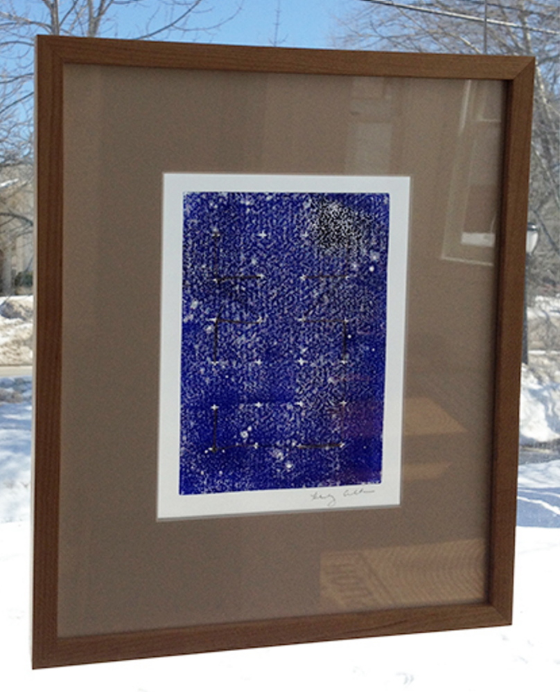
The handsome frames by gallery owner Graham Wood not only add to the look of the art, but they have a substantive effect as well – particularly regarding Crichton’s work. As the “drawing” on her extraordinarily reductive work is made by sewing, we can’t help but imagine the backside of the painted paper on which they are sewn, since it too had to be handled, seen and considered by the artist. Wood’s frames not only allow the works to be hung on the wall, but to be handled so the viewer can see them in different kinds of light.
This is not some subtle the-1960s-were-hard-on-me kind of effect. It’s clear and impressive. The frames are backless, which you wouldn’t see unless you pick one up – or if you display one in a window. When light reflects off the front of the works, like any objects, they appear solid and opaque. But when light passes through the back, the translucency of the paper becomes a primary component, and we can see the thread drawing as having an effect on both sides of the paper. The key term here is nuance. After all, light doesn’t generally come from a single direction. This underscores – and to a certain extent, undermines – a key aspect about the logic of painting. (It also brings “transmitted” versus “reflected” light into play. It’s a complicated subject that can be introduced by noting that with paints – reflected light – adding all the colors together produces black; while with theater lights or computer screens, for example, adding all the colors together produces white.) As I held up a work and turned my body in a circle, the work shifted with every step. The threads behind the paper reached the same density as the front lines and then dropped out of sight completely.
This open-frame effect is invisible with the works on the wall, but it’s not completely hidden from viewers since two of Crichton’s works are hung in the window on either side of the gallery. (The gallery’s windows are otherwise painted with Fulkerson’s brilliantly playful white lines.)
The reason why Crichton’s work is so effective in this mode is because the lines are oriented to the most minimal of systems – just a few 1-inch line segments of the natural fiber thread in one of three orientations: vertical, horizontal or diagonal.
One work, for example, features a pair of 35-unit white rectangles printed on a light gray paper. The form on the left has 12 vertical lines (three rows of four across) and the other 12 horizontal lines that we see as two vertical columns of six lines each. (A 35-unit grid, after all, is created by 24 internal intersections.)
And while it looks thoughtfully sophisticated on its own, the brainy ramifications of Crichton’s minimal aesthetic are powerfully reinforced by the Fulkerson’s impressive drawing systems. Together they make a case that contemporary painting is shifting from the Modernist grid (think cubism, Mondrian or Impressionism and the pixelation of digital photography) toward the systems logic of binary code or Boolean circuits.
The Boolean logic is evident in Fulkerson’s forms. We can follow as they both seem to grow and reduce with the same momentum – a fundamental quality of fractals. While the process logic seems simple – make one line segment and then attach a similar one, etc. – it is the same logic we see throughout nature that creates complex systems like the roots and branches that move away from the singular trunk of a tree. But while the forms mimic natural forms like branches branching out from other branches, we impart a singular narrative process to the image, following the idea that the artist (unlike Mother Nature) can only draw one line at a time.
Because of his visual involvement in the path of the image, Fulkerson can’t help but put the aesthetic out in front. While it is curiously cutting-edge, Fulkerson’s sense of drawing and finish take over each of his works as he brings them to a close. While his creative sensibilities have a logical start to them, once Fulkerson begins to see where his works are going, his artistic eye takes over.
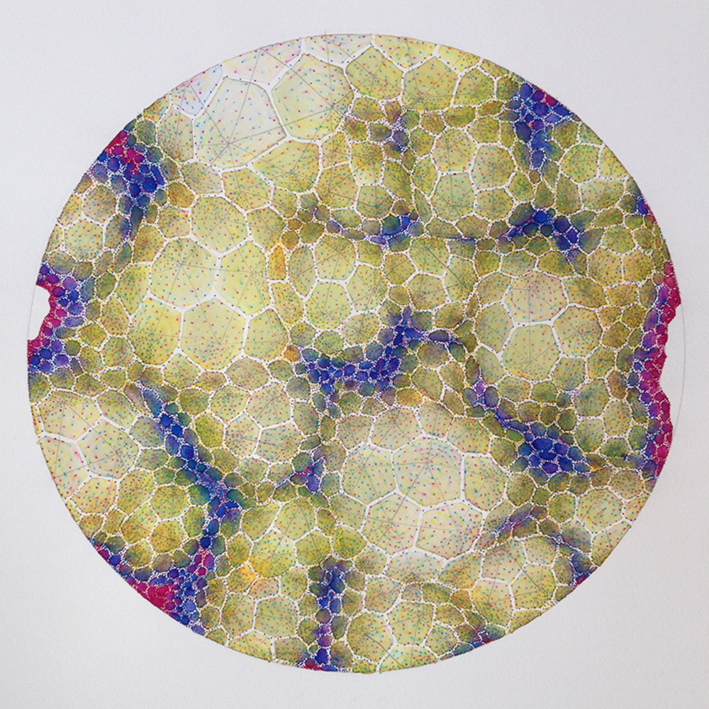
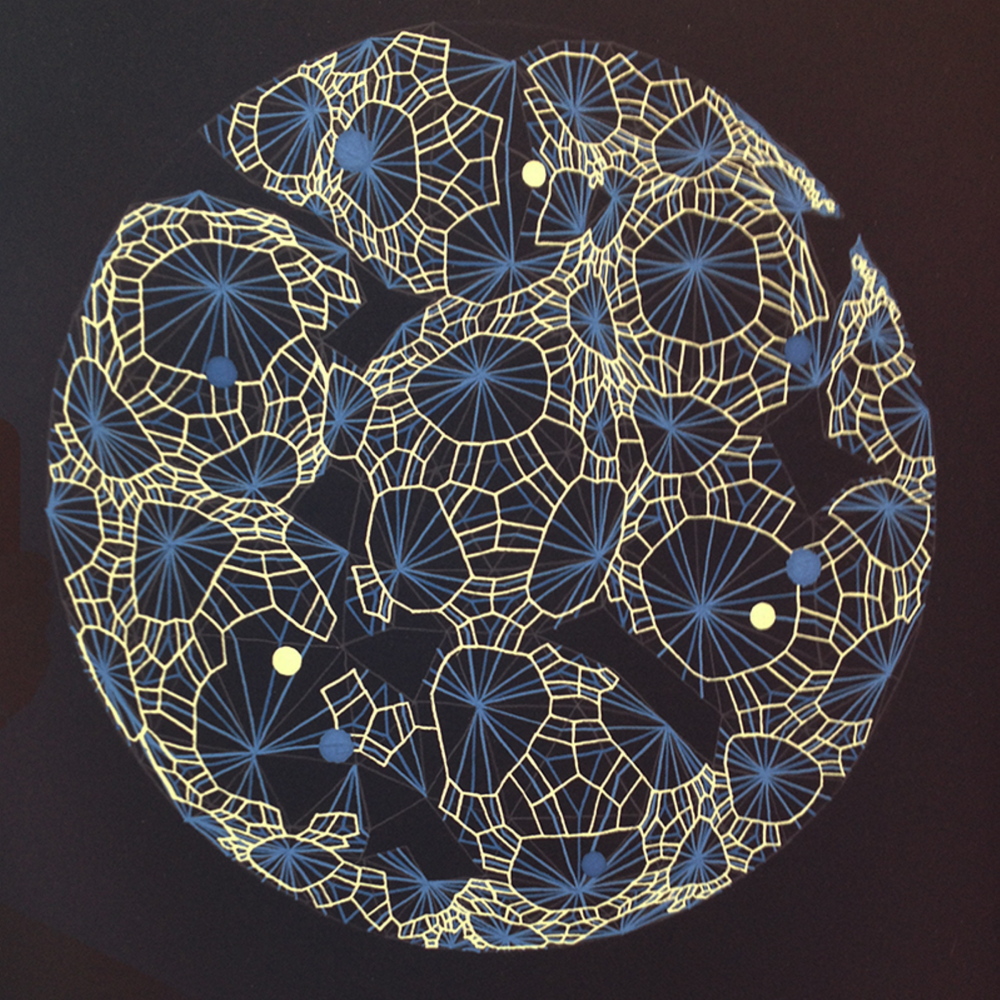
While Fulkerson’s four round-image “Accretion Discs” mark the tide of the two-person show (as well as a high-water mark for drawing in Maine so far this season), the exception that proves the rule is his “Disk” that plays a pixelated grid game about a circle. While we can appreciate the centrifugal orientation of the radial drawing’s quantum logic, in the end it feels like a model or map for Fulkerson’s more successful organic-appearing work.
Fulkerson’s most impressive quality is not his math, but his sense of line. His work looks good from a distance and it’s even more satisfying up close. And even when he works with gouache (although “Accretion Disk 103” has a wet watercolor feel that I hope is a harbinger of works to come), we see his work as drawing. And it is this that gives his work a satisfyingly savvy and contemporary sheen.
Crichton’s work has a similar savvy to it, but it comes from the edgy position that craft now occupies in the contemporary art world. Craft has a great deal to say about painting. And when a fiber artist can so successfully take on minimal painting in terms of seen and unseen, it’s not only impressive, but immensely enjoyable.
Freelance writer Daniel Kany is an art historian who lives in Cumberland. He can be contacted at:
dankany@gmail.com
Send questions/comments to the editors.

Success. Please wait for the page to reload. If the page does not reload within 5 seconds, please refresh the page.
Enter your email and password to access comments.
Hi, to comment on stories you must . This profile is in addition to your subscription and website login.
Already have a commenting profile? .
Invalid username/password.
Please check your email to confirm and complete your registration.
Only subscribers are eligible to post comments. Please subscribe or login first for digital access. Here’s why.
Use the form below to reset your password. When you've submitted your account email, we will send an email with a reset code.