


Carly Glovinski is one of the most accessible but challenging artists working in New England, or anywhere for that matter. She is among four artists celebrated in the George Marshall Store Gallery’s exhibition “Momentum XIV,” all finalists of the New Hampshire Charitable Foundation’s Piscataqua Region Artist Advancement Grant.
While each merits discussion – winner Cheryle St. Onge is represented by a satisfying suite of high-focus observational photographs with a shadowy edge and an eye to personal detail – Glovinski’s trompe l’oeil pranksterism stands out.
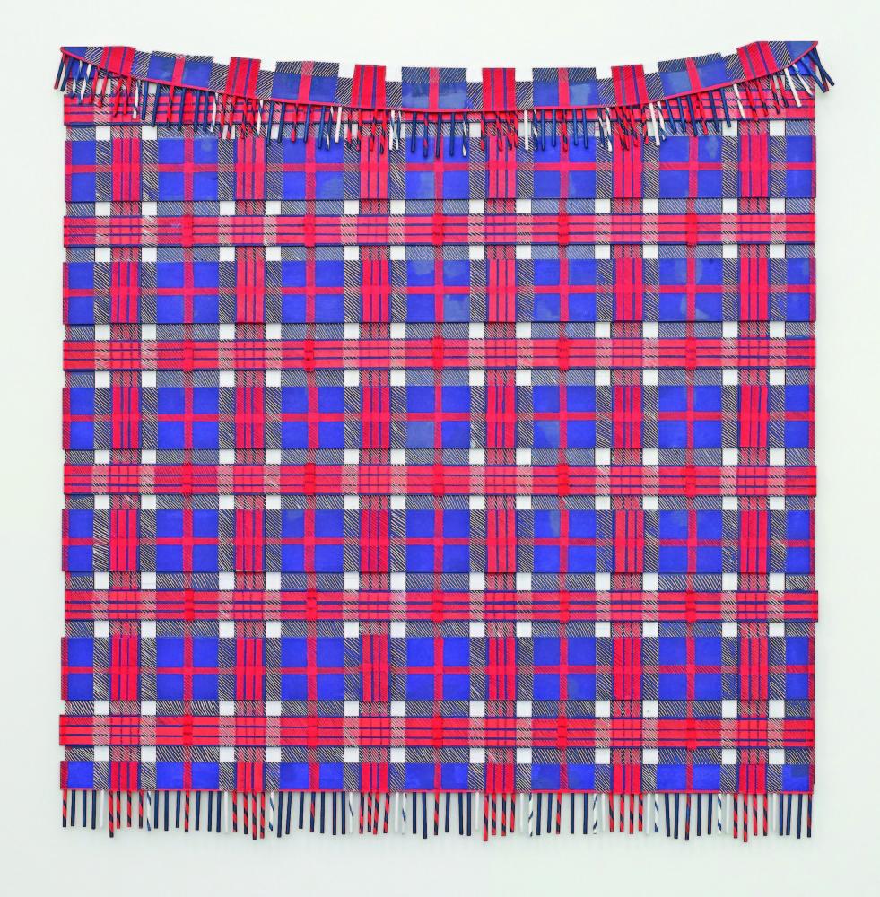
The first work viewers may see is Glovinski’s “Untitled (Blanket)” hanging on the far wall (looking past a handsome fiber piece by Sarah Haskell). It is not the fiber piece it pretends to be from a distance. It is a painting in acrylic and White Out correction fluid on wood.
Glovinski was classically trained as a painter, but she turned to making simulacra – counterfeit objects. Up close, it is easy to see this familiar object, a woolen throw blanket, is made of cut chunks of wood set in different layers. Glovinski’s red, white and blue plaid, tied to Bicentennial-era America, offers an iconic nostalgia. It feels like a well-played trap that breaks through to the personal – but does this say more about my age than the artists’ intentions? I find myself caught in Glovinski’s playful maze, without the ball of string I intended to bring.
Glovinski’s work finds its path intuitively, whereas most similarly conceptual work is calculated to outsmart the viewer. It’s a tough model: To outsmart the viewers is to insult them, while not outsmarting the viewers is to leave them unimpressed. Glovinski’s work, on the other hand, is disarmingly warm, playful and engaging.
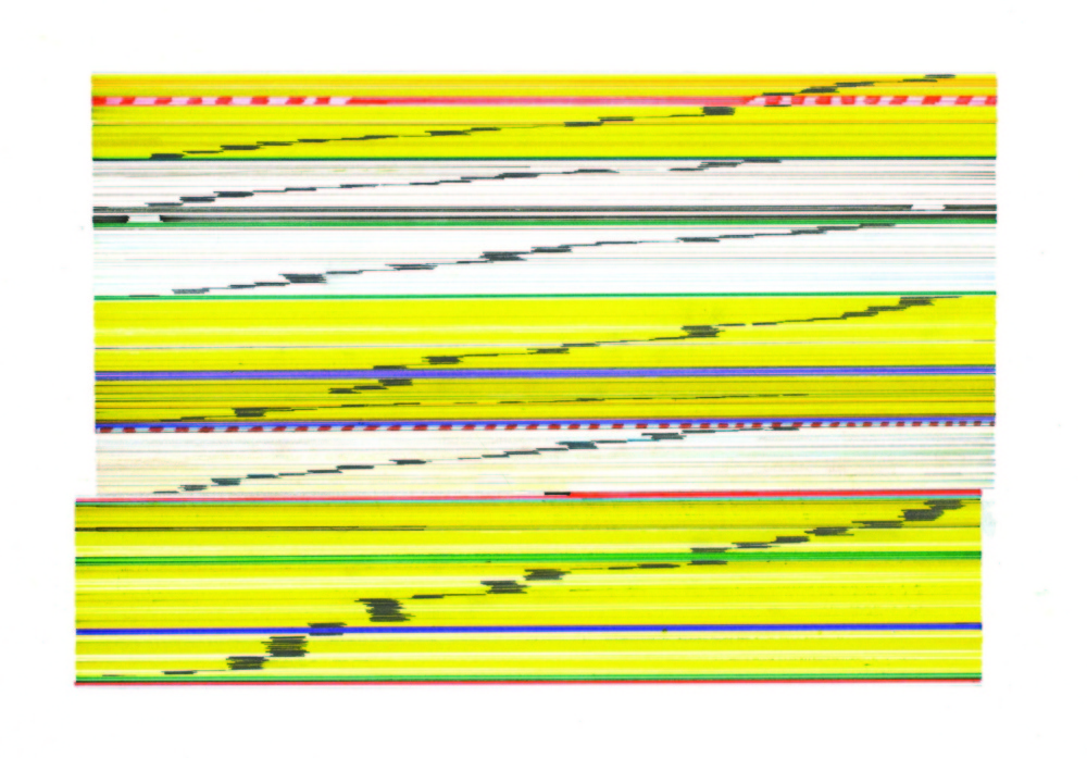
Her “Drop Ceiling Tile Study,” for example, looks like a photograph of a ceiling tile. Even up close, unlike the blanket, it remains perplexingly convincing. The paper is drawn upon with ink, embossed and then stained with coffee. The embossing provides texture, but the coffee stain is the X factor. It looks like a real coffee stain, and it is a real coffee stain.
Here, things get interesting: We see the tile hanging vertically on the wall in a frame, so it’s a picture. It’s obviously a ceiling tile, so we imagine it flat on the ceiling – facing down. But it is a also drawing with ink, so we can feel it facing up on the drawing surface. This is why the coffee stain causes a double take and adds some diagramatic architectural drawing intelligence (architects regularly prove their long-houred dedication via coffee stains on blueprints). It’s a compelling but strange kind of index not unlike when actor John Wayne played a character named John.
Glovinski doesn’t calculate confusion but indulges in the playfulness of irony and invites us to come along. Her shifting perspectives welcome our shifting perspectives. While other artists may present a rebus, Glovinski does not challenge us to find any singular truth in her work. It’s like she’s inviting us to play Legos instead of chess: We play with the artist instead of against her.
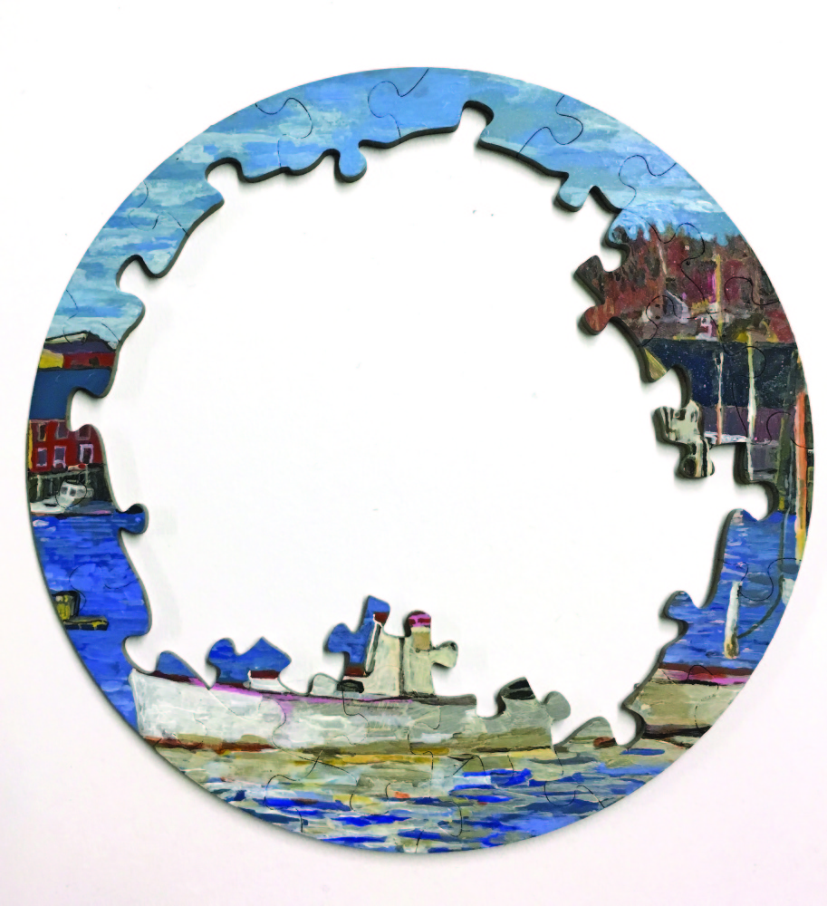
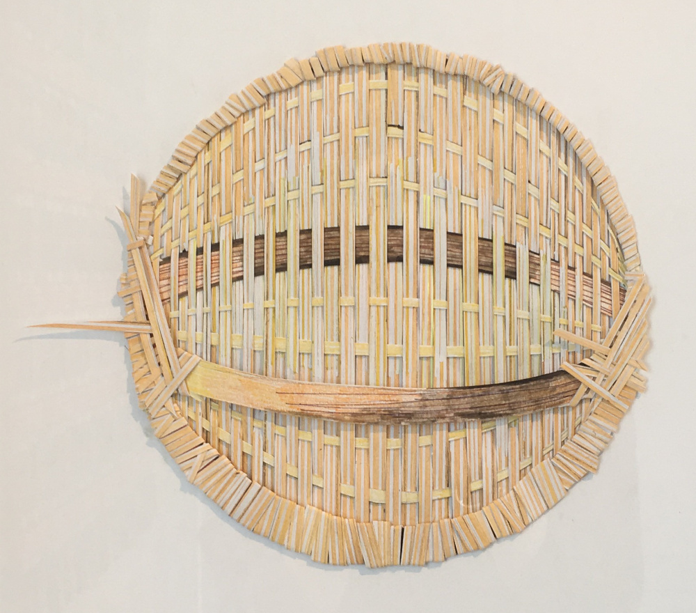
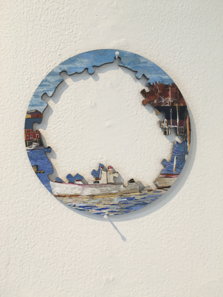
Glovinski’s other works include a map of “Pawtuckaway” painted on tin and folded to look like paper, Her “Baskethead” is flat and framed like a picture, but it is actually woven of paper so, in fact it is actual basketry pretending to be a picture of basketry. Her “Boothbay Harbor” looks like a tiny, circular puzzle of a lobster boat with an unfinished middle; but it is actually a single piece of lasercut Plexiglas painted realistically. Is it a painting of a photo puzzle or is the puzzle depicting a painting? This puzzle logic surfaces differently in “Untitled (picture puzzle)” in which Glovinski presents a puzzle box with a picture of the puzzle – an additional layer of simulacrum. And once again, Glovinski, who is an adept realistic painter, paints the scene very loosely and uses her signature White Out. It may be Socratic, but it is not a test. It’s recess.
While White Out is a tool intended for camouflaging mistakes, the irony is its fundamental practicality. It is the most opaque medium you can find, and it is an extremely well-known brand. Hiding the plane site in plain sight is iconic irony — ironoclasm, maybe?
Glovinski’s most open-ended work is “The Universe,” which comprises a fake 1970s Time-Life book titled “The Universe” and a simulated hand-written copy of its four-page index hanging as a drawing on the wall above it. The two parts interact enough that you might imagine it’s a fake index with the real book. While the book looks real enough (it’s wood), the title is loosely painted. This makes it more fun: You can’t play hide-and-go-seek, after all, if the other party doesn’t know you’re hiding.
In the end, however smart and challenging her work is, Glovinski never treats the viewers like dupes, rubes or pedantic snobs. She warmly invites us to come out and play.
Freelance writer Daniel Kany is an art historian who lives in Cumberland. He can be contacted at:
dankany@gmail.com
Send questions/comments to the editors.

Success. Please wait for the page to reload. If the page does not reload within 5 seconds, please refresh the page.
Enter your email and password to access comments.
Hi, to comment on stories you must . This profile is in addition to your subscription and website login.
Already have a commenting profile? .
Invalid username/password.
Please check your email to confirm and complete your registration.
Only subscribers are eligible to post comments. Please subscribe or login first for digital access. Here’s why.
Use the form below to reset your password. When you've submitted your account email, we will send an email with a reset code.