


Connie Hayes is one of Maine’s best-known painters. She was born in Gardiner and now lives and works in Rockland. Through the ’80s, she held administrative and teaching posts at Maine College of Art. In the ’90s she lived in New York City. Her work has been extremely popular: Greenhut Galleries sold many hundreds of her paintings in the past and Dowling Walsh does very well with her now.
Her work is familiar. Yet, Hayes’ large exhibition of new works at Dowling Walsh, “New Work From Italy,” caught me by surprise.
It follows a shift from stereotypical Maine painting to a mode associated with Americans in Italy well known to Mainers through, for example, works by James Abbott McNeill Whistler and John Singer Sargent. Hayes always had mounds of skill, but I had lost interest in her work years ago when her work became facile and stale.
Hayes’ work has been the very stereotype of Maine painting, but I mean this in the best sense. That stereotype blends plein air observation with economic and stylistically rich execution. It is associated with alla prima (wet on wet paint), bold mark-making and organization by light as opposed to color.
I have always been a fan of this type of painting, and there is much room for it still. In fact, with growing interest in narrative painting, representational Maine painters are well-positioned moving forward.
Yet, this is where Hayes’ work gets a bit uncomfortable for me. Maine painting had always been built on a sense of ethic underlying the aesthetic. Frederic Church’s first paintings of Katahdin, for example, required an outdoorsman’s trek no less bold than Arnold’s march on Quebec. Winslow Homer’s discarding European techniques like glazing for alla prima à l’Americain was seen as beastly, but it was acknowledged as intentionally so. After so many works, however, the path becomes too well-worn and the pejorative in the common tongue of artspeak is “academic” – which, ironically though accurately, implies the use of a recipe as opposed to well-considered steps in real time.
Within the context of Maine painting, this is leaving behind the ethic and being left with an empty aesthetic.
Hayes is often compared to Wolf Kahn, whom many critics are willing to attack for his unabashed predilection for attractive color-based compositions. I see visual intelligence underlying Kahn’s aesthetic choices. But I sense a rhetorical predictability in Hayes’ approach, like a jazz tune played or a recipe prepared for the thousandth time. At some point, the maker no longer needed to even think about it: They could just do it.
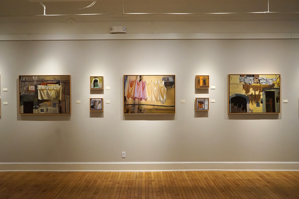
Fast forward to Hayes’ Italy works: oils, pastels and drawings in pencil and charcoal. You will hear “the light in Italy is different,” but that explains nothing. A better metaphor is the difference between jazz and classic music, or, maybe, French and Italian cooking. It’s a different mode, with different expectations. For starters, the Maine paintings are tethered – even the interiors – to the notion of landscape, while the Italian works follow an architectural logic. This appears clearly with Hayes’ turning her eye again and again to the sides of buildings and image after image of specific architectural details.
What we’re sensing, quite simply, is Hayes shifting from Maine’s modernist moment of Homer, Henri and his student Hopper to the 19th-century sophistication of Sargent and Whistler.
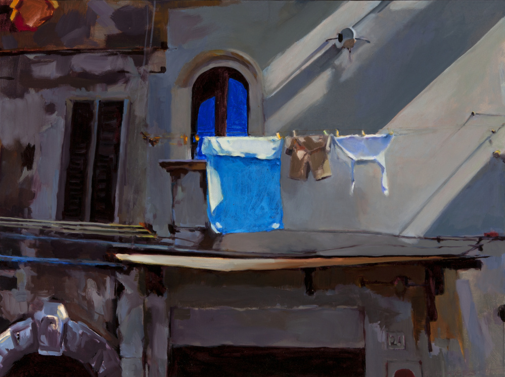
Take “Blue Towel,” for example, the 30-by-40-inch scene of laundry drying outside of abutting, gray Old World city buildings, with raking light pouring down into the, presumably, narrow street. Design-wise, it’s a gem. Seemingly simple, the time-deteriorated buildings invite loose handling. The anachronistic clothespins offer a way to punctuate with bits of yellow. But the key in the largely gray scene is the pairing of the blue shadow of the white towel against the reflected sky blue coming down off the old, arched window – they are two very different bits of blue: glass-reflected sky over dark interior space and the cool shadow of white fabric. What makes this striking, however, is how badly the blues are painted up close. Don’t get me wrong: I admire this, because it reveals Hayes can be more quick than slick – and a willingness to find anew what she leaves on the canvas.
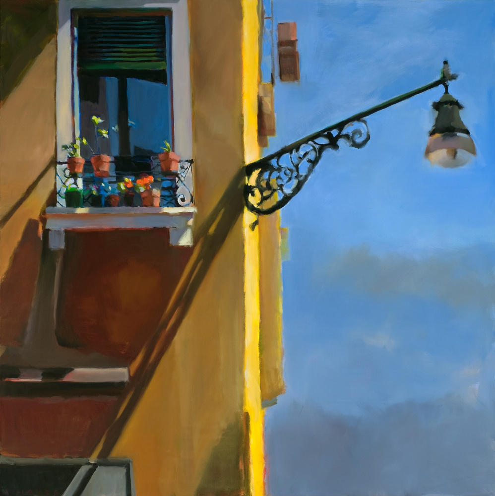
Some canvases reveal a laziness that undermines the evenness of Italy’s cliche gold light, such as “Windows of Venice #23,” in which a street lamp on an extended fixture juts from the blazing butter edge of an apartment building. We’re supposed to rely on a single dapple of light on the sill to tie it together and ignore the lamp itself, that dangles uncomfortably gray. But, again, this is an unsolved problem, so it feels fresher than one that hasn’t been solved a thousand times before.
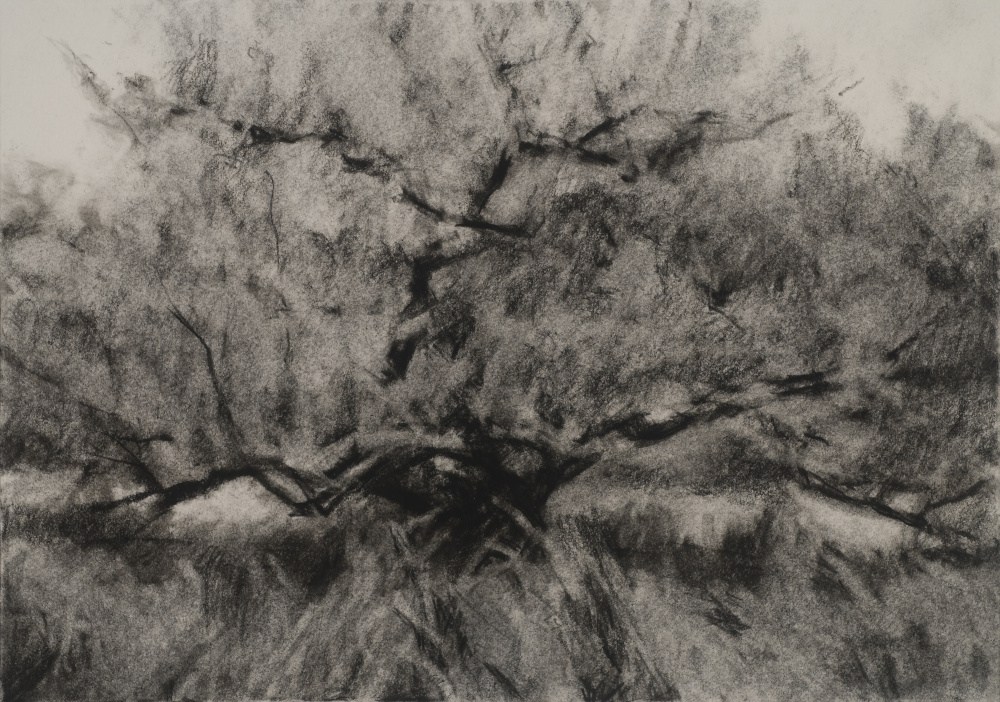
The show begins with a suite of tree drawings, but these circumvent the new problem of light and color that Hayes has taken on with her Italy paintings. Hayes’ new-found freshness is best revealed by the notable inconsistency of the oils. In them, her work finds a balance of style, one that is no longer overly facile.
Hayes has been going to Italy for years, but this is the first I have seen of her adopting genuinely new avenues. While, considering the retrograde motion of her historical models, it’s not clear where she’s going or whether her work will remain fresh, I had written her off and now I want to see where she takes this.
Freelance writer Daniel Kany is an art historian who lives in Cumberland. Contact him at:
dankany@gmail.com
Send questions/comments to the editors.

Success. Please wait for the page to reload. If the page does not reload within 5 seconds, please refresh the page.
Enter your email and password to access comments.
Hi, to comment on stories you must . This profile is in addition to your subscription and website login.
Already have a commenting profile? .
Invalid username/password.
Please check your email to confirm and complete your registration.
Only subscribers are eligible to post comments. Please subscribe or login first for digital access. Here’s why.
Use the form below to reset your password. When you've submitted your account email, we will send an email with a reset code.