Whether by chance or curatorial brilliance, the Bates College Museum of Art now features three distinct fine print exhibitions that key on the relationship between text and image.
“Doorway Portfolio” features a suite of prints by David Driskell and a parallel suite of short poems by Michael Alpert on separate sheets. They are like unrelated families living on either side of a duplex.
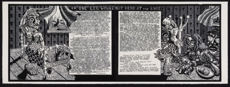
Jay Bolotin’s “The Book of Only Enoch” is a wildly energized suite of 20 woodcuts with embedded etchings (which convey the blocks of hand-rendered text) that essentially comprise an illuminated manuscript in the vein of American ballad storytelling and a woodblock image style inspired by the likes of R. Crumb.
The lead exhibition is “Robert Indiana: Now and Then,” a major exhibition of more than 70 works featuring some of Indiana’s best known works, such as “LOVE,” “The Alphabet,” “HOPE” and “EAT,” along with several of Indiana’s own poems and a debut of his newest work “Like a Rolling Stone,” in which the Vinalhaven artist incorporates lyrics from Bob Dylan’s song into the poster style Indiana developed from Marsden Hartley’s seminal “Portrait of a German Officer” paintings.
This trio could hardly have been better selected to illustrate three of the most significant visual art strands of relating text to image. Driskell’s and Alpert’s ostensibly separatebut-equal pairing is the simplest, although in truth there is no parity: There could be no “portfolio” of Alpert’s texts without the portfolio of Driskell’s prints – which are exquisite (Driskell, who has maintained a home in Falmouth for decades, has a long and successful relationship with master printer Curlee Houlton). They are rich, bold and strong enough to hold your savoring eye for a long while. Driskell’s imagery ranges through high points of modernist painting, looking mainly to Matisse’s color and structure, Picasso’s African-inspired imagery, Rothko-like spiritual gate forms and Driskell’s own forest interior spaces and his beloved white pine images.
Bolotin’s text and image relation may seem the most familiar as illustration, but adults tend to underestimate the power of illustration to tell a story. Moreover, the relation of text to image is laid bare not when viewers first see the large, gorgeously framed prints among several of the plates from which they are pulled, but when they pick up the catalog – which includes the text printed out, making it much easier to read.
While some viewers may think the more comfortable comparison is to comics or graphic novels, Bolotin never waivers from a storytelling style: This story is about Only Enoch, who is named for Noah’s angel-seeing great-grandfather whose “book” was a noncanonical Hebrew text. Only Enoch is a “sensitive” Jewish Kentucky farm boy who follows a dream path on a spiritual journey.
Indiana’s use of text is more complex in the sense that it leans heavily on art history. Indiana’s obvious use of poster logic, for example, is complicated by its Pop Art component, which relies on a critical awareness of multiples and the role of recognizability in popular culture. Indiana’s use of stencils – impersonal and endlessly repeatable – join with lyrics to a popular song, Dylan’s “Like a Rolling Stone.” Ultimately, Indiana’s reliance on Dylan’s poetics is echoed by Indiana’s own poetry, several examples of which are framed in a suite of “LOVE” prints.
Indiana has a reverence for graphic design. His “LOVE” imagery seeks a balance between the cultural icon impact of the word and Indiana’s personal chops as graphic artist. The moving parts come together in his “Rolling Stone” works as Indiana combines pop music, stencil work, graphic design, poetry and painting. The qualities of painting are apparent in Indiana’s newest series – the works are printed in acrylic on canvas and then stretched on canvas – to the point where many viewers will assume (and not wrongly) that they are paintings.
The relationship between print, graphic design and poster is complex and nuanced in Indiana’s work. It is further complicated by Indiana’s connection to Marsden Hartley, the late Maine modernist with whom Indiana long and strongly identified.
While the early Cubism of Picasso and Braque sought the liminal edge of legibility, the late Cubism that Hartley embraced was dedicated to the possibilities of representation – a reading best understood by Hartley and Russian avant-gardist Kasimir Malevich, whose cubist works included words, newspaper fragments, images of all sorts and even a thermometer. Hartley’s “Portrait of a German Officer” paintings from about the same time (1914) render identity through the compilation of identifying traces – insignias, colors, initials, words and various symbols. What marked Hartley’s cubism – the most sophisticated and accomplished of any period American – was its humanistic warmth, a quality that makes the moody Mainer all the more timely today.

Jay Bolotin, “Driven by Man,” 2011-14, woodcut and relief etching on Arches cover paper, 31 x 23 inches
Just about every work in Bates’ three shows is worthy on its own, and each of the three shows is excellent and important in its own right. But together, these exhibitions create a rare conversation about relating to text to image: Between them, they offer much to see and even more to consider.
Freelance writer Daniel Kany is an art historian who lives in Cumberland. He can be contacted at:
dankany@gmail.com
Send questions/comments to the editors.


Success. Please wait for the page to reload. If the page does not reload within 5 seconds, please refresh the page.
Enter your email and password to access comments.
Hi, to comment on stories you must . This profile is in addition to your subscription and website login.
Already have a commenting profile? .
Invalid username/password.
Please check your email to confirm and complete your registration.
Only subscribers are eligible to post comments. Please subscribe or login first for digital access. Here’s why.
Use the form below to reset your password. When you've submitted your account email, we will send an email with a reset code.