

Established in 1977 by Peggy Golden, Greenhut Galleries is Portland’s oldest gallery. Frost Gully Gallery in Freeport, which opened in 1966, closed last year, making Greenhut the respected elder of the Portland area gallery scene.
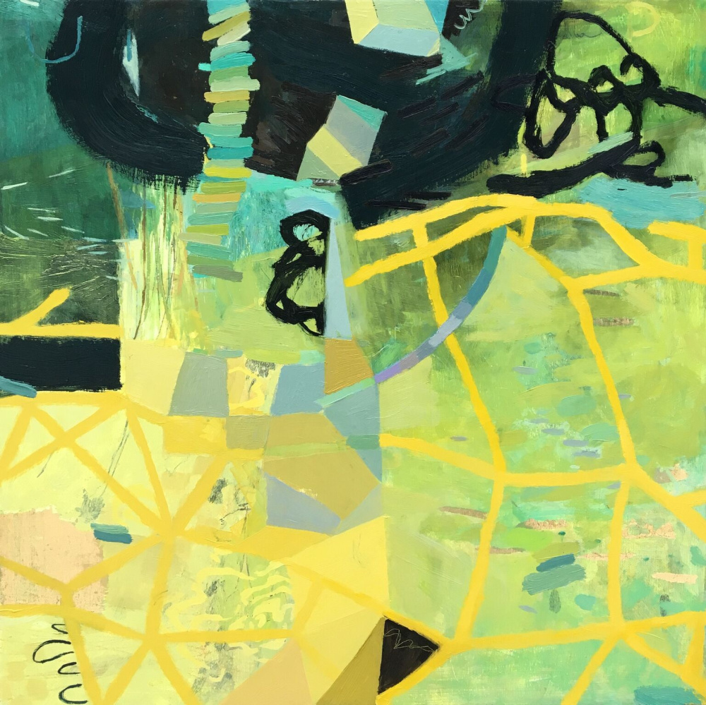
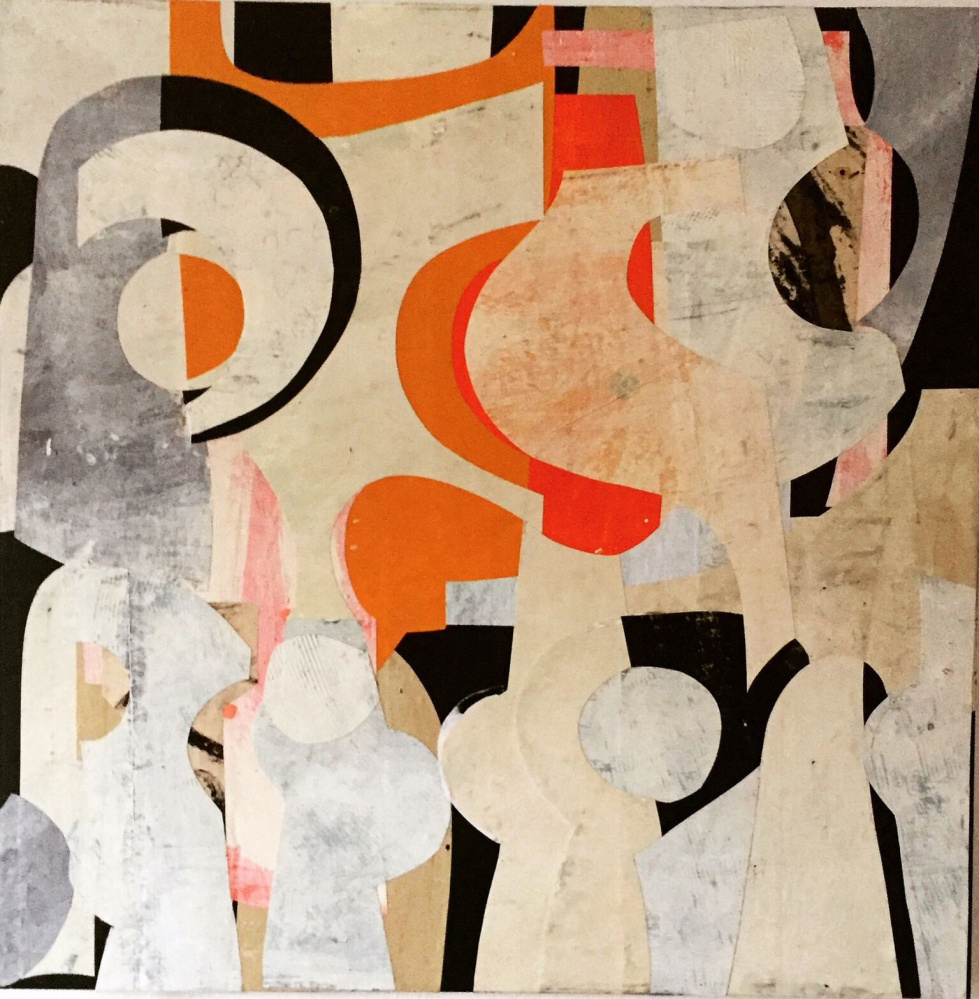
Greenhut is now showing “Abstraction,” a rather basic show that somehow manages to raise some remarkable questions. By “basic,” I mean nothing demeaning – it’s a strong show – but what is most remarkable is how natural it feels.
The team-curated show features a pair of the gallery’s long-time artists, Jon Imber and George Lloyd. But it also includes newer ones: the reductive but powerful paintings of Ken Greenleaf and a work by gallery employee, Chris Beneman, whose constructed architectural monoprint image is a pulsing high point of the show. As a whole, “Abstraction” is testament to Maine contemporary art’s no longer taking a back seat to more traditional observation-based painting.
Greenhut smartly starts “Abstraction” with a large painting by Frederick Lynch in the front the window. Lynch died in 2016 at the age of 80 after a long and highly engaged career as one of Maine’s leading abstractionists. “Division 114” acts like a geometrically carved wooden room divider barely jammed into the 7-foot canvas. Lynch acknowledged the corners of the canvas with the darkest bits of the scene where the trompe-l’oeil-ish architectonic surface form didn’t quite reach out. This is in fact a witty blend of the modernist practice of emphasizing the literal edges and corners of a canvas to underscore its literalness and of postmodernism’s willingness to play games with any tool, however fictional or cliché. The result: We see the painting as a flat, cornered rectangle with artist-energized painting stuff happening all over the surface. We see the thing, the process, the intention, the faith.
But the main problem with “Abstraction” is immediately apparent: There are too many works in too small a space. This is initially visually distracting, but there is an argument for more-is-better if you’re actually there to see as much art as you can. While this is less an issue for the more self-contained paintings, it’s tough on works that rely on an object presence. Noriko Sakanishi’s grandfather clock-like “Sentinel,” for example, looks like something jammed into an attic if you approach from the left side of the space, but it’s strong if you enter from the right and see it straight on. Sentinels need space to watch over, and this one is no exception.
Lynch’s other work is a complicated object painting that suffers from lack of space, as do a few of the tightly grouped grids in the side gallery such as Willa Vennema’s “The Circular Nature of Chaos and Order,” which feels like a circle jammed into a box, and, in particular, Allison Goodwin’s “The Sum of Its Parts,” a playful piece that comes across as too many kids on a cramped city playground.
Still, the work is generally very strong. I was particularly struck by new-to-me Lisa Noonis’ “Birch,” a rhythmically rich and pleasantly vertical visual field worked with a light touch. The strongest work in the context of the cramped show is Tom Flanagan’s jumpy and jagged “Shelter.” Conversely, Penelope Jones’ “Byzantine Permutations” bubbles to the top by carving out its own corner of historically layered decorative elegance. George Lloyd’s small paintings pack a visual punch, but they’re hard to see on the busy walls unless you specifically give them a few moments of their own: Do it. The payoff is big.
“Abstraction” is not short on appeal. Daniel Anselmi’s, Sandra Quinn’s and Ingrid Ellison’s elegantly finished square paintings all shift in real time with the mesmerizing grace of dancers. Nor is it short on formal intelligence, which arrives in spades with the unfurling shaped-canvas geometry of Ken Greenleaf’s “Lotus Blossom” and Lori Tremblay’s musically mapped blues unfolding as a circular tri-fold earth.
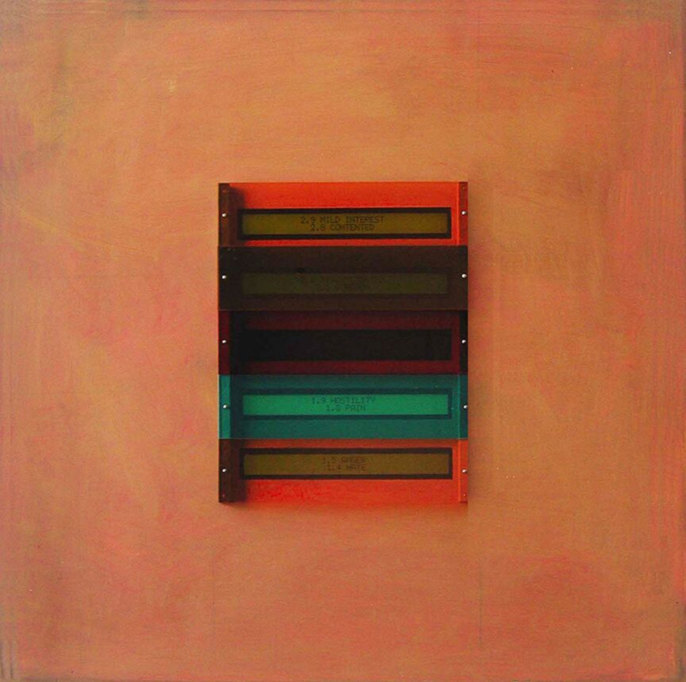
By far the strangest and most intriguing work in “Abstraction” is another square work – Tom Paiement’s “Tone Scale,” which features five horizontally stacked folder-tab-colored lucite bars in the middle of a two-foot skin-toned panel. Four of the bars are LED text screens. The middle one is blank, seemingly playing the role of the drawn line in L. Ron Hubbard’s famous explanation of his Scientology “Emotional Tone Scale”: “Just draw a horizontal line on the page. Put the people who are less alive on the bottom and the people who are more alive on the top.” Hubbard, in fact, listed 81 steps on the logarithmically numbered scale. And it is these that Paiement flashes at us. It’s a startling piece in the context of Donald Trump’s current anti-Muslim efforts. But Paiement’s ironical weaponry, unlike the Scientology scale, is comfortably capable of handling multiple positions simultaneously. On one hand, the work is about painting’s inability to respond to the shifting emotional states of its viewers. On the other hand, Scientology ostensibly values creativity and yet has tied itself to a dogmatic orthodoxy of labeling and judging anyone and everyone on its enumerated terms.
An awareness of Paiement’s art in general isn’t necessary, but it helps: He doesn’t comment on the Tone Scale. He doesn’t need to. He lets the systems logic and the gallery practice of contemporary art viewers do the work. Contemporary art, after all, is charged with explaining its own self-contained logic. The fact that we have to reach out further to educate ourselves and judge the merits of the piece as we would judge any work of contemporary art puts the ideas (and orthodoxy) of Scientology in a standard line of critical inquiry.
The result is a bit of self-education by the viewer, but the creative context is challenging. It’s a fair question to ask yourself if Paiement is an earnest Scientologist, and in the end, the hypocrisy revealed by the contrasting of internal art logic with the externally imposed religious dogma doesn’t discount that possibility. And there’s the wit. It’s one thing to come up with this system, as Hubbard did. But it’s another altogether to follow Hubbard in using it to judge yourself and others. Paiement is far too subversive to straightforwardly announce his own judginess. Besides, if it weren’t up to such iconoclasm, it wouldn’t be art – it would be religious testimony. And religion it ain’t.
You might not see Paiement’s “Tone Scale” as abstraction, but you would be hard-pressed to argue it isn’t. To me, it is an extraordinarily timely work because it offers a path for Paiement to open up a critical line of thinking about religion: That it is inextricable from irony, a truth made clear by organized religions throughout history that have preached a variation on “love they neighbor” while simultaneously judging and persecuting people of other faiths.
The greatest quality of contemporary art is that it can build its own paths to content. This is precisely why it is such a powerful cultural tool. Contemporary art can be pretty or revolutionary. It can fun or political. It can be quiet or spiritual. It can be anything. We make the mistake of assuming an abstract painting’s standard of success is aesthetic – when it can be so much more. There is a reason why both Hitler and Stalin saw abstraction as a threat and made it illegal. Something that can do anything, after all, can be very powerful indeed.
Freelance writer Daniel Kany is an art historian who lives in Cumberland. He can be contacted at:
dankany@gmail.com
Send questions/comments to the editors.

Success. Please wait for the page to reload. If the page does not reload within 5 seconds, please refresh the page.
Enter your email and password to access comments.
Hi, to comment on stories you must . This profile is in addition to your subscription and website login.
Already have a commenting profile? .
Invalid username/password.
Please check your email to confirm and complete your registration.
Only subscribers are eligible to post comments. Please subscribe or login first for digital access. Here’s why.
Use the form below to reset your password. When you've submitted your account email, we will send an email with a reset code.