

Nancy Hemenway Barton (1920-2008) lived in Maine for much of her artistic life. A concert pianist, active mother and wife of a diplomat, Barton was quite literally worldly. She grew up in Massachusetts (summering in Maine) and attended Wheaton College. In the late 1940s, she lived in Uruguay and Argentina. She spent much of the 1950s in Madrid before moving to New York and Washington, D.C. In the 1960s, she lived in La Paz, Bolivia, and Mexico.
During these years, while Barton was showing her art around the world, she created a solid and regular presence in Maine with annual exhibitions from 1960 to 1983 at the Maine Art Gallery in Wiscasset.
Barton started out as a well-trained painter and “Ahead of Her Time,” wrapping up a run at the University of New England Art Gallery in Portland, gives enough of her early work for us to sense her seriousness and acknowledge her abilities. But Barton raised herself into the upper ranks with her work as a fiber artist. Many aspects of Barton’s work set her apart, but on a very basic level, it’s hard not to see her work in painterly terms. Further, she pushes sculpture into her painterly logic in a way that reaches with undeniable awareness to Cubism and its Abstract Expressionist reiterations. At the same time, Barton’s feel for the material gives her work a sense of fiber art at its best – somehow both nuanced in its subtle material sensibilities and indulgently exuberant with its physically potent textures and colors.
I am regularly reminded of Barton’s extraordinary abilities every time I enter the Olins Art Center at Bates College, home of both the Bates College Museum of Art and some of the college’s most active performing arts spaces – highly fitting for a concert musician like Barton. Visitors to the Olins Art Center see an extraordinary example of one of Barton’s works to the right on a soaring hallway wall above a stairwell. It’s a long slender, striped piece, but folded with an almost Japanese calligraphic intensity (keeping in mind that kimono is one of the world’s most subtle, complex and historied practices of fiber arts). It’s an undeniably great work.
Barton with “Tipi Waterfall”
“Ahead of Her Time” is another feather in the over-brimming cap of UNE’s Ann Zill, whose 20 years of exhibitions at the Art Gallery are most notable for Zill’s worthy and exacting attention to Maine women artists.
Barton’s extraordinary accomplishments might be well-represented by a list of her museum collections and major exhibitions, such as her solo exhibitions at leading American institutions from Art Institute of Chicago to the Los Angeles County Museum of Art, or internationally from Edinburgh to Botswana. But Zill’s presentation shows Barton in her best light – through her work. “Ahead of Her Time” is a sufficiently large show in an excellent space. It lets Barton’s best works shine as they should.
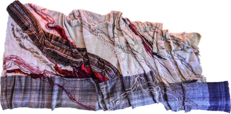
Viewers are greeted to “Ahead of Her Time” by Barton’s “Tipi Waterfall” of 1992 – well, actually a remake of the great work, since the original was damaged after an exhibition in China (apparently as cultural retribution related to the international response to the 1989 Tianamen Square protests). “Tipi Waterfall” is a 9-foot-tall teepee of karakul and mohair embroidery on hand-woven wool and alpaca fur. Instead of an enterable opening, it features a cavalcade of gorgeously water-like (alpaca?) fibers cascading down from the splayed hem hinges of the teepee and seemingly splashing out from the base, which is weighted all around by stones polished by the Boothbay surf.
“Bending Blue”
“Tipi Waterfall” appears to be an outlier, a true 3D work in a show of fiber works dedicated to the painterly logic of Abstract Expressionism. And yet it’s an excellent response to painterly logic: We see the surface of the teepee, after all, as a “skin,” a thin flat surface, not unlike a canvas, with decorative (i.e. painterly) possibility. The effect of “Tipi Waterfall” is less about spatial – sculptural – qualities than aspects of the art object, such as material presence like texture, material and design.
Barton was comfortable with color – a point apparent in spades with her late works, like the red, white and blue “Bending Blue” of 1987 – but she’s at her best with the organic qualities of her basic materials. “Rock Lichen” of 1975, for example, is a full-scale tapestry (68 by 50 inches) featuring two basket-like (or barnacle) forms. The driving factor of the work, however, is the natural feel of the lamb’s wool, the object materials rather than the color designs.
“Machu Picchu”
Barton’s most complete work is “Roserock” of 1982, a 13-foot wide form that feels like a beige and gray flag with red highlights flapping down to the right from a pole to the left of the fiber object. It’s an extraordinary thing, what with design and material qualities surpassing most Abstract Expressionist paintings. And this is precisely the point: After World War II, the U.S. became the world’s economic and cultural center and America’s clear foot forward was the movement known as Abstract Expressionism. While “AbEx” is primarily recognized as a painterly movement, its logic has become the standard notion of American artistic culture: Anything manipulated in the name of self-expression is legitimately art. This idea is the common driver behind everything from what children learn in elementary school art class to what average Americans expect for content when they happen to visit a gallery or museum. In the 1950s and ’60s, however, this logic fueled the American Craft Movement. Artists worked under the assumption that any medium in which they worked resulted in “art,” and from this thinking, artists such as Dale Chihuly (a fiber weaver who turned to glass) and Peter Voulkos (commonly considered America’s greatest ceramic artist) joined – or have led – the ranks of the nation’s best known artists.
Barton should be considered in this light. She has little of the recognition Chihuly or Voulkos have enjoyed, but her work sparkles no less than theirs in the light of the American logic of AbEx.
“Rock Lichen” (detail)
Like “Roserock,” “Wave Length III” of 1982 also twists down from the left like a flag, but its organic whites electrify the nuances of material, color and shadow-created shading. It is a symphony of subtlety.
“Confluence II” of the same year folds back and fourth five times with the pulse of a painter’s brush. Soaring 12 feet into the air, it outflanks Roy Lichtenstein’s famous fake brushstrokes – like the example on perpetual display at the Portland Museum of Art. This is not to say Barton makes Lichtenstein’s work look bad; on the contrary, without Pop Art works like Lichtenstein’s, Barton’s piece would be much harder for the average viewer to connect to painting – or Barton’s quiet hint that the vast white wall on which the work hangs is her canvas.
And the wall was Barton’s canvas. There is no doubt. Her work as a painter leads the way, with a single abstraction hinting at what she might ultimately achieve. In the end, however, Barton makes her own case. Her work is monumental, gorgeous and brilliant. It is satisfying and exciting. And, much like the work of Voulkos or Chihuly, the material ultimately gives way to the expression of Barton herself. The work of Nancy Hemenway Barton makes its own case: Its achievement is not the impressiveness of craft, but the power of artistic expression.
Freelance writer Daniel Kany is an art historian who lives in Cumberland. He can be contacted at:
dankany@gmail.com
Copy the Story LinkSend questions/comments to the editors.

Success. Please wait for the page to reload. If the page does not reload within 5 seconds, please refresh the page.
Enter your email and password to access comments.
Hi, to comment on stories you must . This profile is in addition to your subscription and website login.
Already have a commenting profile? .
Invalid username/password.
Please check your email to confirm and complete your registration.
Only subscribers are eligible to post comments. Please subscribe or login first for digital access. Here’s why.
Use the form below to reset your password. When you've submitted your account email, we will send an email with a reset code.