

KANSAS CITY, Mo. – Tweets containing hateful words are coming in larger proportions from people living in the eastern half of the United States, according to a new map that tracked hate speech on Twitter.
“How much hate people are broadcasting online is a little shocking and upsetting,” said Monica Stephens, assistant professor of geography at Humboldt State University in Arcata, Calif.
Additional Photos
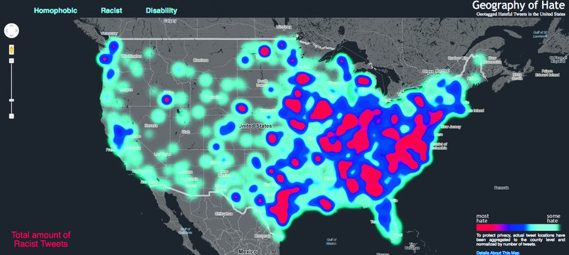
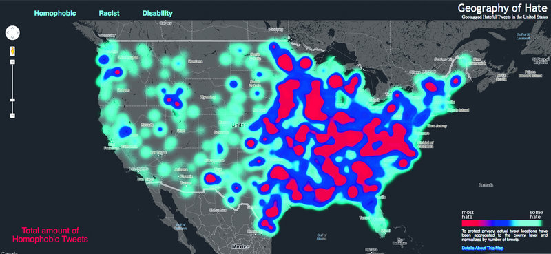
The map is based on tweets that were scanned for hate words that are homophobic, racist or demeaning to people with disabilities.
“I think the words themselves are shocking when you realize how much volume there is,” Stephens added. “We were dealing with over 150,000 times that these words were used in slightly under 10 months.”
The map uses data from the DOLLY Project at the University of Kentucky, which provides an archive of tweets that have been tagged with a location. The tweets were from June 2012 to April 2013.
Stephens had the help of three geography students – Amelia Egle, a junior; Miles Ross, a senior; and Matt Eiben, a graduate student – to analyze the tweets and build the map.
The students read them to determine whether they were hateful, positive or neutral.
“It was hard sometimes to make that decision,” Egle said. “There were definitely some racist and shocking statements that you aren’t expecting at first.”
Growing up in California, Ross said he heard racism a lot, but mostly in closed circles.
“It was surprising they would actually say these words to begin with and also have a spacial location attached to it,” he said.
Geotagged tweets are a small percentage of total Twitter traffic. People have to opt in to provide the geographic location from where they are tweeting. But those that are geotagged provide a good representation of what is being tweeted, Johnson said.
Eiben joined the project after Egle and Ross had been working on it for several months to help out with the technical end and creating the visualization of the data.
He said steps were taken to protect the privacy of people who tweeted the hateful speech.
The map’s result was based on how often people used Twitter in that particular location. A ratio was created by county to see what proportion of tweets were hateful, Stephens said.
“People may feel their communities are misrepresented, but these are parts of the community that they may not be interacting with and may not see,” she said. “We hope that this is an impetus for a conversation with members of a community about using these words and not supporting these groups.”
Those upset with how the maps looks can help change it by geocoding their own tweets, which would help improve the ratio of overall tweets to those with hate words in them, Stephens said.
“Stop tweeting hate,” Stephens said. “Start tweeting things that are more benign, that mention how much support there is and resources there are in the community for individuals. If Twitter had more of that and a little less negative sentiment, that would change it.”
She said she hopes the map encourages people to reach out and start conversations with their neighbors and others who are different from themselves.
Send questions/comments to the editors.

Success. Please wait for the page to reload. If the page does not reload within 5 seconds, please refresh the page.
Enter your email and password to access comments.
Hi, to comment on stories you must . This profile is in addition to your subscription and website login.
Already have a commenting profile? .
Invalid username/password.
Please check your email to confirm and complete your registration.
Only subscribers are eligible to post comments. Please subscribe or login first for digital access. Here’s why.
Use the form below to reset your password. When you've submitted your account email, we will send an email with a reset code.