


PORTLAND — Portland is about to become a more accessible city for the visually impaired.
Members of the city’s Historic Preservation Board voted unanimously Wednesday night to approve the design for a new curb cut ramp — known as a tip down treatment — that complies with the Americans with Disabilities Act.
Additional Photos
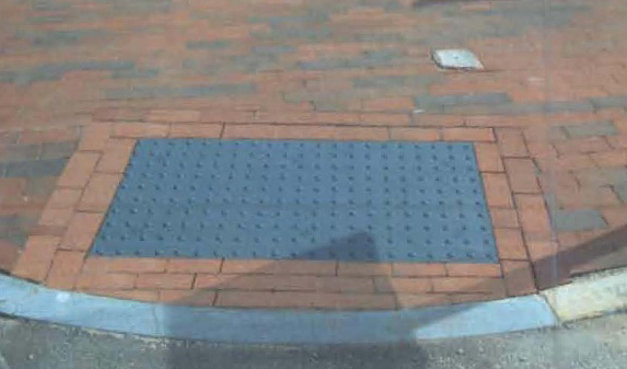
Each ramp will have a composite warning tile that will feature a number of truncated domes — bordered by brick — that cue people who are blind or visually impaired to the fact they are entering a sloped area where the sidewalk meets the street.
Dark gray tiles will be installed in historic districts such as the Old Port and Stroudwater while bright yellow tiles, embedded in concrete, will be used in all other locations.
The Preservation Board agreed with city officials that a cast-iron tile, which has a reddish hue, is too expensive though the color was more in keeping with historic district standards.
The gray and yellow tiles will cost $1,200 each. About 50 will be installed this year.
“We want to make sure that our city is as accessible as it can be,” said Michael Bobinsky, the city’s Director of Public Services.
Finding the right design was important, not only as a safety measure for visually impaired persons, but for ensuring that the curb cuts met historic district and ADA standards.
The process began last October when the city’s Public Services Department met with the board to weigh options.
In the months that followed, the city polled other communities and met with advocates for the blind and visually impaired to come up with a design.
“The city of Portland really blazed a trail,” said Matt Doughty, field inspections coordinator for the Department of Public Services.
Caitlin Blodgett, an advocate from the state’s Division for the Blind and Visually Impaired, spoke on behalf of the city’s proposal.
Blodgett explained that the vast majority of visually impaired persons do not use canes, and can see some color.
“To be able to know where the sidewalk ends, they need to rely on these visual cues,” she said.
Members of the board appeared pleased with the Department of Public Service’s efforts.
“I can see why the cast iron has an emotional interest, but it has no practical use,” Ted Oldham said.
“I think it’s a great compromise. I feel comfortable with the gray,” added Michael Hammen.
Staff Writer Dennis Hoey can be contacted at 791-6365 or at dhoey@pressherald.com
Copy the Story Link
Send questions/comments to the editors.

Success. Please wait for the page to reload. If the page does not reload within 5 seconds, please refresh the page.
Enter your email and password to access comments.
Hi, to comment on stories you must . This profile is in addition to your subscription and website login.
Already have a commenting profile? .
Invalid username/password.
Please check your email to confirm and complete your registration.
Only subscribers are eligible to post comments. Please subscribe or login first for digital access. Here’s why.
Use the form below to reset your password. When you've submitted your account email, we will send an email with a reset code.