

William Manning is an elder statesman of Maine painting. His terrific exhibition at ICON Contemporary Art in Brunswick reveals he has always been about making paintings that function through visual intelligence rather than mere aesthetic charm.
Manning long ago stopped trying to impress or seduce viewers. He challenges himself by making paintings that actually do something. This might sound vague to readers who aren’t steeped in the visual logic of Ab Ex and other abstract painting movements, but it’s more about perception than book-learned concepts.
Additional Photos
Manning’s tilting geometries reveal themselves with a jazzy snap similar to Stuart Davis’ best paintings, but with a more refined take on their overall logic and a blend of brushy passages with geometrical forms that recall Hans Hoffmann.
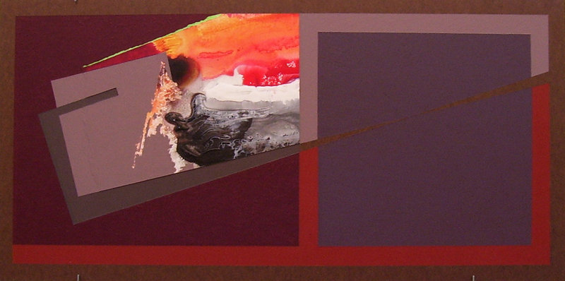
“Painting #222,” for example, is a small horizontal Masonite panel. The artist, as he so often does, retains a margin in which the Masonite is exposed. Between the margin and the way the image is split down the middle, the image has a book-like quality. This is furthered by the way the abstract visual narrative of the work unfurls itself.
The two sides are framed by a brick-red margin that reaches up from the bottom, containing, on the right, a plum-gray square form and on the left a purple rectangle with a doubled, gray rectangular form slashing up to the right. Within the angled form are broiled blacks, hot orange and fiery reds. The puce bottom of the doubled rectangle exits to the right form, where it is inverted as a continued line of exposed Masonite through the plum-gray square. The puce is echoed and punctuated by a band covering the top of the square on the right.
Describing how Manning’s paintings look says little about how they work. The previous paragraph only hints at the well-choreographed motions through which the painting takes your eye.
Yet Manning’s paintings all have clear sets of functions, and so are surprisingly satisfying. Give any of these pictures a few minutes, and it will do the work for you to “get” it.
Manning’s paintings will not seduce you visually. While some are very handsome, many use complex or even confrontational palettes. It’s not enough for his works to be attractive – Manning wants you to like them for their brains and conversational ability.
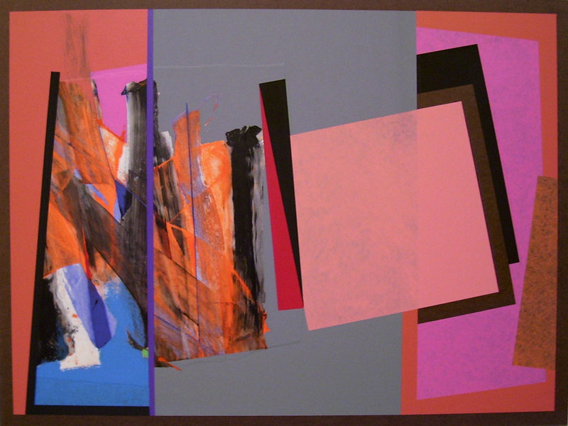
“Painting #324,” for example, is one of my favorites, but it’s hardly pretty. The palette of peach, pink, brick, orange, brown, blue, periwinkle, gray, black and red nightmarishly echoes the forms’ jangly jagged and staccato rhythms. The scraped orange and black on the left clamors for primacy, but eventually the bold elegance of the painting’s geometrical structure prevails, and a spate of deliciously sophisticated gestures becomes visible around the margins.
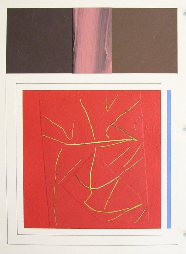
While the back-and-forth book logic is Manning’s primary formal vehicle, a few cross-sectional works (incorporating photos by the artist’s wife) are about how root systems below relate to the tree above. One of my favorites, “Drawing #147,” is barely legible but gorgeous and interesting nonetheless.
The top is a puce band with a gorgeously brushy pink stripe down the middle (one of Manning’s many reverential uses of Barnett Newman’s top to bottom “zips”). The bottom form is a red square with some yellow lines (or are they photographic branch elements?) scratched into it.
The heavy lifting is in the subtleties: the line flowing down from the left side of the top element that frames the work on the bottom; the matching line banding the red square on all but the right side; the painted-over paper rectangle lilting in the red square; and, finally, the blue vertical rectangle to the right of the red square that punctuates the entire piece. Seemingly simple, this small piece has about a dozen brilliantly honed chops as well as several interesting art history references.
Manning’s work reveals healthy fascinations with some of the most innovative and influential painters of the 20th century. The most important in this show might be Kazimir Malevich, whose “Black Square,” “White on White” and Suprematist forms are echoed everywhere in Manning’s work. I also see more than a smattering of Newman, Mondrian and Malevich in the work.
I might be going out on a limb, but I’m guessing Manning’s favorite all-time painting is Matisse’s 1916 “Piano Lesson.” If you want a feel for the palette and complex (but fully resolved) logic that Manning seeks in his work, look at Matisse’s secular Modernist masterpiece. I think it helps both to explain Manning’s goals and reveal his myriad accomplishments.
Manning’s resume is book-thick, but his painting certainly doesn’t rely on his past accomplishments. His work at ICON might not be pretty, but it’s brilliantly conceived, extraordinarily well-executed and a pleasure to behold.
Freelance writer Daniel Kany is an art historian who lives in Cumberland.
Send questions/comments to the editors.

Success. Please wait for the page to reload. If the page does not reload within 5 seconds, please refresh the page.
Enter your email and password to access comments.
Hi, to comment on stories you must . This profile is in addition to your subscription and website login.
Already have a commenting profile? .
Invalid username/password.
Please check your email to confirm and complete your registration.
Only subscribers are eligible to post comments. Please subscribe or login first for digital access. Here’s why.
Use the form below to reset your password. When you've submitted your account email, we will send an email with a reset code.