

Eric Hopkins is one of Maine’s best-known and most easily recognizable artists. He makes highly stylized and supremely energized Maine landscapes. Yet, for all their clarity and consistency – for a Hopkins is a Hopkins without a doubt – they are not particularly easy to explain.
Additional Photos
Along with James Mullen and Colin Page, Hopkins is a featured artist currently on view at Thos. Moser in Freeport. The Moser showroom is a homey place to see art. The custom-made furniture is gorgeous, but it also subtly provides a key context for understanding Hopkins’ art. In fact, Hopkins started his art career as a glassblower who worked with Dale Chihuly at the Rhode Island School of Design and then as his blowing assistant.
In fine craft – and this is particularly true of Chihuly and the huge crop of glass artists who have worked with him – design is a critical process that is refined over time. As they evolve, different designs become something closer to modes (think stool vs. bench vs. rocking chair, etc). This differs in a key way from the public understanding of series in fine art, in which the works are essentially variations on a theme.
Some artists simply find a compelling cliche and beat it to death in the belief that self-branding is expected of the artist. But the term for that is kitsch – not art.
The flip side is that many highly stylized artists get wrongly written off as kitschy simply because they look consistent.
Seeing just a few works by an artist like Hopkins isn’t enough to understand him. He develops new series using design logic. It’s not that he changes the superficial aesthetic of his paintings, as much as he establishes fundamentally new structural approaches within his work.
Looking back over his ouevre – which is particularly enjoyable via Carl Little’s terrific new monograph on Hopkins – this becomes apparent.
While, like Chihuly, Hopkins revisits many of his distinct modes over time, they have a certain developmental motion to them akin to evolution punctuated by periodic, radical breakthroughs. (Conversely, I think Chihuly’s paintings do not transcend kitsch; but that’s another story.)
Hopkins’ freshest works are landscapes with three-dimensional horizontal elements. These are smoothly curved clouds, islands or forms on the water that have a hard-edge organic quality to them that uses cast shadows seamlessly and rather brilliantly.
“Two Clouds #2” is such a piece. It features two long, rectangular-ish white clouds mirrored by their complementary dark-blue shadows in smooth water. The scene is divided by a dark shoreline and distant mountains. There is something of Hartley’s Maine visionary mysticism in these forms.
Of course, there are still plenty of Hopkins’ manically Marin-esque seascapes with their insistently spiky inverted “V” trees in his signature palette of happy blue, vibrant green and bright white – all in a cartoonishly rendered world curved as though based on aerial photography (which, often, it is).
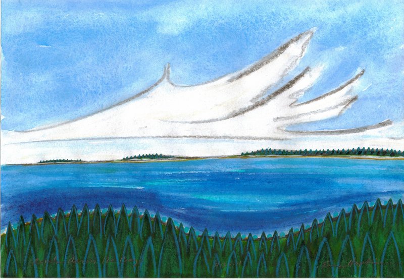
One of my all-time favorite works by Hopkins is a tiny charcoal, crayon and watercolor called “Clouds Across the Bay.” Past the undulating swales of spiky-tree-covered hills in the foreground and the bright-blue water of the bay are some evergreen-covered islands.
Washing over these strips of land are waves of white clouds rendered – miles high – by just a few bold strokes of charcoal. It masterfully captures the rhythms, motion and brisk energy of the Maine coastline.
Colin Page is one of the better painters in Maine, and his work is at least as strong as Hopkins’ in the show. It needs less of an explanation, however, because its appeal and achievement are so much more obvious: Page’s exquisite mark-making and ability to render economically with lively and delicious brushwork.
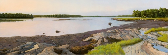
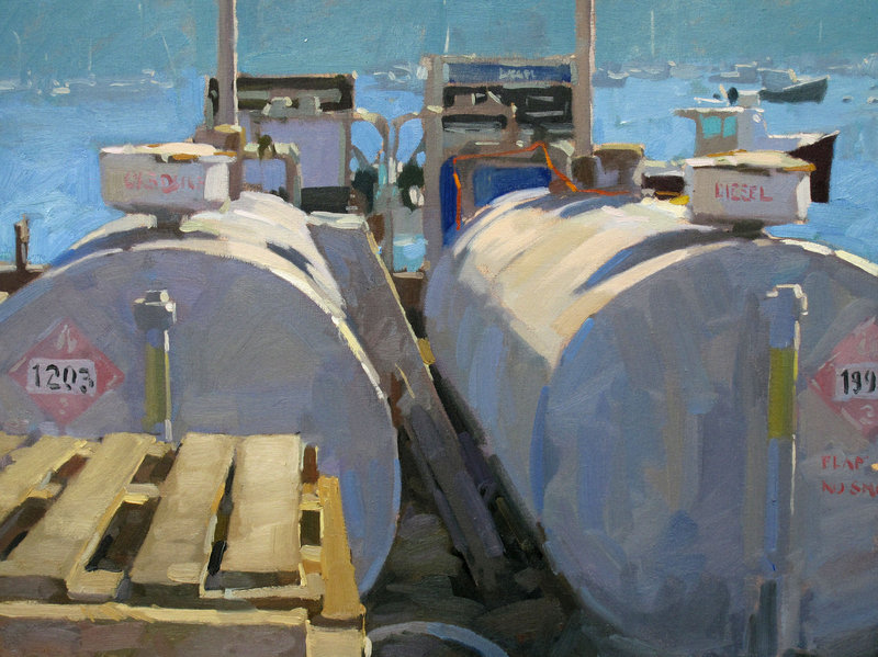
Page’s work flows rather seamlessly from quiet Maine seascapes to industrial scenes simply because of its proximity to real life – working boats, docks, harbor hardware and the majesty of the Maine coast – all painted with a brush that would make Homer proud.
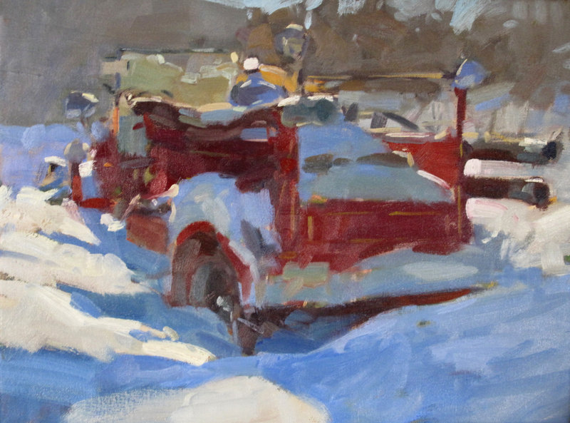
Page’s “Firetruck Stuck in the Snow” stopped my 10-year-old son in his tracks. It’s an old red truck in the bright sun of winter, piled in snow frosted by dazzling light and deep blue shadow. Page’s paint is thick and chewy, yet the strokes are deft enough not to feel stuck themselves. It’s a great little painting.
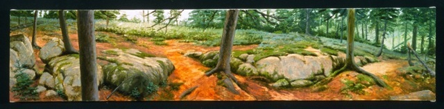
James Mullen’s paintings are landscapes that are more about scene than stroke. They could hardly be more different than Hopkins’.
There is a common position in the art world that looks down on bravado brushwork as though technique were somehow anathema to intellect. I doubt Mullen feels that way, but his work shuns showy brushwork. (His brushiest piece, the singular oil on plexy “Twilight,” is my favorite.)
His “Acadia Woods” and “Staples Cove,” for example, exude wonderfully recognizable senses of place. Page’s paintings, however, are a tough act to follow, and the effect on Mullen’s work is significant.
Because the combination of Hopkins, Mullen and Page creates a lively sense of comparison, the weaker works by Hopkins and Mullen suffer. But in general, they make for a fantastically revealing and interesting show.
Freelance writer Daniel Kany is an art historian who lives in Cumberland. He can be contacted at:
dankany@gmail.com
Send questions/comments to the editors.

Success. Please wait for the page to reload. If the page does not reload within 5 seconds, please refresh the page.
Enter your email and password to access comments.
Hi, to comment on stories you must . This profile is in addition to your subscription and website login.
Already have a commenting profile? .
Invalid username/password.
Please check your email to confirm and complete your registration.
Only subscribers are eligible to post comments. Please subscribe or login first for digital access. Here’s why.
Use the form below to reset your password. When you've submitted your account email, we will send an email with a reset code.