

‘Upon Reflection,” the title of an exhibition of photographs at the University of New England and its sumptuous accompanying catalog, implies a chance to reconsider and, perhaps, offer some thoughts about the future.
The photographs are the work of Judy Ellis Glickman, a highly accomplished photographer. Her work is a classic example of the 30 or more years during which it was produced – black and white, silver gelatin, largely conceptual, intense and immaculately produced. It is thoroughbred in every sense, with images that, for their strength and associational factors, I find indelible.
Additional Photos
If I were to seek the works’ brushes with greatness, I would say Paul Strand and Josef Koudelka – the latter for his manipulation of darkness and grit; the former for a shutter that is perpetually cocked and ready for the coincidences of life.
If I am right with these musings, Glickman is entitled to enthusiastic applause and a seat in the arts.
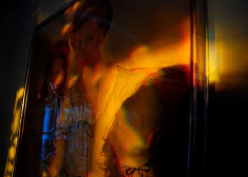
Unlike the main body of the show, the work in this gallery is in color and, I assume, accomplished with a hand-held cameras, likely digital. The results are electric by contrast.
The work becomes rational – or mostly rational – and with very little stylization. Some of it is presented in traditional print form; more of it appears digitally on a screen. The colors are raw, at times gaseous, and are shot across with slashing abandon.
The images can be specific, doubled, reflected or demoted to shadows and flickering lights. There are reflections upon reflections of objects, persons, paintings, sculpture, film edges, windows, vacant rooms, window blinds and more than I could identify. The photographer appears as an eminence grise in most prints and in many of the frames.
She doesn’t identify herself, and is more an observer than a participant. The narrative running through it all appears to be reflection, a reverie with occasional hard edges.
I realize that part of my reaction to this aspect of Glickman’s work is the shock of the new, but I was moved by the range of invention and release a highly disciplined artist has allowed herself in this animated body of work. I find it memorable.
IF YOU’VE never been to the Gold/Smith Gallery in Boothbay Harbor, chances are you are not familiar with the paintings of Mario Francesconi.
One of Italy’s leading modernists, Francesconi is widely known in Europe, but that has not made much of an impression in this country.
I can’t offer an explanation, but I can say that Gold/Smith has for years been a staunch supporter of contemporary Italian painters and sculptors. Its directors are part-time residents of that country, know the artists, and are discriminating in their selections.
Francesconi offers a tonic from regular Maine fare. His work is of our time, but not of our locale, although it is not uncomfortable among us.
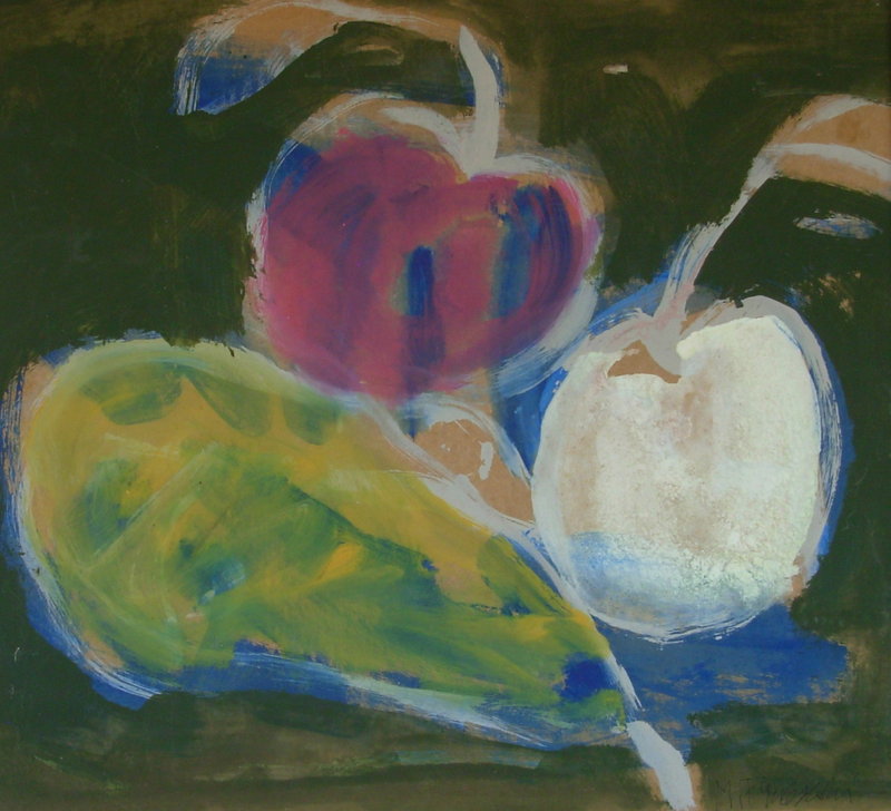
As its name implies, the work at Gold/Smith, “Natura Morta: l’Estate,” is largely still life – perhaps a green apple with a purple pear, perhaps two oranges on a black background, perhaps what appears to be a white pear in company with an orange and a green apple. The objects can be non-specific, and the colors as arbitrary as the artist elects.
The presentation can vary. In some works, the boundaries are more lyrical than fact, and the forms melt toward one another. In others, the fruit exists within darkly inscribed borders. It is aesthetics without apologies.
It is ironic that Francesconi produces these paeans to joy on old materials – cartons of one sort or another, pieces of cardboard and the like.
This factor – the irony that materials as well as fruit can be impermanent – has something in common with Post-Modernist thought of a few years ago, and adds to the pleasure.
This is a handsome and refreshing show.
“A RIVER Lost & Found” at the Bowdoin College Museum of Art in Brunswick deals with the Androscoggin River that, among other obligations, aqueously connects my town, Lewiston, with Brunswick.
The presenter is Michael Kolster, a photographer who, among other disciplines, practices the arcane art of making ambrotypes in the field. There are a few ambrotypists around, but those whose work I’ve seen labor in studios.
The field makes the difference, particularly when the base material is a glass plate. We’re not talking ferrotypes or tintypes; we’re talking glass plates, a near but fragile relative of them.
The making of landscape images using the technology of ambrotypes is a journey back to the 1870s about the time that the Androscoggin was harnessed and readied to become the great cloaca of its prime.
This serendipitous happening scents Kolster’s plates. In some visual way, they allude to the level of nastiness a great river may achieve.
But, back to landscape ambrotypes. The photographer must lug a large camera, his glass plates – say, 8-by-10s – his chemistry, his water for processing and a light-proof “dark box” in which to sensitize the plates and, after exposure, develop them. The sensitization is a quick pour of collodion over the surface of the plate, and there is art in the pour. It is not always complete, a fact that does not detract from the adventure.
There was life before photography became an art, before even George Eastman. Kolster’s plates installed against black backgrounds to read as positives reach back to the time when the capturing of an image was, in itself, a small miracle.
At Bowdoin, I took particular note of the diptych “Continental Mill from Auburn” (a view unchanged in any essential way since the 1880s), “Riverview, Durham Boat Launch” a triptych and “I-295 Bridges, at Topsham,” also a triptych.
Philip Isaacson of Lewiston has been writing about the arts for the Maine Sunday Telegram for 47 years. He can be contacted at: pmisaacson@isaacsonraymond.com
Copy the Story Link
Send questions/comments to the editors.

Success. Please wait for the page to reload. If the page does not reload within 5 seconds, please refresh the page.
Enter your email and password to access comments.
Hi, to comment on stories you must . This profile is in addition to your subscription and website login.
Already have a commenting profile? .
Invalid username/password.
Please check your email to confirm and complete your registration.
Only subscribers are eligible to post comments. Please subscribe or login first for digital access. Here’s why.
Use the form below to reset your password. When you've submitted your account email, we will send an email with a reset code.