

The Portland Museum of Art’s ongoing series of shows by living contemporary artists, “Circa,” has been consistently excellent. The work in Andrea Sulzer’s “throughoutsideways” is no exception. It is brainy, subtle and sophisticated.
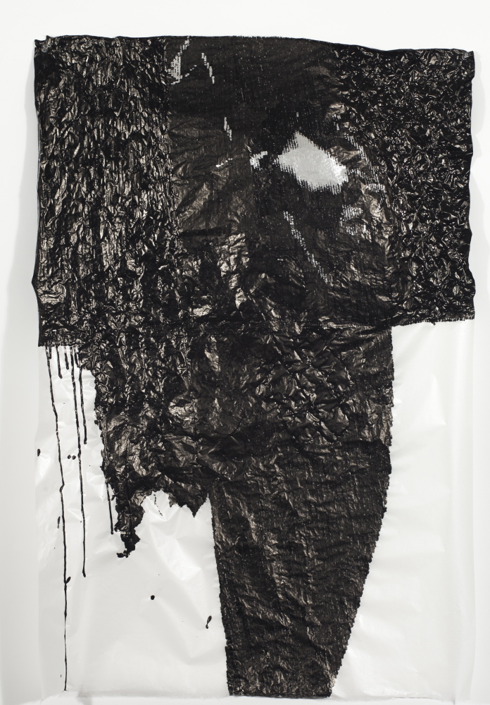
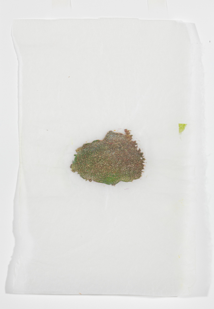
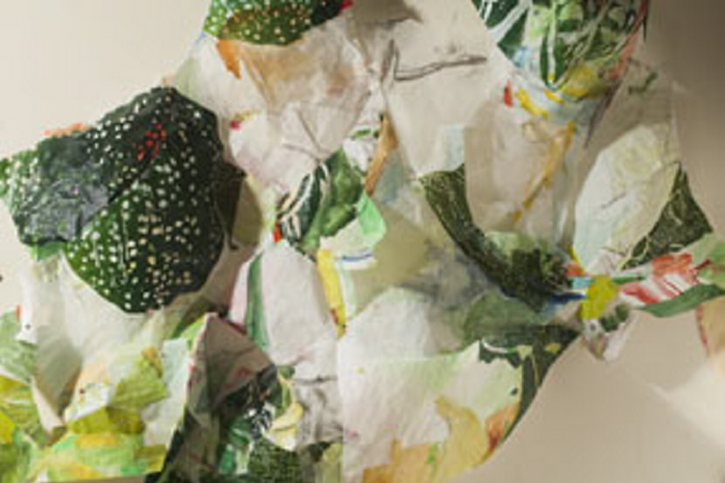
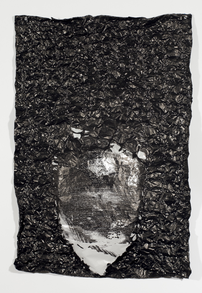
Most of the pieces are abstract variants of drawing and collage on paper that clearly announce themselves as paper objects. Crumpled, folded, bent, sewn, stapled or cut, paper is a well-adored medium in Sulzer’s hands. For example, you can easily sense her fascination when the gampi paper, a fine Japanese tissue, wrinkles around a spot of dried ink.
art review
“ANDREA SULZER: THOUGHOUTSIDEWAYS”
WHERE: Portland Museum of Art, 7 Congress Square, Portland
WHEN: Through Aug. 24
HOURS: 10 a.m. to 5 p.m. Tuesday to Thursday, Saturday and Sunday; 10 a.m. to 9 p.m. Friday
HOW MUCH: $12; $10 for seniors and students with ID; $6 for ages 13 to 17; free for ages 12 and younger; free for all from 5 to 9 p.m. Fridays
INFO: 775-6148; portlandmuseum.org
Additional Photos
It may seem a minor thing, but Sulzer’s use of the ink-inspired wrinkles to clearly articulate her craft-as-sculpture aspirations is contrary to the way we usually see buckling as an unintended problem when, for example, liquid mediums are used on tracing paper. The fact that we recognize wrinkles as an unwanted side effect lends Sulzer’s work a savvy sense of self-awareness. It forces us to reorient our ideas about works on paper.
Sulzer’s work is ultimately more about systems and process than images, self-expression, recognition or legibility.
If you took a group of artists to the Maine coast, you would expect most to exclaim “Wow! Where’s my camera?” But a few might mumble “Wow! Where’s my microscope?” If you like art that fits in the latter group, then you will probably enjoy “Throughoutsideways.”
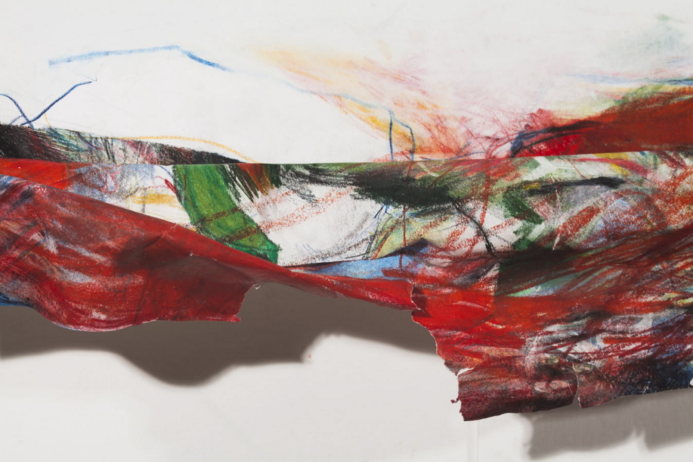
Sulzer’s microscopic sensibilities are most effective in some of the least likely places. The strongest work in the show is a giant (71 by 57.5 inches) sheet of paper of which the bottom has been colored, crumpled, stapled and frayed so it juts out six inches from the wall. Without the huge white expanse, the crumpled bottom wouldn’t read as a macroscopic version of a frayed edge. It’s like a sheet of paper long ago placed in a book with only its edge exposed.
This leads to the logic of margins, footnotes, afterthoughts and the overlooked. If you come to see Sulzer’s work this way, it’s a magical show.
“Goya’s Witches, Grounded” takes the microscopic slide idea in a different direction. Sulzer sculpted a 3D model of the three witches in Goya’s famous painting “Flight of the Witches” at the Prado in which three half-dressed witches in episcopal mitres (exaggeratedly long, skinny, funny hats) float into the (solid black) air as they devour a writhing man. Sulzer encased the clay sculpture in black clay to make a solid block and then sliced it like biopsy slides.
Goya’s 1798 painting is generally seen as a rationalist statement in opposition to the Inquisition, the Church and superstition in general. Sulzer seems to be piling on, but how apparent will that be to the public when the label copy reads “the witches represent a figment of the imagination conjured up by superstitious fears”? And it’s hardly a rationalist gesture for Sulzer to leave out Goya’s writhing victim.
This brings us to a problem with “Througoutsideways” – the language used to describe Sulzer’s work (other than the fabulous title). Because Sulzer is one of those artists who avoid commenting on their work (a position I respect despite the complaint I am filing here) it means any statement in thewall labels plays an oversized role. Even if the museum staff wrote the label copy, we assume the artist approved and so we ascribe it to her.
In “Pi,” Sulzer arranged strands of colored clay in the order of the never-ending digits of pi (3.14159…). The label proclaims its “unexpectedly beautiful array of patterns.” While I can think of many things to call this mashup of colored clay strips, “beautiful” is not one of them.
A clearer illustration of the cloyingly bossy copy accompanies “Flicker,” an abstract work on panel. It begins “Flicker defies our expectations of a print…” and goes on to explain that it’s many layers of ink. But the piece is hung perpendicularly to the main space, so what we first notice is that it’s a panel, and so it’s hardly a surprise that it acts like a painting.
This condescending tone interrupts and brings down the show. A successful Maine painter I saw at “throughoutsideways” described the label copy as “completely pretentious” – and he was right.
While we don’t know if it’s the museum or Sulzer who was behind the verbiage, it reflects poorly on both.
Another built up ink piece on panel, “Candyland,” lies flat under glass with a magnifying lens stuck over it. While this underscores (though coarsely) the microscope logic of the show, it’s even fussier and bossier with large print words on the base ordering viewers not to lean on the glass. Despite the hints, this presentation of ink is not something Sulzer invented – nor is it even remotely the most interesting exhibition featuring such work. Bates recently hosted a breathtaking show of Japanese printmaking that featured many extraordinary examples of this kind of surface comfortably, impressively and without a lick of pretense.
If you can look beyond the presentation, however, you will see work that is sophisticated, quiet, refined, beautifully finished and intellectually effervescent.
If you go, I suggest spending some time on the show’s centerpiece: “Night Flight.” Don’t think about anyone’s explanations: Just bask in the rich skeins of sumi and acrylic on the gloriously buckled gampi – and enjoy.
Freelance writer Daniel Kany is an art historian who lives in Cumberland. He can be contacted at:
dankany@gmail.com
Send questions/comments to the editors.

Success. Please wait for the page to reload. If the page does not reload within 5 seconds, please refresh the page.
Enter your email and password to access comments.
Hi, to comment on stories you must . This profile is in addition to your subscription and website login.
Already have a commenting profile? .
Invalid username/password.
Please check your email to confirm and complete your registration.
Only subscribers are eligible to post comments. Please subscribe or login first for digital access. Here’s why.
Use the form below to reset your password. When you've submitted your account email, we will send an email with a reset code.