

“John Marin: On the Verge of Wilderness” is worth seeing. It features about 30 excellent works, all watercolors, from private collections (read: see them now or not at all) that were made in and about Maine.
“On the Verge” includes works from 1914, Marin’s first year in Maine. It was a critical year for his work, but also personally – Marin found a sense of home here and returned to Maine again and again for the rest of his life. His Maine works reveal a struggle to develop an effective pictorial language that could balance the organic complexity of the rugged landscape with Marin’s propensity for efficiency. In “Untitled II,” (1914) Marin looks to Matisse and uses blue outlines to connote trees in front of the coast. It works, but much of the image is illegible. In “West Point” (also 1914), he switches to color and interior qualities: Textures and scratchy lines come into view, and Marin pulls the whole thing together with flashes of wet paper technique, particularly with a sap green that shifts from stroke to wet surface and back to form the “U”-shaped structure of the composition. Much visual chaos remains, but the forms have begun to play the parts of legible components.
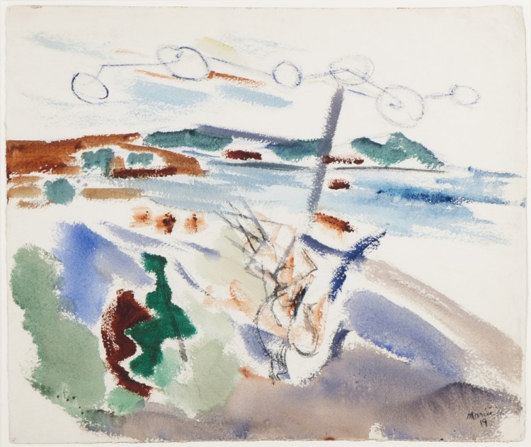
By 1919, Marin has gained more confidence. His “Islands Looking Out from Deer Isle, Maine No. 2” is not only confident tonally, but with an effective fore, middle and background structure, as well. The transition to the sky is smooth, and Marin has pushed away the problems of the bottom edge, making the visual entrance to the scene easy for the viewer. At the time, the artist was pressing his modernist cause in works like “Deer Isle, Maine, No. 1.” It is a reductive work in which every element plays a visual role. At the water’s edge, a vertical stroke – we can assume it’s the tree seen more clearly in “No. 2” – pushes from the fore space past the middle ground water, through the background island – splitting it – and into the sky. This subdued sky is one of the key elements of “On the Verge.” Marin has made clouds out of six simple circles that he has connected with lines. At a glance, all is well. With a closer look, the simply drawn clouds seem almost bizarre, and yet undeniably efficient.
Marin’s particular strength was how he could put his visual intelligence to work in his watercolors. The key word here is “watercolor.” These days, we often get caught up in a (generally lame) dialogue about whether watercolors are paintings, drawings or something else. But in the late 19th century, when Marin (1870-1953) was trained as an architect, watercolor was the medium par excellence for visual inquiry and noting visual ideas. At that time, many architects – among them the nation’s best, such as Stanford White (1853-1906) and Harold van Buren Magonigle (1867-1935) – were masters of watercolor. The leading Maine architect of the day, John Calvin Stevens (1855-1940), not only designed 350 buildings in Portland, and over 1,000 in Maine, and was highly influential in the field of American domestic architecture, but he was also an excellent painter. And the painterly medium underlying the relationship between architecture and visual arts was always watercolor.
“Steamer and Gulls”
What distinguishes architectural images from other visual forms is that architecture is about spaces for people and that architectural drawings convey practical information. What takes this pair of ideas from obvious to amazing follows two reasonably common opinions about art. First, that a primary goal of modernism is tethering the body of the viewer to a here-and-now experience of looking at a painting, starting with Impressionism’s perception-based optical approach. The second is early Cubism’s dedication to legibility: Picasso’s and Braque’s first Cubist paintings were, more than anything else, about the minimum requirements we need to recognize one thing as a still life and another, say, as a portrait. Early Cubism was all about drawing, and it looked again and again to the language and logic of architecture. It’s not by chance that Picasso’s 1912 “The Architect’s Table,” for example, was a seminal Cubist work.
Islands Looking Out From Deer Isle, Maine No. 2
What I am asking you to do, in short, is look at Marin as an architect who learned the most sophisticated lessons of Cubism. The problem for us – and for Marin’s legacy – is that we no longer understand Cubism. We chose not to. World War II, after all, helped American art dealers make the case that we were making the good stuff – and that historicist European erudition was a failed project that led to war and even genocide.
The two Americans who best came to understand the most profound insights of Cubism were Marin – who internalized the legibility-oriented early stuff – and Marsden Hartley, whose portraits of a German officer, for example, reveal his understanding of late Cubism as an encyclopedia of painting’s possibilities.
The problem with such a brainy approach to painting is that it isn’t sustainable when any given work isn’t blazing new trails. “Isle au Haut from Deer Isle” (1919), for example, is a straightforward landscape that, alas, goes almost nowhere because its vertical water stripes on the right fail to take flight. “Four Master” (1933) reveals a moment in which Marin’s visual interest is piqued, but the architect in him renders the ship almost too accurately, and that leaves the problem of context, so the rest of the scene winds up fittingly flat and literal. We see this even more clearly in the context of “Steamer and Gulls” (1932) in which, among playful passages, Marin inserts a long, drawn vertical “S” on the foreground beach with no other purpose than to punctuate the undulations of the composition.
“Grey Day, Cape Split, Maine”
One section in particular reveals how Marin sought Cubist solutions rather than what we could call realist detailing. The rocks in the foreground of “Grey Day, Cape Split, Maine” (1934) are a solid, effective mass of gray-blue and brown. As in many of Marin’s other watercolors, they reveal the pencil underdrawing, but not merely outlines and shapes. Marin’s drawing here is almost like script or notes. There are rhythms, letters and geometrical forms. It’s an excellent passage of painting, and it reveals that Marin was undeniably unusual. It helps us see that his watercolors are fundamentally drawings. With them, Marin would not only construct images, but investigate and unpack visual elements. For him, this was a visual process, not a verbal or theoretical practice. Architects use drawings as the visual to convey ideas; drawings are a means, but for artists, the primary goal is the visual conveyance of the image.
Mount Katahdin 2
“On the Verge of Wilderness” is a troubling title if the goal was to portray Marin as a straightforward Romantic, theatrically pushing himself to the edge of culture. However, I suspect that new Ogunquit Museum of Art director Michael Mansfield was hinting at something different – at Marin’s push toward the limits of language, to the points where painting pushes past our abilities with words.
Matisse is everywhere for Marin in “On the Verge.” We see him subtly in the dotted Post-Impressionist references in works like “Boat and Sea” (1946) and monumentalized in “Two Women by the Shore” (not dated). But Matisse is still famous for his struggle with Picasso (also Marin’s elephant in the room), so it’s not surprising that when Matisse appears, Marin is often in trouble. We see flashes of greatness when Marin is on his own; take, for instance, the impressively majestic “Mount Katahdin No. 2.” (1941) Mostly we see Marin at his best, struggling to unpack the visual ideas that make up the architecture of painting.
Freelance writer Daniel Kany is an art historian who lives in Cumberland. He can be contacted at:
dankany@gmail.com
Send questions/comments to the editors.

Success. Please wait for the page to reload. If the page does not reload within 5 seconds, please refresh the page.
Enter your email and password to access comments.
Hi, to comment on stories you must . This profile is in addition to your subscription and website login.
Already have a commenting profile? .
Invalid username/password.
Please check your email to confirm and complete your registration.
Only subscribers are eligible to post comments. Please subscribe or login first for digital access. Here’s why.
Use the form below to reset your password. When you've submitted your account email, we will send an email with a reset code.