

The range of works in “Time and Again,” a show up at the George Marshall Store Gallery in York, reveals the power and energy of Portland artist George Lloyd, whose paintings and drawings date from 1971 to the present.
These qualities shift somewhat in different modes and over time, but they never diminish. Lloyd’s highly abstract figures and interiors are painterly and dynamic and maintain a highly wound intensity throughout the years, in whatever mode.
More than 4 feet wide, the 1971 oil on canvas “Composition with Lamp and Iron” is both the oldest and largest painting in the show. It is stylized to the point of abstraction. The lamp, for example, is a flat yellow form on what is otherwise a sheer rectangle of light blue running up the left side of the canvas. The rest of the image appears more of an architectural fantasy drawing than an interior. It is flat, geometrically taut and intentionally avoids linear perspective. It has the feel of Matisse’s tensest large compositions, such as the “Piano Lesson.”
Lloyd’s connection to Matisse is important for his interiors as well as his figures, but it is less apparent than his relationship to the flat frontalness of the Bay Area School painters. Lloyd, who originally hailed from Boston, lived and worked in the Bay Area for years, but his own propensity for bringing forms to the surface relates no less to his familial relationship to architecture and architectural drawing. Indeed, even in his most painterly paintings – and Lloyd is not afraid to let his brush fly – drawing is never far away. “Composition with Lamp and Iron” is thickly laid with paint, for example, but it is the linear play of drawing that ultimately pulls the composition into focus.
“Blue Interior” is a small oil painting, so brushy and loose that it teeters on the edge of abstraction. What presses the painting into legibility (and beyond – it’s a brilliant image) are a few scraped-in lines placed with intelligence and apt precision. These few and delicate marks lift the image into architecture. They are specific and intentional, so much so that they redouble the sense of looseness of the paint. It is the tension between these modes that raises the work to a philosophical (i.e., dialectical) level.
“Seated Figure With Bird,” George Lloyd
“Seated Figure with Bird” is a deKooning-esque watercolor from 2008 – wild, loose and racecar-quick. Again, the image borders on abstraction, but we can read the figure by means of its fleshy peach color. The bird, on the other hand, however small, is drawn clearly. While the titled subject comes into sufficient focus, the majority of the lines and paint seem more about the joy of lines and paint than playing any descriptive role.
Lloyd has prodigious powers as a painter. His hand is as smart and skilled as it is bold. And he is so bold with the brush that his paintings have a sense of swagger. Yet Lloyd keeps this in check by letting messier passages stand or by offering breathing space. Lloyd is bold, but affably so. Any of the works in excellently curated “Time and Again” is a treat for the viewer.
“At Ease,” at the same gallery, is based on the chair paintings of Barbara Sullivan, but she is joined by Amy Brnger, Gordon Carlisle, Grant Drumheller, Tom Glover, Stuart Ober, Carole Rabe, Michael Stasiuk and Michael Walek. It is another smart and eminently enjoyable show.
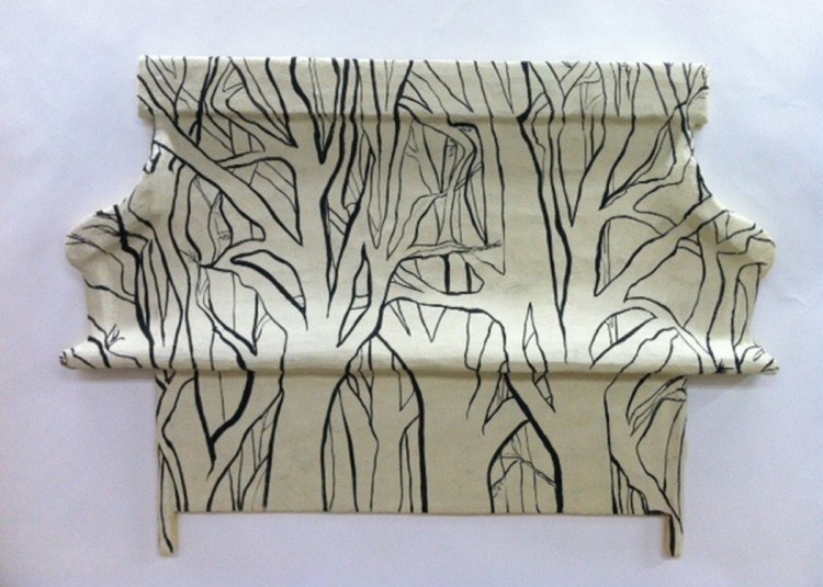
Sullivan’s pieces are shaped panel frescos, a technique Sullivan learned while working as the head cook at the Skowhegan School of Painting and Sculpture. Sullivan’s works are coquettishly witty and free from any fuss. She is particularly successful with a few pieces that play with ideas, pattern, material and ceramics. “Quimper Chair” hilariously echoes the yellow, blue, green and Mars red palette and design elements of the popular French ceramics and features a Quimper-style couple at the top of the chair, drawn with a perfect Quimper-stylized looseness. It’s a fake ceramic non-chair pretending to be a pretend chair. This is brilliantly hilarious, but it goes beyond the joke with Sullivan’s deeper delving into issues of style and recognizability – a point emphasized in “Small Blue Floral,” a chair that, because of the “Quimper Chair,” appears as based on Delft porcelain. One of Sullivan’s key observations is that decoration often makes an object into something else, even hiding it as it takes on other brands or identities. This is even more apparent in the 4-foot “Tree Shaker Bench.” The Shaker bench form is apparent as something like a silhouette, and it’s covered with black and white drawings of trees that reference her installation wall-drawing style that we saw in her recent Caldbeck show in Rockland, but not here in York. The trees act like a sort of drawing camouflage, and somehow it seems to be a play on “can’t see the forest for the trees,” but maybe as “can’t see the bench for the forest.”
“At Ease” is a large and varied show. In addition to Sullivan’s work, most notable are Ober’s stately quiet corner of a couch, Drumheller’s “Maine Bedroom” with its Nabi-like color richness, Brnger’s nod to Wayne Thiebaud – a picnic centered by an extraordinarily painted cake – and Gordon Carlisle’s unlikely and riotously surreal collage “Do You Have Something You Would Like to Add?” – a 1950s domestic scene in which a couple is joined in the living room by an enormous tortoise sitting between them on the couch.
Freelance writer Daniel Kany is an art historian who lives in Cumberland. He can be contacted at:
dankany@gmail.com
Send questions/comments to the editors.

Success. Please wait for the page to reload. If the page does not reload within 5 seconds, please refresh the page.
Enter your email and password to access comments.
Hi, to comment on stories you must . This profile is in addition to your subscription and website login.
Already have a commenting profile? .
Invalid username/password.
Please check your email to confirm and complete your registration.
Only subscribers are eligible to post comments. Please subscribe or login first for digital access. Here’s why.
Use the form below to reset your password. When you've submitted your account email, we will send an email with a reset code.