

The Maine Jewish Museum in Portland has settled into a rather busy routine of mounting three concurrent shows. The current trio is rich and varied. And, as with most of Maine art doyenne and museum curator Nancy Davidson’s shows, they are handsome and broadly accessible.
The main gallery – the entry hall of the Portland temple – is loaded with Berri Kramer’s collages and encaustics. The other first floor gallery features masterful color prints by Jane Banquer. The third floor space – the upper gallery of the sanctuary – harbors the black and white close-up floral photographs of young newcomer Ilana Welch.
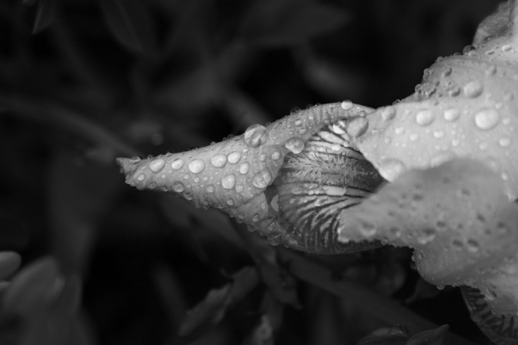
WELCH’S SHOW – “Extracts” – is notable for its unlikeliness. Davidson’s approach has been to stick with established artists. Still student-aged, Welch has professional roots with her years of work with the estimable Anne Zill, the erstwhile director of University of New England’s Art Gallery in Portland, but this is the first time I have seen Welch’s work. While it is not overly original, Welch tips her hat openly to models like Georgia O’Keefe (and let’s be honest: Welch’s flower photos don’t shy away from the brazen sexuality of O’Keefe’s florals) or the texture-driven luscious clarity of Joyce Tennyson’s black-backgrounded flower portraits. Welch’s works might not reach the subtle depths of these inspirations, but they do more than merely succeed; they make the elegant upper level space look better than I have ever seen it. The same-sized, crisply-edged black and white works are hung on level with the middle massings of the stained glass windows. They actually enhance the somewhat recently renovated space. (It’s hard not to sense Welch’s UNE colleague Kevin Callahan of Kimball Street Studios in Lewiston in both the mounting and the hanging of the work.) Particularly notable is Welch’s longest-titled work, “An Eternity in a Grain of Sand an Instant in a Drop,” a rose-shaped bud beaded with water pointing back to the left on a black ground. Welch isn’t showing much of a range with this work, but in a moment, she proves her work has the ability to enhance an already elegant space. Many successful artists never accomplish that.
“Downeast Spruce,” by Jane Banquer.
BANQUER’S WOODCUTS, linocuts and solarplates are dense and masterful. The easy takeaway lies with her Maine coastal scenes, mostly multi-plate color woodcuts that seek to define themselves as unique shapes instead of as photo-like rectangular assumptions (think Sam Cady, but with connected multiple groupings: say, a beach, a treeline, an island and a cloud). Banquer’s forms in these works would rise up flatly if they were paintings (think Bay Area, like, maybe, Wayne Thiebaud), but as prints, they largely hold to their contained form on the surface. To a certain extent, we can thank Japanese prints and their admirers – like van Gogh – for this, but Banquer does the extra work to clarify these are her terms. In “Downcast Spruce,” for example, she balances a central compositional swerve to the left with a sort of inverted “S” shape left in paper white, which, with such contrast, more than holds its own within the structure of the image.
With “Headlands View North,” Banquer creates a stone golem-like figure with a pine-stand-headed rocky cliff smashing a lobster-like pincher claw into the sea. Or, you might simply see a picturesque – though common enough – Maine coastal scene, weatherbeaten and muscularly wizened by the ages.
It is Banquer’s solarplates, however, that best reveal she studied with one of America’s greatest printmakers, Leonard Baskin. Solarplate printing was developed in the 1970s as a less noxious approach to etching that leaned on light-sensitizing photographic techniques. Banquer’s solarplates combine a Jean Arp-like pair of overlayed color egg forms with a pair of Baskin-esque bird and feather forms. These are graphically brilliant works that push both the medium and Banquer’s abilities as a draftsman towards their outer edges. Sure, within them, it’s impossible not to grab the chicken-or-the-egg joke (one terrific pair actually comprises chickens with the egg forms) but even the cheapest reading still works. And if you push it further to parroting and poppinjays, well, let’s just say that I think Banquer, at least at some point in the past, was a sharp-beaked wit. (N.B., I have no idea on dates: these could have been last year, but my bet is the late 1970s; I rather enjoy not being told the dates in this case.)
“Screen Boro,” by Berri Kramer, encaustic.
BERRI KRAMER’S WORK is both the starting point for and the punctuation on the trio of shows. It also forms its own internal trio among collage, paintings and encaustics. All, of course, are interrelated: The collages are wax-sealed, the paintings include collage elements, and so on. Kramer presents her work as three modes, but what might have driven her to make the works (she comments – with respectable insight – about her father’s bookshelves, moon-driven tides and then communication remnants such as inks and rusted-out bits and so on) does not overwhelm her strategic approaches. And it is her strategic approaches that drive the aesthetics of Kramer’s work. And make no mistake about it: It is the aesthetic of the work that delivers its success. As a collagist, Kramer’s instinct is for the gorgeous; she has an uncanny sense for the edge of an object and her obvious ability is as a quilter. She lays collage objects end to end, but finds her particular path with subtle bits of fiber, particularly the linen we associate with painting or ticking (the typically blue-striped wrap of old mattresses). Combined with her use of wax medium, these materials set up unusually gorgeous surfaces rich in both literal and metaphorical weave.
Frankly, Kramer’s content is far better unpacked in person. One of her pieces might include several envelopes mailed decades ago and letters laid out in script liquid beyond what our now-unpracticed hands have long forgotten. The visual intelligence of the work follows the time logic of quilts in addition to the scripty directionality written with elegant pens long ago found to be outdated. Her work reaches deep into personal subjectivity, both of the producers of her included objects as well as her choices about what, where and why. Indeed, Kramer confounds our senses of conjectural knowledge (i.e., the stuff of doctors and detectives) by relying on, for example, puzzle-piece logic. And the clarity of this stance is huge: There is no doubt that content matters to Kramer, but her main target appears to be simpler systems such as aesthetics, texture and space. This also makes her collages feel more like painting than collage; and however ironic that may sound, it is, with a look, rather obvious. She shows again and again that visuality has more than enough chops to outsmart content. That might be tough to read, but when you’re looking at Kramer’s work, it’s practically impossible not to see.
Freelance writer Daniel Kany is an art historian. Contact him at:
dankany@gmail.com
Send questions/comments to the editors.

Success. Please wait for the page to reload. If the page does not reload within 5 seconds, please refresh the page.
Enter your email and password to access comments.
Hi, to comment on stories you must . This profile is in addition to your subscription and website login.
Already have a commenting profile? .
Invalid username/password.
Please check your email to confirm and complete your registration.
Only subscribers are eligible to post comments. Please subscribe or login first for digital access. Here’s why.
Use the form below to reset your password. When you've submitted your account email, we will send an email with a reset code.