

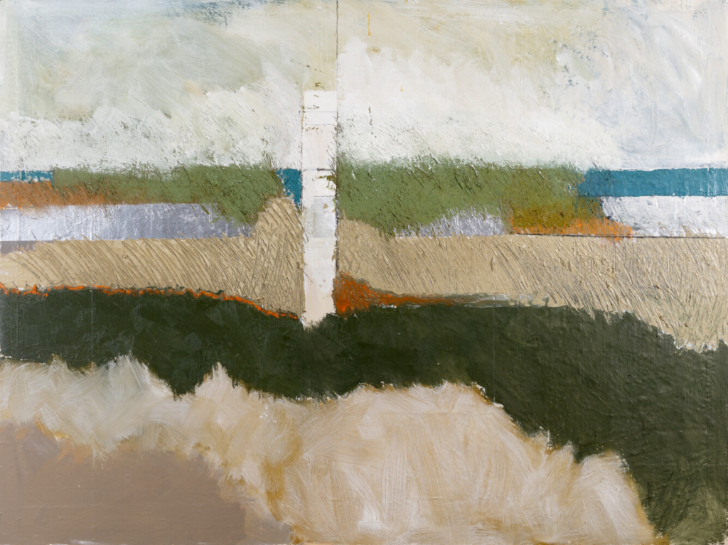
Tim Beavis, “Moody Beach bs566,” 36 x 48, 2020. Photo by Justin Lamkin Photography
Tim Beavis was a fixture in Kittery Point until his death last year, at 75, from lung cancer. People driving along Pepperell Cove in the wee hours of the morning had come to expect seeing lights on at his studio, where he painted from 3 a.m. to 8 a.m. every day. He is best known for his Beach series of paintings, most of them inspired by walks on Seapoint Beach nearby. He sold over 600 of them in his lifetime.
“Remembering Tim Beavis” – a retrospective organized by his wife, Hanna Frank, and her sister, Marjan Frank – reveals a prolific artist who was, fascinatingly, perpetually in motion. The Beach series might have brought him acclaim, but his drive for experimentation was restless and fertile. Most of the works exhibited downstairs at his old studio on Pepperell Road, which the Frank sisters converted into a gallery, are from their personal collections and not for sale. But the attic upstairs is jammed with pieces that are stacked against the exposed beams of the pitched ceiling. They’re worth rifling through, whether you’re in the market for art or not, after taking in the treasures downstairs.
Born in Dayton, Ohio, Beavis studied art for two years at the School of the Museum of Fine Arts Boston in the 1960s. In need of money, however, he left to work at a Boston hospital photographing X-rays with a 35-millimeter camera, then forsook the city and went into construction, first in New Hampshire, then Maine. Beavis began making painted shoji screens and two-dimensional wood constructions in his spare time, which rekindled his nascent art impulse. In 1995, just into his fifth decade, he decided to pursue painting full time.
Beavis said his inclination to make art “evolved from a personal crisis. This was a way to give myself a voice.” Hanna Frank pinpoints that crisis to the death of Beavis’s older brother, Jimmy, to leukemia at the tender age of 10. “This greatly affected him,” she says. Finding one’s voice after such a tragedy can take a lifetime, and Beavis sampled many visual languages on that personal journey.
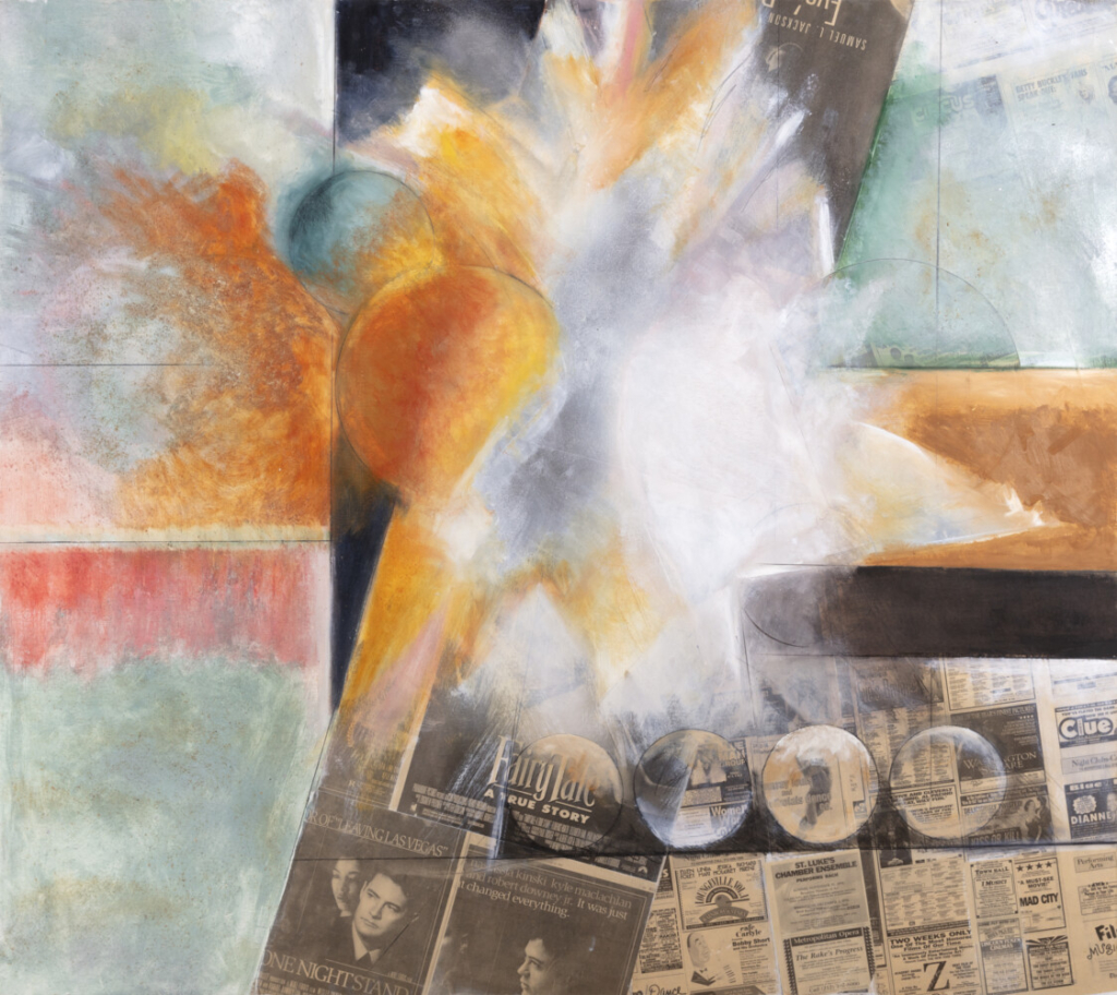
Tim Beavis, “Fireworks series #2,” 48 x 48, 1997. Photo by Justin Lamkin Photography
The first paintings to emerge became Beavis’s Fireworks series, explorations of light and pyrotechnics superimposed on arrangements of circles that were confined within (and could also cross over) irregular grids. Inside the graphite lines that defined the grids, he layered luscious fields of color and/or filled them with newspaper. On top of these, Beavis painted expressionistic explosions of color. Two large paintings upstairs, “Fireworks Series #1” and “Fireworks Series #2,” exemplify how powerful these images could be, while the Cézannesque “Small Fireworks” downstairs transmits the quieter mood Beavis was capable of conjuring using the same means. They’re all rich, ravishing and among his most impactful works.
The Fireworks paintings reveal Beavis’s love of Richard Diebenkorn’s lyrical abstractions, which were also concerned primarily with light and color, though more formally segmented on his surfaces. The California artist’s groundbreaking “Ocean Park” canvases reduced the views outside his Santa Monica studio to serene fields of luminous color set within fractured geometries also created with thin lines.
The connection is not immediately apparent in the Fireworks paintings, but it becomes more so in the Beach series. Like Diebenkorn, Beavis was concerned more with the land than the ocean; the proportion of sand and grasses usually outweighs water and sky. It is a refreshingly original take on ubiquitous Maine seascapes, which historically have focused on the rolling and crashing of the ocean. Also, Beavis, like Diebenkorn, often splits the canvas with enigmatic vertical planes, or by placing the central focal point of his compositions on the path dividing brush and opening to the beach, giving it definition with graphite lines.
But similarities end there. While stretches of sand, sea, sky and grass flirt with becoming purely abstract bands of color, Beavis never makes the leap entirely. These elements are always perceptually what they are, often heightened with texture created by mixing sand into paint or applying thicker gesso onto the surface before painting.
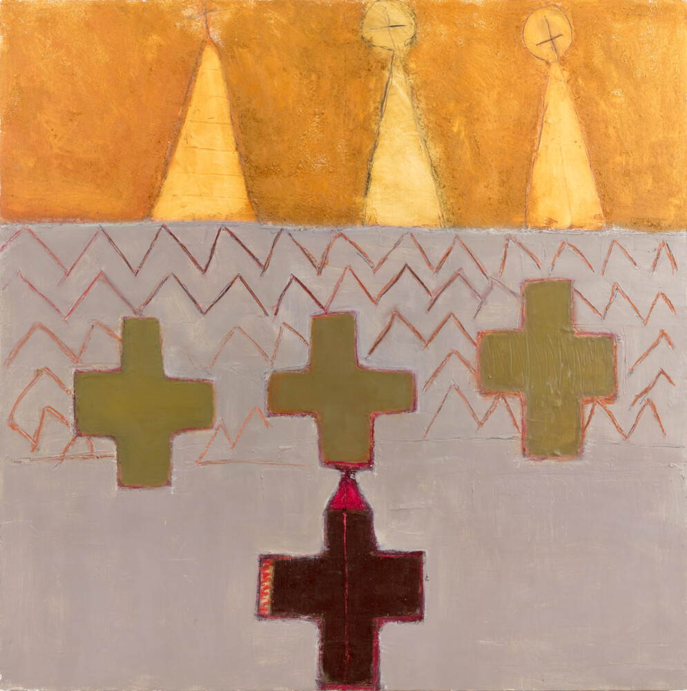
Tim Beavis, “Family series #4,” 45 x 45, 2001. Photo by Justin Lamkin Photography
The Sept. 11 terrorist attacks hit close to Beavis’s early experience of loss. This period spawned a highly emotional series that the Franks have hung in a front room they call “the chapel.” The works feature crosses and steeple-like forms painted in deep, earthy tones. Though not at all related to Mark Rothko’s color field paintings aesthetically (except, perhaps, in their palette of colors), they plumb similar spiritual depths to touch into the ineffable transcendence experienced by both those who have left and those who remain.
Beavis returned again and again to the highly successful Beach series between numerous other experimentations. In 2006, he drew inspiration from the quilts of African American women in Gee’s Bend, Alabama, which had hit the national exhibition scene in 2002-03 and became a marketing sensation, appearing on stationery, posters and other products. The Quilt series never really took off and, in light of the preceding body of work, it’s not hard to see why: They feel highly decorative, the patterns too ordered, even considering the variation of color within each module. Which is odd considering their source material. Gee’s Bend quilts had an irregular, almost improvisational spontaneity, while these paintings are more linked to traditional American quilt patterns like the Tennessee Waltz and the Log Cabin.
Beavis painted images of sprockets in 2007, Mondrian-like tree abstractions in 2009 (among his favorites, he said), still life compositions in 2011. A brief detour into corrugated cardboard constructions returned him to his interest in pattern in 2012. In 2016, he started flattening out cereal boxes onto gessoed wood or canvas and painting lovely Constructivist abstractions over them.
When one considers that all this happened in just 25 years, it is impossible not to be astonished by the work of Tim Beavis. He painted right up until the day before his unique voice, so hard-won, finally quieted and settled into another dimension. The show will run through Dec. 31.
Jorge S. Arango has written about art, design and architecture for over 35 years. He lives in Portland.
Send questions/comments to the editors.

Success. Please wait for the page to reload. If the page does not reload within 5 seconds, please refresh the page.
Enter your email and password to access comments.
Hi, to comment on stories you must . This profile is in addition to your subscription and website login.
Already have a commenting profile? .
Invalid username/password.
Please check your email to confirm and complete your registration.
Only subscribers are eligible to post comments. Please subscribe or login first for digital access. Here’s why.
Use the form below to reset your password. When you've submitted your account email, we will send an email with a reset code.