

Kenneth Noland, Untitled, 2007 Kerry Ryan McFate/Courtesy of Dowling Walsh Gallery
With the exception of Kenneth Noland, Dowling Walsh’s current show, “In the Abstract” (through Feb. 27), concentrates on Abstract Expressionists who might not be household names. Yet the territory their work inhabits is, by turns, electrifying and sublime.
Mention American Abstract Expressionism, and most people immediately think of the 1940s and ’50s, first-generation Ab Ex artists Jackson Pollock and Willem de Kooning, or the co-emergent Color Field painters who included Mark Rothko, Clyfford Still and Barnett Newman. The next generation overlapped with the first, emerging in earnest in the 1960s and spawning talents such as Morris Louis, Helen Frankenthaler, Joan Mitchell and Kenneth Noland. These painters continued to reject figurative and representational art but allowed wider latitude; sometimes, for example, obliquely referring to landscapes. Their looser, softer work was dubbed Post-Painterly Abstraction by the influential critic Clement Greenberg.
The four painters now holding court at Dowling Walsh begin the trajectory of American Abstraction in the first generation with Stephen Pace, technically acknowledge the second with Noland (though the paintings here are from 2006-2007, near his death in Port Clyde in 2010, and are of a different order entirely) and come to rest in Lyrical Abstraction of the 1970s with Ann Purcell and Syd Solomon, whose touch was lighter and brighter than either previous genre.
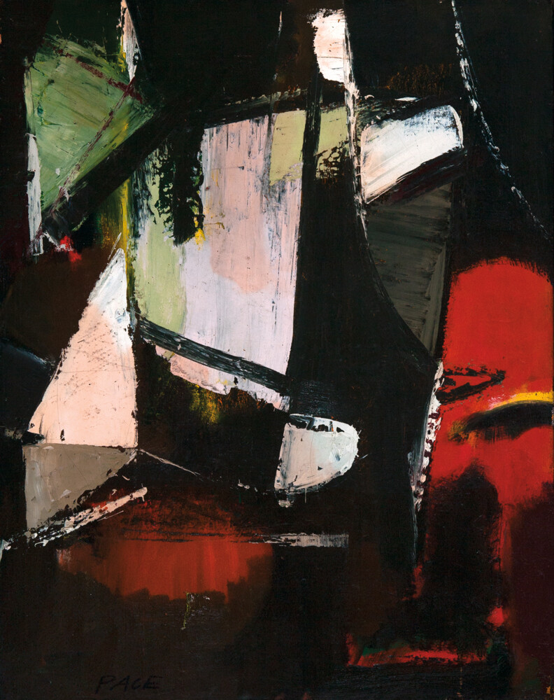
Stephen Pace, Untitled, No. 50-93, 1950, 1950 Oil on canvas 28″ x 22″ Courtesy of Dowling Walsh Gallery
The Missouri-born Pace was a protégé of Hans Hofmann, who inculcated his students with the importance of “push/pull” – that is, alternating oppositional elements on a canvas to activate the picture plane. Juxtaposing structure and fluidity, brightness and shade, geometric and biomorphic form created a magnetic vibrancy that was impossible to turn away from. Yet it’s clear from the works here that Pace, who died in Indiana in 2010, was also absorbing the highly emotive action painting of Pollack and de Kooning.
It’s easy to decipher Hofmann’s training in a painting like “Untitled, No. 50-93,” in which planes of red, white, green and pink are locked within thick lines and planes of black. The visual “opposites attract” tension and balance of this sort of pairing is also present in “Untitled, 1957,” but it arrives through the process of an almost explosive dynamism that critic Dore Ashton detected when she wrote, in 1960: “… energetic elements battle their way to equilibrium. No matter how baroque Mr. Pace’s compositions are – and they are nearly all fretted with tilting and bucking forms – they do ultimately come to rest.”
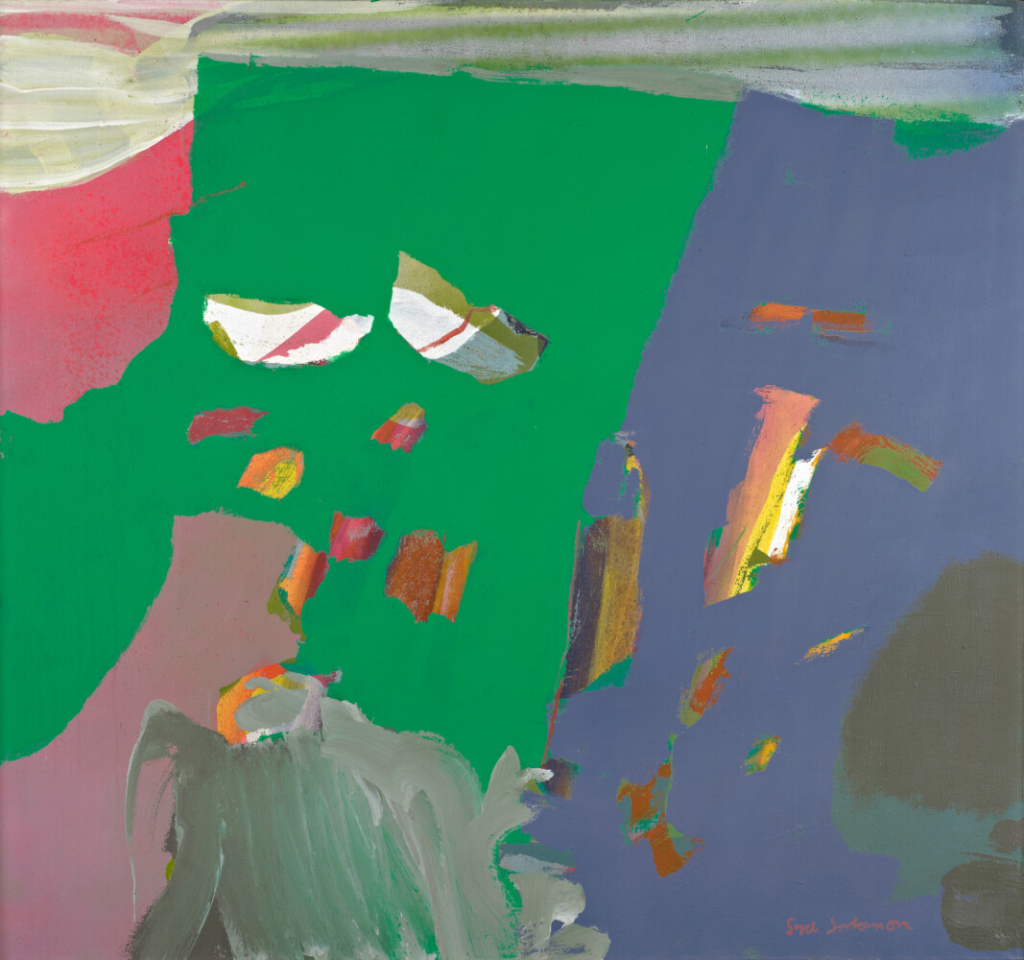
Syd Solomon, “Spar,” 1973, acrylic and aerosol enamel on canvas 45″ x 48″ Courtesy of Dowling Walsh Gallery
Syd Solomon came to painting after serving in World War II as a camoufleur, literally a designer of camouflage that helped disguise munitions being transported through enemy territory. (Interestingly, fellow camoufleurs she met along the way included the British artists Barbara Hepworth and Henry Moore.) This and his aerial reconnaissance experiences are discernible in the works at Dowling Walsh, though his primary inspiration was nature.
After the war, Solomon fell in with many of the Ab Ex gang during summers and autumns in the Hamptons, some of whom he brought to teach at the Institute of Fine Art at the New College, which he established in 1964 in Sarasota, Florida (he spent winter and spring there). A consummate innovator, Solomon was the first artist to work with acrylic paint and to use aerosol spray paints in combination with resists (a technique gleaned directly from his camouflage days).
All these elements come together in “Flightfancy” and “Spar,” which can be seen as having an aerial-like perspective. The latter, especially, looks almost like fields or the meeting point of land and sea as seen from above. Paint forms seem to move between viewer and land like colorful clouds. The topographies of “Flightfancy” seem to shift perspective from aerial to slanted, and it is layered in ways that call to mind land features partially concealed under something else (yes, camouflaged). I’d bet money that both – with their irrepressibly bright pinks, greens, turquoises and blues – were painted in Florida, where he died in 2004.
Ann Purcell, now 80 and living in the D.C. area where she has spent most of her life, would likely be appalled to have her name spoken in the same breath as Helen Frankenthaler. In a 1976 interview, the curator of the Corcoran Gallery in Washington, D.C., made this connection. Purcell admitted to respecting the artist’s early work, but said it eventually became “slick” and “glib.” Then she quoted Barnett Newman, who unkindly observed that Frankenthaler’s paintings looked like they “were done between cocktail hour and hors d’oeuvres.”
Ann Purcell, “Lagniappe #1,” 1977 Mixed media on canvas 72″ x 66″ Courtesy of Dowling Walsh Gallery
So, apologies in advance to Ms. Purcell. She counts as her more important influences Henri Matisse, Robert Motherwell and Richard Diebenkorn, all of these more than plausible in the paintings on view. But there is something about the suggestion of landscape (“Langniappe #4” and, to a lesser extent, “Lagniappe #1”), the vast expanses of a reductive palette, and the way her colors float on the surface rather than create a sense of depth, all of which invite this reference.
To be sure, there is nothing slick or glib here, and Purcell does not employ Frankenthaler’s famed soak-staining technique (appropriated by both Morris Louis and Kenneth Noland). She was also a dancer for a time and involved her whole body in her painting process, often dancing around a canvas placed on the floor while applying paint, like Pollack. These are quietly powerful works that feel at once softly meditative and substantial. So much so that they emanate an unwavering confidence that easily stands up to Pace’s combustible color and wild brushstrokes as well as Solomon’s dizzying perspectives on the facing wall.
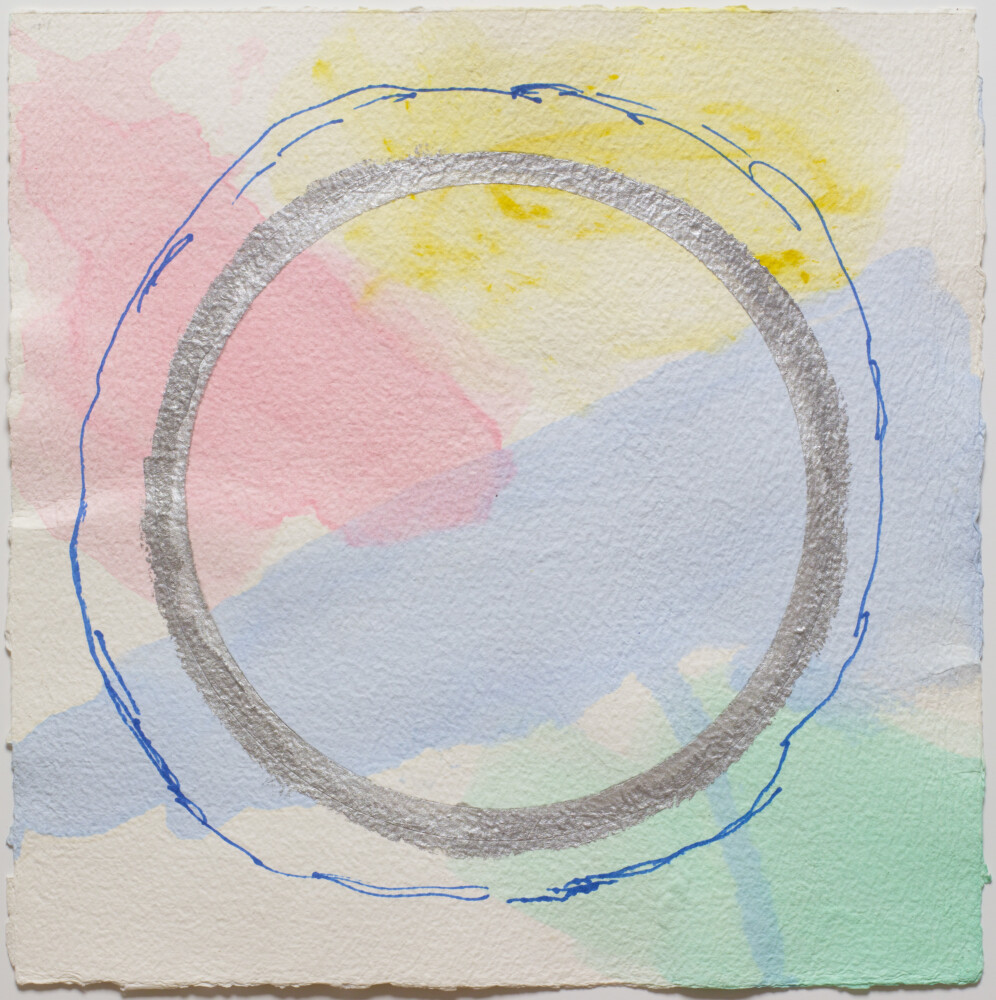
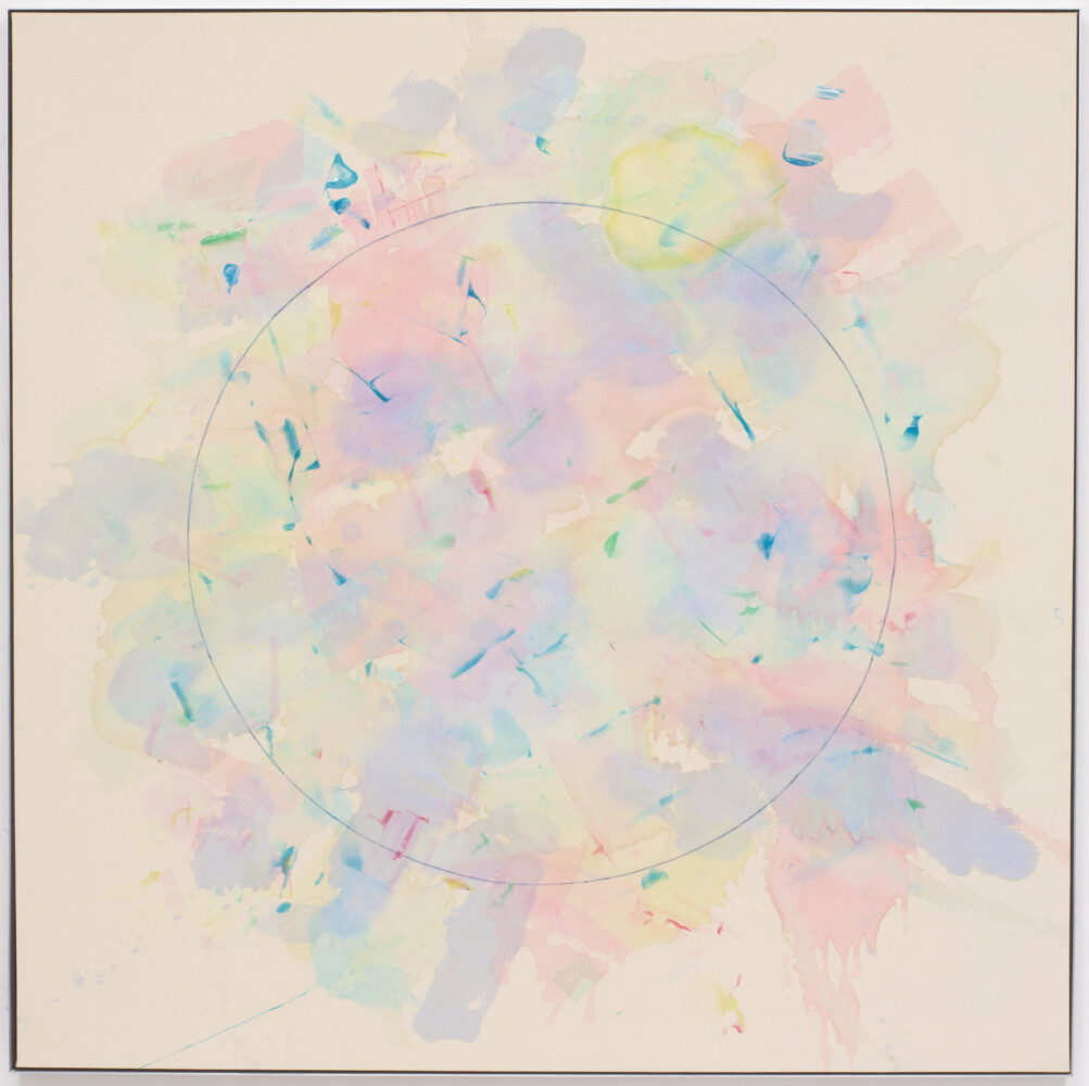
Then there is Noland. Though circles figure in all of them, these are not the bull’s-eyes of saturated color combinations that made him famous. Noland adopted circles as a way of not only centering his paintings within the frame (as Renaissance artists did with one-point perspective), but also calming and centering the viewers’ mind-body. In three untitled works on handmade paper from 2007, pastel liquid washes of diluted acrylic bleed into one another. Hovering over them Noland painted a calligraphic silver circle surrounded by a looser, wavier line that appears to have been drawn with blue pencil. Gone is the rigorously disciplined geometry of his earlier bull’s-eyes. Here the circles impart a sense of some universal organizing structure that feels benevolent, stable and timeless amid the ebb and flow of emotion, shifts in energy fields, the ever-changing character of light and even cosmic movements.
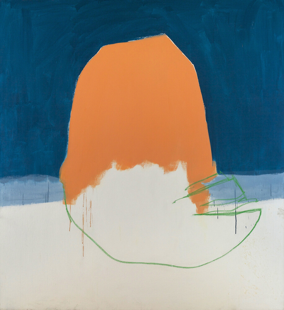
Kenneth Noland “Into the Cool No. 3,” 2006 Kerry Ryan McFate and Tom Barratt/Courtesy of Dowling Walsh Gallery
Something similar happens with “Into the Cool, No. 3,” which is based on the music of Gil Evans, to whom many attribute the birth of “cool” in the 1940s, and to whom Noland was supposedly listening while he painted this series. The pastels here are certainly cool in tone and light as a cloud. Noland organized acrylic splotches applied to the back of the canvas with a kind of rhythmic syncopation. These bleed to the front in pale, diluted hues. Then he punctuated the composition with staccato notes of gel medium applied to the surface. As with the circles superimposed on the handmade paper works, the circle here holds down nothing, fixes nothing in space. It is almost like the corona that becomes visible only during an eclipse, with a presence that has less constancy and acknowledges the eternal fluctuations of everything.
Jorge S. Arango has written about art, design and architecture for over 35 years. He lives in Portland. He can be reached at: jorge@jsarango.com
Send questions/comments to the editors.

Success. Please wait for the page to reload. If the page does not reload within 5 seconds, please refresh the page.
Enter your email and password to access comments.
Hi, to comment on stories you must . This profile is in addition to your subscription and website login.
Already have a commenting profile? .
Invalid username/password.
Please check your email to confirm and complete your registration.
Only subscribers are eligible to post comments. Please subscribe or login first for digital access. Here’s why.
Use the form below to reset your password. When you've submitted your account email, we will send an email with a reset code.