

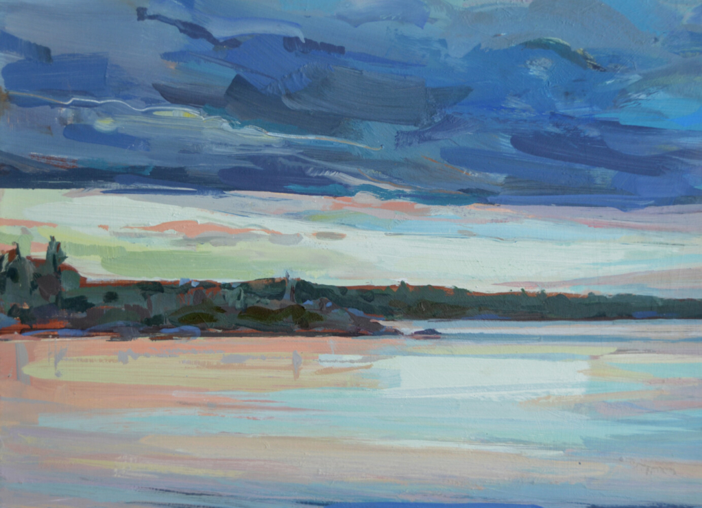
“Meditation, Maine Lake,” by Roy Germon Photos courtesy of Littlefield Gallery
At first sight, the two artists whose work is on view at Littlefield Gallery in Winter Harbor, “Roy Germon and Amy Bernhardt” (through June 21), don’t appear to have much in common. Germon’s paintings are representational, Bernhardt’s mostly abstract. Germon uses acrylic, while Bernhardt employs oil pastels. Germon’s work focuses on the natural landscape; Bernhardt’s aims for another type of landscape entirely – the more intangible topography of our inner life.
Yet close inspection also reveals stylistic, if not thematic, similarities. Both luxuriate in complexly layered color. Germon and Bernhardt are equally drawn to the full spectrum of rosy shades – from fluffy cotton candy and dense mauve to deep salmon and a scandalously hot Schiaparelli pink. And both artists’ work is concerned with light.
Upon entering the gallery on a damp, gray day, something to the left immediately seized my attention. It was Germon’s “Meditation, Maine Lake.” In spite of the drizzly morning drear – or perhaps because of it – light seemed to pour forth from this canvas in such abundance that it was palpable from almost 30 feet away. Standing before it, I could see the light sprang from the lower third of the composition, a representation of the lake’s surface. Yet directly above these pinks, aquas, yellows and creams was a dense layer of stormy blue-gray clouds. Huh? Then I noticed the water’s colors came from a section of sky in the distance. Clearly the sun, low to the horizon, was sending slanting rays that came at the viewer almost straight on, slipping the lighter, more colorful reflection underneath the darker layer and into the foreground.
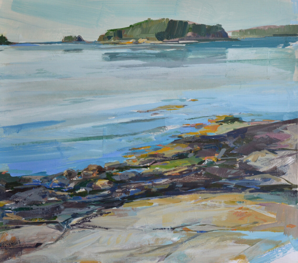
“Island Off Grindstone,” by Roy Germon
A similar radiance emanates from “Island Off Grindstone.” I inspected the surface for a long time to figure out how Germon achieved the water’s gleaming quality. I’m still not sure, but it appeared that some underpainting, perhaps a layer of gesso, was applied vertically. Atop it Germon laid horizontal bands of blues, grays and greens for the water. But the underpainting caught the gallery’s ambient light in a vertical way that intensified the water’s sense of reflectivity, as if light was literally bouncing upward off its glassy surface.
Quick: How many Maine water scenes have you seen in your lifetime? OK, unfair question; it’s impossible to calculate, of course. But how many of them sucked you right up into their luminous fields and asked you to contemplate how those light effects do or don’t make sense? Rarely does this familiar subject matter demand so much of the viewer or feel so compelling, which is Germon’s gift: bringing a fresh immediacy and depth to a genre you’ve seen countless times before.
Portland-based Germon studied at the School of Visual Arts in New York and worked for years as a widely published illustrator, which makes the expressionistic style of his paintings all the more remarkable. Illustration is essentially about documentation, though it, too, can be expressionistic. Certainly, Germon is documenting specific places and conditions of light. But he does so sans the precision and minutiae of illustration, opting instead for broad energetic gesture. His strokes are wide, thickly applied and forceful. Pine trees, such as the one in “The Narrows, Schoodic,” are little more than a grayish-brown vertical line supporting a canopy of quick, confident stabs at the surface made with brushes coated in various shades of green.
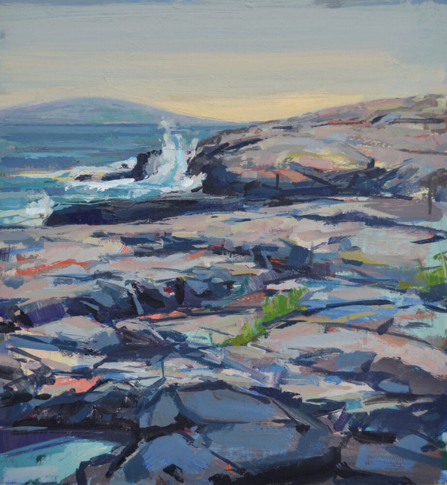
“Schoodic Point,” by Roy Germon
This is not to imply his methods are in the least simplistic. Two paintings – “Spring Ravine” and “Schoodic Point” – are memorable for the sheer density of Germon’s color layering. In the former, multiple gradations of grays, blues, greens, browns, tans, yellows, purples and creams travel down the center of the canvas to evoke a cushy forest floor bisected by a stream. In the latter, Germon deploys a panoply of pinks, rusts, ivories, gray-blues, yellows and greens to reveal, in the rock face that takes up most of the picture plane, mosses and lichens, pools of standing water, sunbaked expanses of flat rock and shadowy crevices, dry and wet areas. You will get lost trying to count the colors.
Germon is a unique amalgamation. He combines an impressionist’s sense of light with an expressionist’s brisk and vigorous brushstroke to produce clearly recognizable landscape paintings. It is a mélange that winds up unearthing something deeper, more emotional and essential about the actual subject matter – in a sense, the inner life of rocks, trees, water and sky.
You could say that Bernhardt is after the same thing but goes about it by eschewing a direct connection to recognizable subject matter in favor of pure abstraction. Though she studied art in college, until 2012 she practiced architecture in Boston, returning to painting when she moved to Deer Isle that year. There are some works – “Between Day and Dusk,” for example, and “Yellow Glove” – that reveal a lingering architectural affinity for planes that intersect, abut and fracture, and that also imply horizon lines and spatial perspective.
Yet Bernhardt’s most effective works are unrestricted by either form or space. They seem so vast as to extend infinitely beyond the picture frame. They have no central focus, no particular perspective. Like Germon’s work, the layering of color is intricately achieved, yet it is as misty and ephemeral as a cloud. We cannot tell where one color stops and the other begins. All this conspires to give them the quality of gaseous elements materializing out of some mysterious profundity. They can feel like an effulgence emerging from a mysterious inner light, manifestation arising out of non-manifestation, being arising out of nonbeing.
“About to Be,” by Amy Bernhardt
Indeed, several titles speak to this. In “About to Be,” indistinct blue forms seem to be coming into focus, but we can’t tell what they will end up being. People? Geological features in a landscape? Sea forms? “Memories of Tomorrow” simultaneously speaks of imminence and disappearance. Are these fields of color, some rising out of darkness and others from light, forms that are congealing into something that eventually becomes memory, or are they the remnants of a memory that is fading away? The title of another, “Opus Pocus,” implies conjured magic that quickly evaporates without rational explanation.
We can’t hold onto anything in these, which is the nature of our moment-to-moment experience. As soon as we acknowledge feeling a feeling, it has shifted and morphed into something else. From this perspective, they can be read as chronicles that chart the movement of Bernhardt’s inner life over the span of time it took to paint each work.
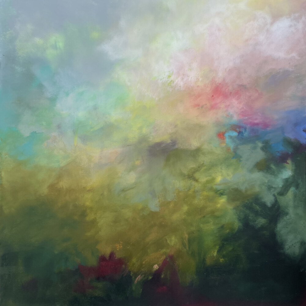
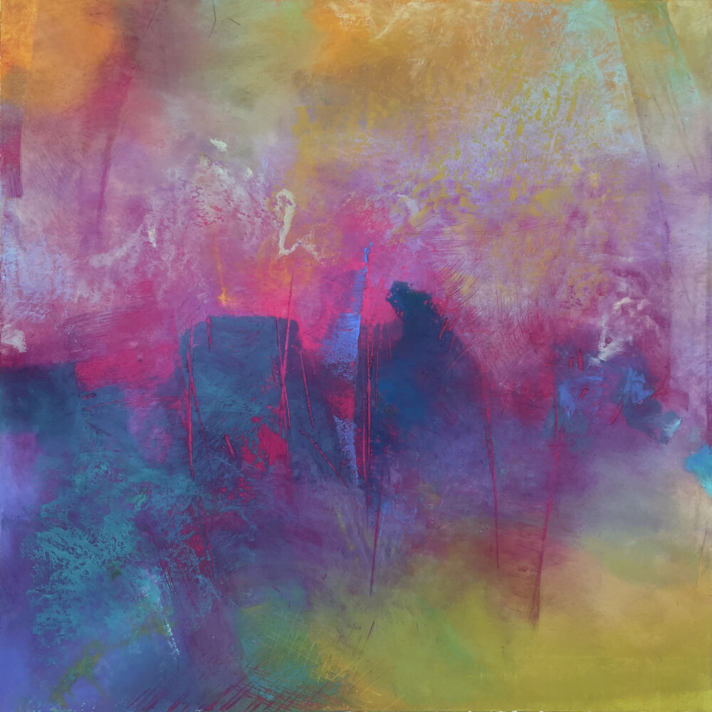
“Memories of Tomorrow,” by Amy Bernhardt
“Memories of Tomorrow” exhibits how much can vary within that span. The lower part of the painting is brooding and moody, its reds indicating moments of rawness and exposed vulnerability. As our eyes move up the canvas, the dark murkiness transmutes into green, then yellow, then pink, then white. This last feels like light glowing through a cloud, some kind of source of lightness and life. We travel with Bernhardt through an entire arc of experience within this 20-inch square.
This scale and the 16-inch-square works feel more intimate and, so, better suited to the personalness of that journey. Larger horizontal pieces, by contrast, seem rangy and diffuse. The personalness seems to dilute, disperse and dissipate, eventually falling apart. They are still abstract but seem to refer to something more universally recognizable like landscapes and horizon lines.
Jorge S. Arango has written about art, design and architecture for over 35 years. He lives in Portland. He can be reached at: jorge@jsarango.com
Send questions/comments to the editors.

Success. Please wait for the page to reload. If the page does not reload within 5 seconds, please refresh the page.
Enter your email and password to access comments.
Hi, to comment on stories you must . This profile is in addition to your subscription and website login.
Already have a commenting profile? .
Invalid username/password.
Please check your email to confirm and complete your registration.
Only subscribers are eligible to post comments. Please subscribe or login first for digital access. Here’s why.
Use the form below to reset your password. When you've submitted your account email, we will send an email with a reset code.