

We certainly don’t need another reason to go to Chase’s Daily in Belfast. The food is fresh, healthy and delicious. The market sells the most gorgeous, often unusual, produce you’ll find. But it is also the home of Perimeter Gallery, where Freddy LaFage and Karen McDonald curate top-notch shows of local artists. These have included, over the years, Dan Anselmi, Jenny Brillhart, Alan Fishman, Karen Gelardi and Margaret Nomentana. Currently gracing the walls of Perimeter are the “minimal luminist” paintings of Jeff Kellar (through Nov. 14).
The term minimal luminist is Kellar’s own, and throughout much of the show it proves perfectly apt. At other times, the term feels less applicable. Whichever the case, it is fascinating to see how much Kellar can convey with abbreviated gestures and a few simple lines.
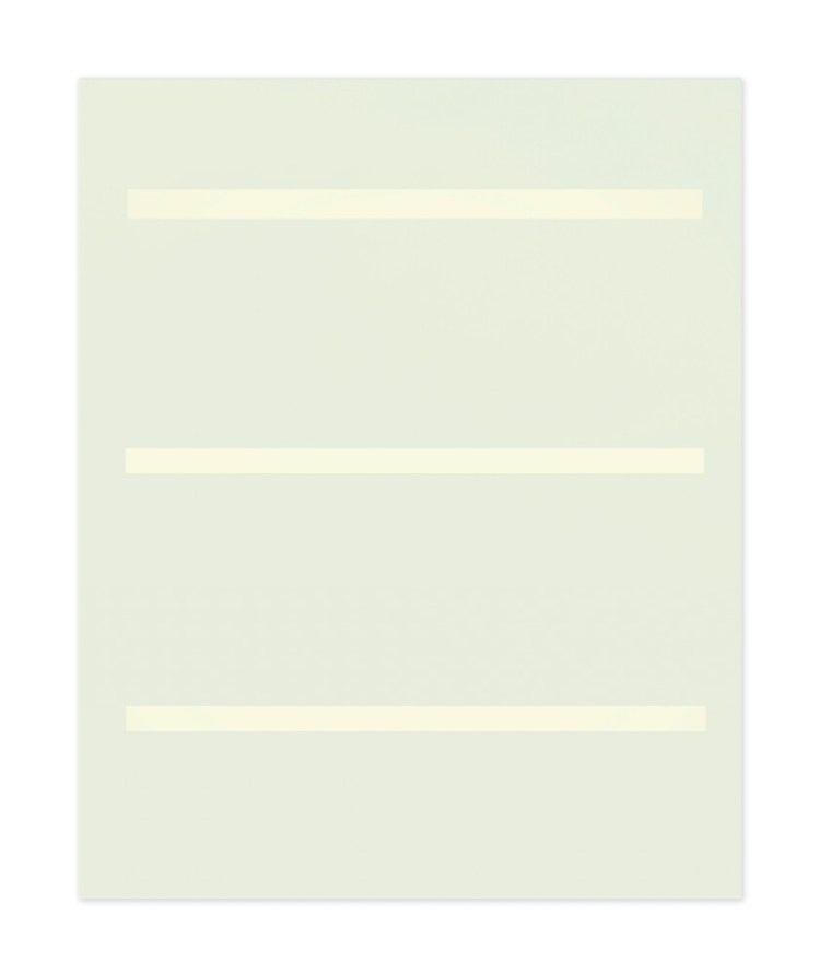
Two paintings share the same title: “Lined Space Green.” Number 4, actually a green so light it appears more like a creamy celadon, is a prime example of what Kellar’s term points to – specifically, the behavior of light in the natural world and the way it can be perceived by the viewer. It sports three evenly spaced bands of white on a field of this creamy celadon. It is one of the best paintings in the show.
Kellar builds up layer upon layer of color using pigment, resin and clay, giving the celadon a sensually mottled texture reminiscent of Venetian plaster. The materials seem to be in constant motion, like a slow, gently swirling vapor, exuding a gravitational pull that draws us into the surface.
The horizontal white bands appear neatly geometric at first. Yet as we get closer, we can see that their edges are not as distinct as we assumed from a distance. Extraordinarily, they resemble glowing beams of light cutting through the vaporous field from some mysterious source.
The composition and application of paint impart the sort of contemplative silent quality that spellbind us in works by abstract painter Agnes Martin. As with Martin’s paintings, the more we look at “Lined Space Green,” the more this optical illusion seems to emanate and shift, disorienting our normal way of seeing and making us feel lightheaded, as if we are almost levitating in midair before the work. It is completely transporting.
Conversely, the other “Lined Space Green” never achieves this numinous physicality. It is partly because of the particular shade of green Kellar is using. A kind of shamrock hue, it feels flatter and more opaque. The four bands here are lengths of a very narrow (perhaps a quarter inch) tape placed vertically onto the surface. Kellar then paints over the whole composition in this green.
In his statement, Kellar explains: “They have the effect of exciting then soothing the eyes in the manner of looking away from the bright scene of midday into the cool deep light reflected under the trees.” For me, he accomplishes this … to an extent. The farther we stand from the painting, the more subtly we can perceive the variations of color, with lighter areas capturing that sense of reflected light. But close up, this is harder to discern.
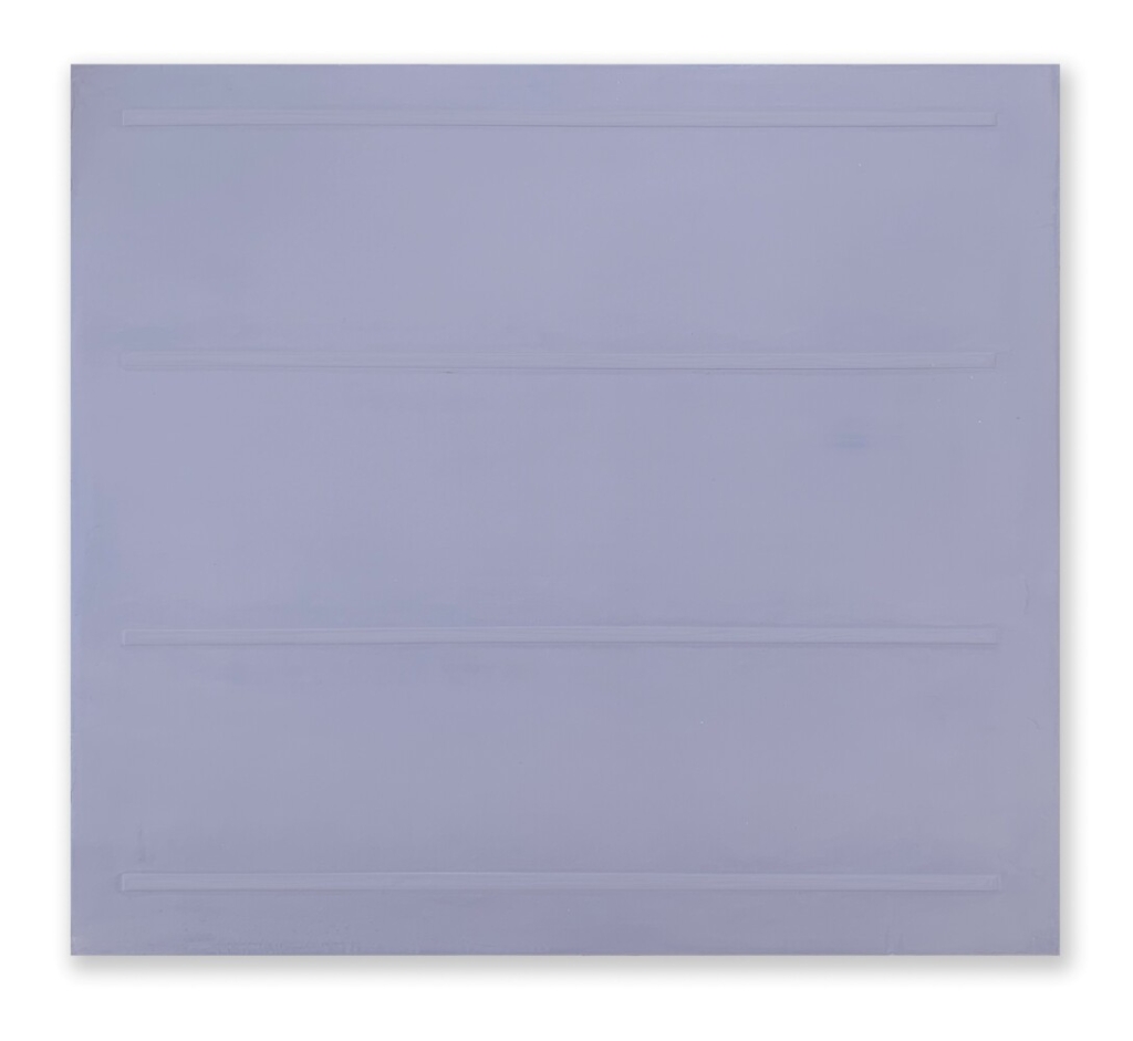
“Lined Space Blue” by Jeff Kellar. Photo courtesy of Jeff Kellar
“Lined Space Blue,” which appears to be produced using exactly the same technique, has more impact. Yet the French blue itself is a shade that – even when applied in flat, unmodulated layers – tends to feel vibrant and naturally illuminated. Its sense of glow, in other words, is an integral quality of the color. The way Kellar builds the layers up, then, only magnifies that optical disorientation to give us that woozy sense of hypnotic pulsation, once again doing something to our vision that makes us feel we are floating. It is indeed both minimal and luminous.
My one quibble with the show has to do with the presentation of these three paintings. Because Chase’s is first a restaurant and second a gallery, they hang on the exposed brick wall above a banquette and tables. To get the full effect of “Lined Space Blue,” you really have to stand squarely in front of it, something impossible to do because the tables interfere between us and the art. We find ourselves viewing it from an oblique angle that diminishes its power.
The other paintings are also higher than optimal for viewing and experiencing them. Admittedly, this might also have contributed to the less interesting impression I had of the shamrock-colored work. I suppose there’s nothing to be done about it, but it’s a pity.
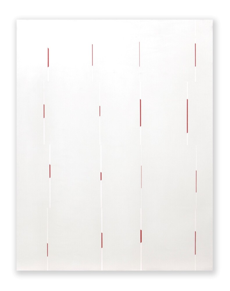
“Glimpse (Day)” by Jeff Kellar. Photo courtesy of Jeff Kellar
Across from these are two large paintings called “Glimpse (Day)” and “Glimpse (Night).” The latter’s surface is largely black, the former largely white. Into both, Kellar has incised thin vertical lines that reveal the slightest hints of paintings underneath. These “glimpses” of other works are teasing, eliciting a sense of mystery. Our brains can deduce that the under-paintings might consist of large tomato red dots on white grounds, but we can never really resolve this definitively.
The incised lines are, again, probably only a quarter inch wide and do not proceed up and down the surface in one continuous gesture. Rather, they are slightly staggered, adding to the general sense of irresolution. These works might have come off as coolly precise. Yet Kellar’s lush overlay of black or white feels thick and waxy, almost like encaustic. We want to run our hand over it. The voluptuous temptation relieves and balances the rationality and precision.
Other works concern themselves less with light and have more to do with form and architecture. I would not categorize these as luminist. Rather, they use geometry to create the illusion of depth in grounds that are matte and perceptually opaque. At first, we comprehend “Walls Black” as little more than a field of inky black on which Kellar has thinly outlined two walls in white lines that intersect in the middle.
But as with many of Kellar’s works, time spent scrutinizing them reveals universes of nuance. The longer and closer we look, the more we begin to feel, almost corporeally, the slightest variation in the black field. The almost imperceptible variance of tonalities somehow creates a sense of space, a kind of void, in which objects can exist.
The white pencil-thin geometry that defines the intersecting walls exploits that space. The convergence of lines suddenly feel like they occupy that space, interrupting the flow of energy within it in the way that Richard Serra’s controversial “Tilted Arc” once did in three actual dimensions in Lower Manhattan.
That interruption forced people traversing the square where Serra placed “Tilted Arc” to walk around the massive steel structure, eventually leading to its removal and a heated legal battle about altering site-specific sculpture. “Walls Black” does something similar in two dimensions. In order to keep moving, all color and air within the boundaries of the painting must circulate around the walls.
This sense of space defined by geometry happens again and again in paintings such as “Shade Orange Orange.” In the two polychromatic “Stacked Blocks” paintings, the sense of light that permeates the “Lined Space” works mentioned at the beginning feel more present. That luminous quality is what animates minimalism, which can often seem intellectual and remote. This, for me, is Kellar’s very particular gift.
Jorge S. Arango has written about art, design and architecture for over 35 years. He lives in Portland. He can be reached at: jorge@jsarango.com
Send questions/comments to the editors.

Success. Please wait for the page to reload. If the page does not reload within 5 seconds, please refresh the page.
Enter your email and password to access comments.
Hi, to comment on stories you must . This profile is in addition to your subscription and website login.
Already have a commenting profile? .
Invalid username/password.
Please check your email to confirm and complete your registration.
Only subscribers are eligible to post comments. Please subscribe or login first for digital access. Here’s why.
Use the form below to reset your password. When you've submitted your account email, we will send an email with a reset code.