

There are so many places to see art in Maine, including under-the-radar locations you might not think to check. One such site is Frontier, the former restaurant, cinema and mixed-use space in the Fort Andross Mill building that anchors Brunswick’s main drag. “Mill Works 3” (through Jan. 31) brings together 26 artists who occupy studios in the former mill.
Starting in 1809, the massive edifice harnessed the force of the Androscoggin River to power an enormous operation that produced cotton for yarn. It failed a couple times and renewed itself a couple times before falling into disrepair in the 1960s. In 1986, it was purchased and renovated into offices and studios.
Michael Gilroy established Frontier in 2006 as a venue for film, food, music and art. After shutting down at the start of the pandemic, the restaurant space reopened on Nov. 3 as a gallery and cafe, and its “welcome back” show features 26 artists who have studios in the building. The show was arranged by Frontier employee Kristyn Platt, in collaboration with Richard Keen, one of the exhibiting artists (who contributed colorful nautically inspired graphic abstractions that are easy on the eyes – even charming – in their simplicity and one-dimensionality).
There’s a lot of interesting work to see here. But because the space was most recently a restaurant, it has its challenges. Many works are hung too high in order to clear former restaurant built-ins, such as partitions. This also makes getting close to a few works hard, as it forces the viewer to look at them either close but off to the side, or straight on but further back.
The generality of the rubric under which this art is assembled can also be problematic. It is a bit of a grab bag, uneven in terms of quality of work. It’s also not curated in the sense that Platt has grouped together works without much contemplation about how they complement, or distract from, each other. Her emphasis seems to be more on the final configuration of the wall rather than on its individual parts.
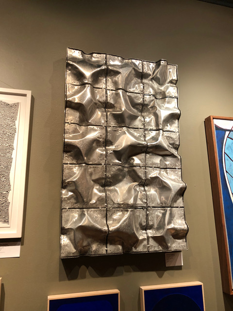
Bill Zingaro, “Urban Landscape”
One salon-style wall, for instance, groups some of the show’s best works by Andrea Sulzer, William Zingaro, Ellen Golden, Carla Weeks and others. But there is no connection among them, leaving each to fend for itself regardless of what is adjacent.
Take one of Bill Zingaro’s aluminum “urban landscape” constructions. It is strong, volumetric and masculine, and it literally pops out at the viewer. This pulls attention away from Carla Weeks’ hypnotic, but smaller and subtler “Monochrome Study in Blue 6” and “Monochrome Study in Blue 7” under it.
Taken individually, each is powerful. Zingaro heats sheets of metal and hammers them into desired modular forms that he welds together into framed grids. They resemble two-dimensional topographic models produced from land surveys. The silvery metal has a hard, industrial presence emphasized by areas where the underlying sheet has split, which Zingaro patched with smaller riveted pieces. Visually and viscerally, it packs a forceful punch.
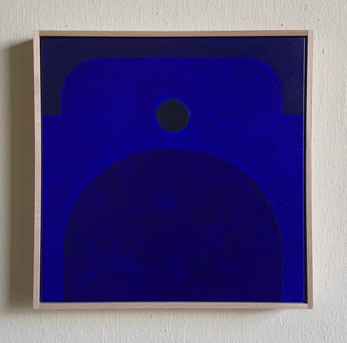
Carla Weeks, “Monochrome Study in Blue 6”
Conversely, Weeks’ canvases employ a few barely graded shades of deep cobalt blue to convey abstract forms that hint at architecture. Visually and viscerally, they are quietly profound. The color is so lusciously thick that you can almost taste it, and the gradation of shades is so subtle that it takes your eyes a minute to discriminate the various forms within the frames. They require deep looking and telegraph a sense of peace that seems at odds with the formidable charisma of Zingaro’s work.
The salon-style grouping also means some works are hung lower than optimal. Sulzer’s extraordinary “Snow Packed” is a casualty of this. It deserves plenty of space around it to take in the intricacy of her process. It is made with oil-based printer’s ink and watercolor, which Sulzer applies to paper in what seem to be hundreds of random, obsessively made marks.
Overall, the work appears to depict a snowy mountainside. But the marks confuse our sense of scale and subject. Sometimes clusters of short lines can look like trees, at other times like skiers. Other clusters can intimate whole villages perched on the mountainside. Still others seem to be foot or hoof prints tracing the movement of humans and animals across the snow.
Andrea Sulzer, “Snow Packed”
As we look at sections of the painting, the details seem to move and shift, constantly reassembling in our brain as something different until we have no idea what we’re looking at. In this way, the composition feels unfixed and ungraspable in any meaningful way, leaving us suspended in some sort of unresolvable space. The interior sensation this produces is fascinatingly disorienting.
One of Ellen Golden’s optically exuberant works also hangs on this wall (her work is also currently on display alongside her late husband Duane Paluska’s at the Maine Jewish Museum). In this case, there is some connection. Golden credits an intensive drawing class she took with Sulzer as the turning point in her art.
The “intensive” orientation certainly stuck. Like Sulzer, Golden’s drawings can jar our sense of continuity. They are essentially composed of horizontal stripes. But Golden obliterates their linear quality by breaking them with intervals of black ink that collectively form triangles, rectangles and trapezoids. These geometric shapes interrupt and completely fracture the horizontal regimentation of stripes.
Flanagan himself has a few wonderful abstract works in the show. “Mumbles,” on the wall opposite this one, has a distinctly rhythmic, musical quality to it. Its jumbled geometries create a sense of movement. Trapezoids and triangles can feel as if they’re jutting out toward the viewer or disappearing into a void. Lines squiggle this way and that, moving forward and curling back on themselves. All this conveys the individual elements in motion in a dance that feels energetic and improvisational.
In general, the abstract works are the most rewarding in “Mill Works 3.” Exceptions are Tina Ingraham’s “Dune, Popham Beach, Phippsburg, ME” and Renuka O’Connell’s “Forest Boards.” Ingraham’s impressionistic style lends itself well to the subject matter of dunes, which, like her soft-focus brushwork, can seem to be shifting and morphing. It is traditional landscape painting, but she keeps the romanticism nicely in check with this work. O’Connell uses ink to evoke the woods in winter. But the image is not literal. Rather, it seems to have a dash of analytic cubism to it that intriguingly walks an edge between representation and abstraction.
These artists’ works and others are well worth a trip. Even when their presence seems like an anomaly among the company they keep, they reward our attention. A single digital video by Elijah Ober, for example, seems oddly placed in a small corridor leading to the cinema. Yet it is so visually absorbing that you will likely watch several loops of that snail tracing its path and revealing enigmatic structures in its wake.
Jorge S. Arango has written about art, design and architecture for over 35 years. He lives in Portland. He can be reached at: jorge@jsarango.com
Send questions/comments to the editors.

Success. Please wait for the page to reload. If the page does not reload within 5 seconds, please refresh the page.
Enter your email and password to access comments.
Hi, to comment on stories you must . This profile is in addition to your subscription and website login.
Already have a commenting profile? .
Invalid username/password.
Please check your email to confirm and complete your registration.
Only subscribers are eligible to post comments. Please subscribe or login first for digital access. Here’s why.
Use the form below to reset your password. When you've submitted your account email, we will send an email with a reset code.