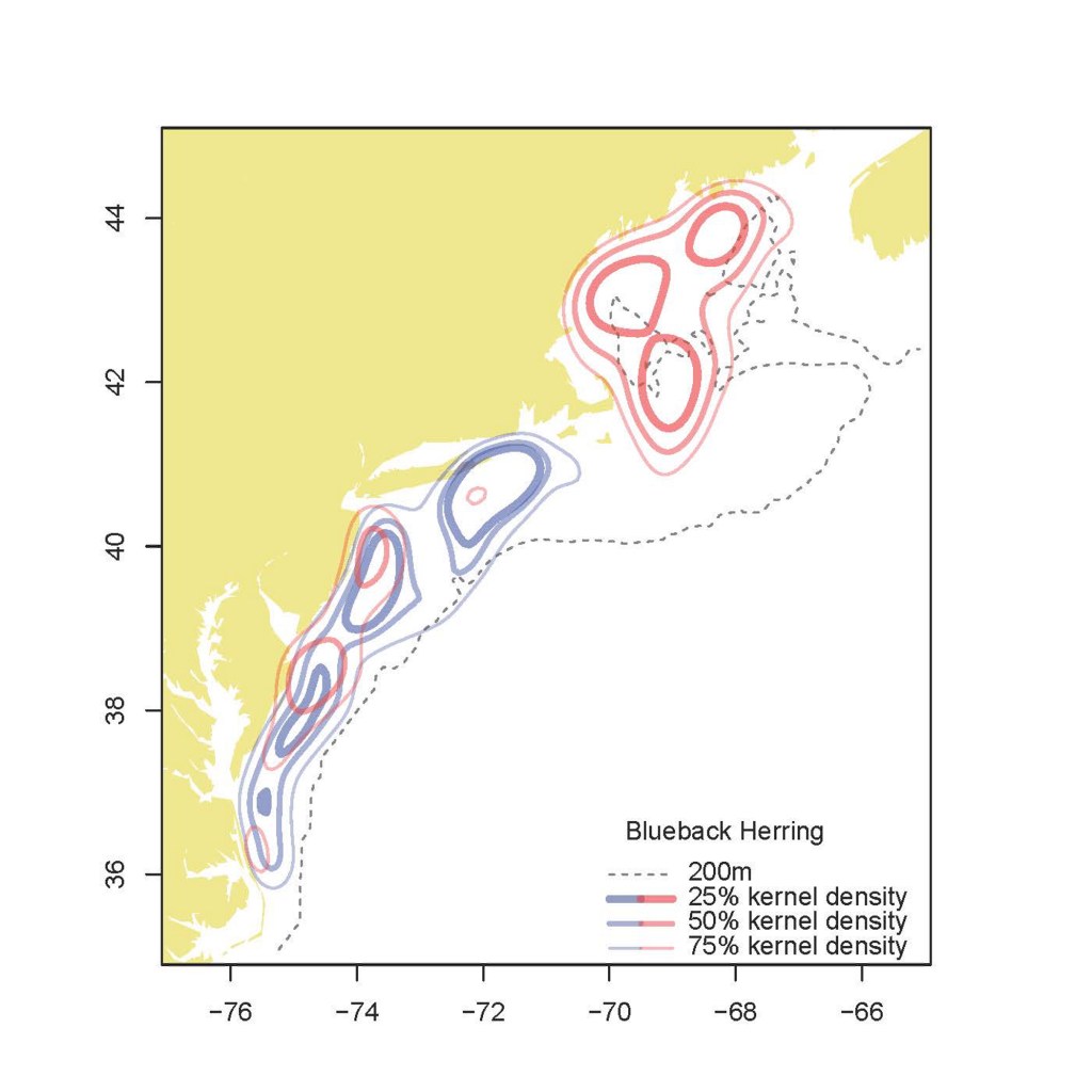
Blueback herring kernel density from the 1970s (blue) to the period of the last three years (red).
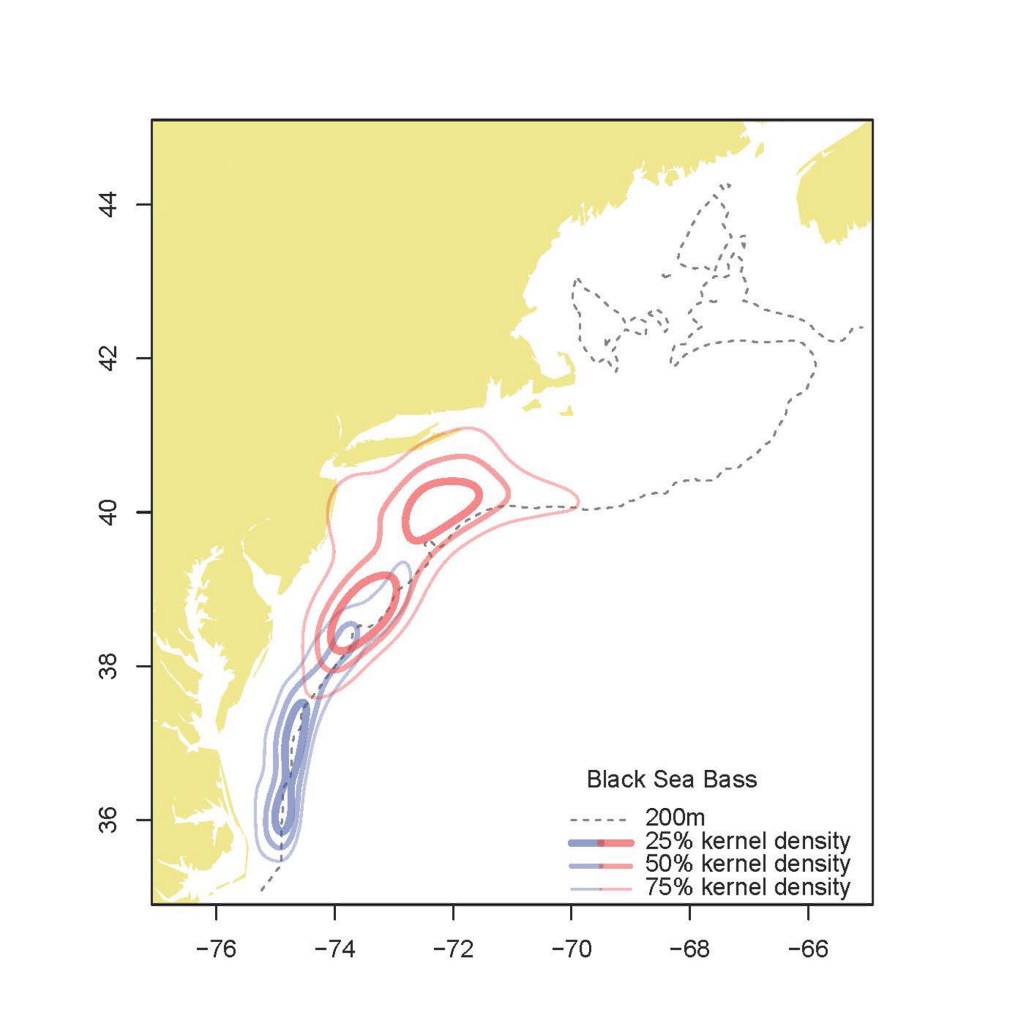
A similar plot for black sea bass. The thickest lines, labeled as 25% kernel density, show the core area of the distribution, while the thin 75% line represents the broader distribution area.
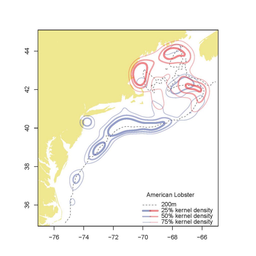
Kernel density plot showing change in distribution of American lobster from the 1970s (blue) to the current time period (red). The hashed line is the 200-meter depth contour.