

For this week’s roundup of gallery shows, we take some detours out of Rockland and Portland — arguably our two biggest art centers — to feature retrospectives of two artists no longer with us and one artist who, in his nonagenarian years, is as alive and vital as ever.
COURTHOUSE GALLERY
“William Irvine: Heading Home” (through Aug. 10), Ellsworth. courthousegallery.com, 207-667-6611
William Irvine is in his 95th year and still producing some of the most idiosyncratic marine paintings in Maine. No one paints anything like this artist, which in itself is a measure of his boundless originality. What is remarkable is how much variety and invention he has achieved within what is basically a single view from his studio and home in Brooklin. That vista takes in Blue Hill Bay and Tinker Island, which he has painted hundreds of times, but never in quite the same way. If figuration had an equivalent to Josef Albers’s “square within a square” works, Irvine’s oeuvre would be it.
Irvine has a unique way of applying color and moving it around the canvas with paper towels, imparting a textured surface often layered in colors that have the physical profundity of Rothko’s luminous, floating squares and rectangles. Irvine has spent years on the water and clearly understands something about the ever-shifting weather conditions of being at sea, where in a single two- or three-hour sail we can experience dense fog, clear sky, sudden squalls, high chop and mirror-calm waters.
But by disassembling the components of these phenomena and seeing them through a cubist lens, then reassembling them within the picture plane, everything transforms into liquid geometries. The conditions may be familiar. But in paintings such as the remarkable “The Rough Sea,” the tumultuous white caps are simplified into a jumble of triangles. Clouds are almost always square or rectangular. A long horizontal line bisecting the canvas stands in for the long wake of a lobster boat. Simple elements convey so much.
In many ways, these boats seem to travel not only through different weather patterns, but actually through multiple dimensions of reality. The same scene is sometimes rendered, surreally, from slightly different angles that seem to exist in different times. Then he pieces them together like a collage. We’re not exactly sure where we find ourselves or what we are really looking at.
In between working on these larger canvases, Irvine paints charming scenes of daily life — people lying in the grass, sunning on a dock, picking apples, and so on. But perspectives in these are severely foreshortened and the characters are often outsized, much in the way of folk-art painting. This exhibition’s title seems to portend the inevitable. But hopefully Irvine isn’t headed to the great beyond any time soon. He is a Maine treasure.
SARAH BOUCHARD
“Frederick Lynch” (through Aug. 16), Woolwich, sarahbouchardgallery.com, by appointment 207-809-9670
Even in the best of circumstances, it’s a thankless task to synopsize the career of an artist like Frederick Lynch (1935-2016) who went through so many transitions. In Bouchard’s small gallery in the Woolwich treetops, it’s downright daunting. Yet Bouchard has done an admirable job in hitting important touchstones, starting with two etchings from the 1980s.
Though it is a quantum leap from these etchings to Lynch’s colorful, pattern-based works of 1988, two of which are represented, we can discern in both his interest in breaking up a rectangle into smaller segments, which would become a major thrust of his later work. The 1988 works are obviously more about color and collage-like composition, reminiscent simultaneously of architecture and landscape, though unquestionably abstract and with a Pop-like flavor. What impacts this viewer most about these is Lynch’s sense of saturated color mixing, which gives every element of his compositions a sense of dimensionality.
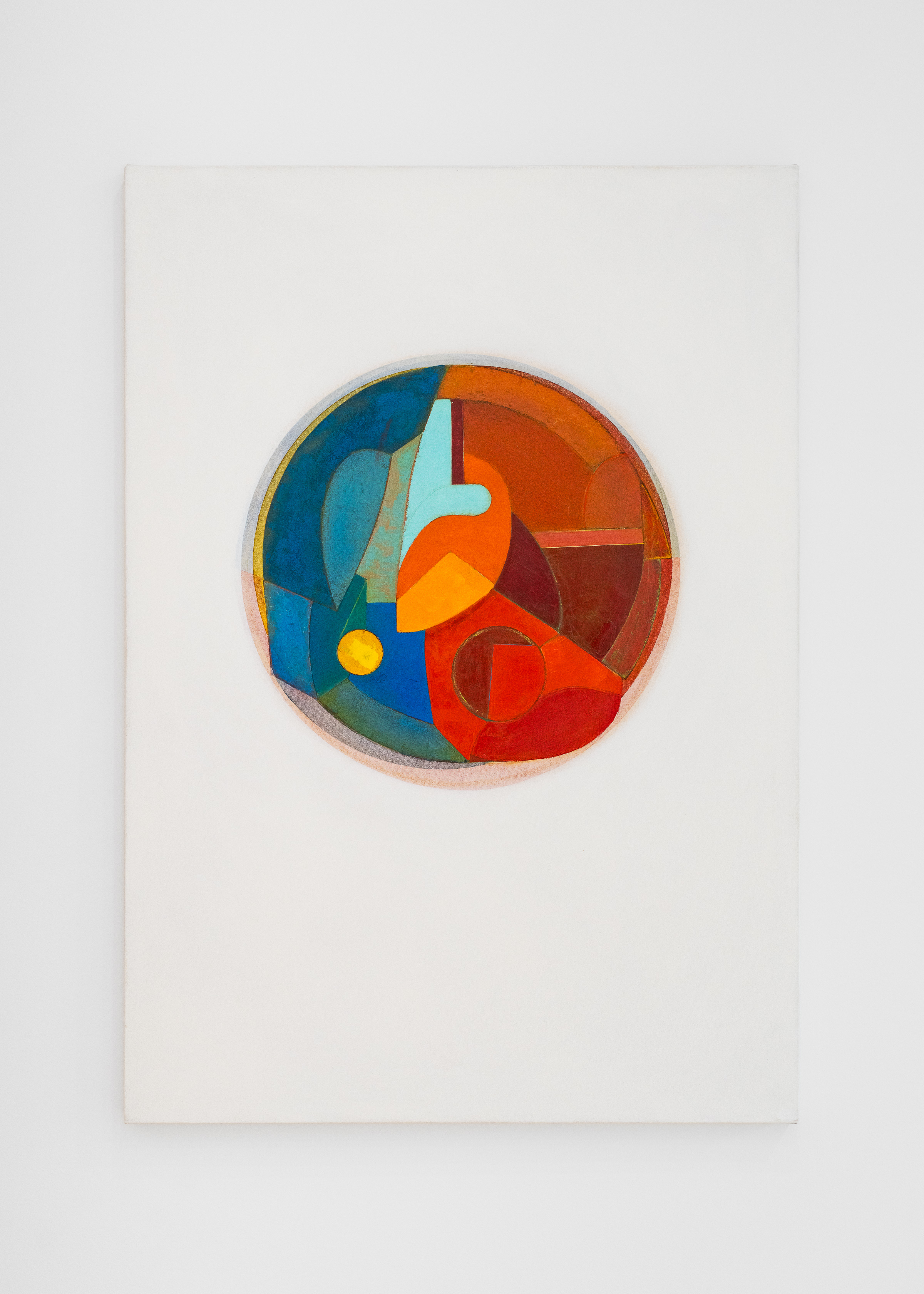
Lynch’s “Rotoform” paintings of 1994-95 were a surprise to me. They channel his color saturation into circular paintings that feel loose and freeform, and that transmit a sense of movement and abstract expressionist energy, It seems a huge — and sensual — departure. But by the 2010s, he immerses himself in segmentation again with his “Division” paintings. In 2010, Suzette McAvoy quoted Lynch’s explanation of the inspiration behind these works in a studio visit piece she wrote for Maine Home + Design magazine: they reflected his fascination with the “idea that repeated sectoring of a given area can produce infinite shape variations.”
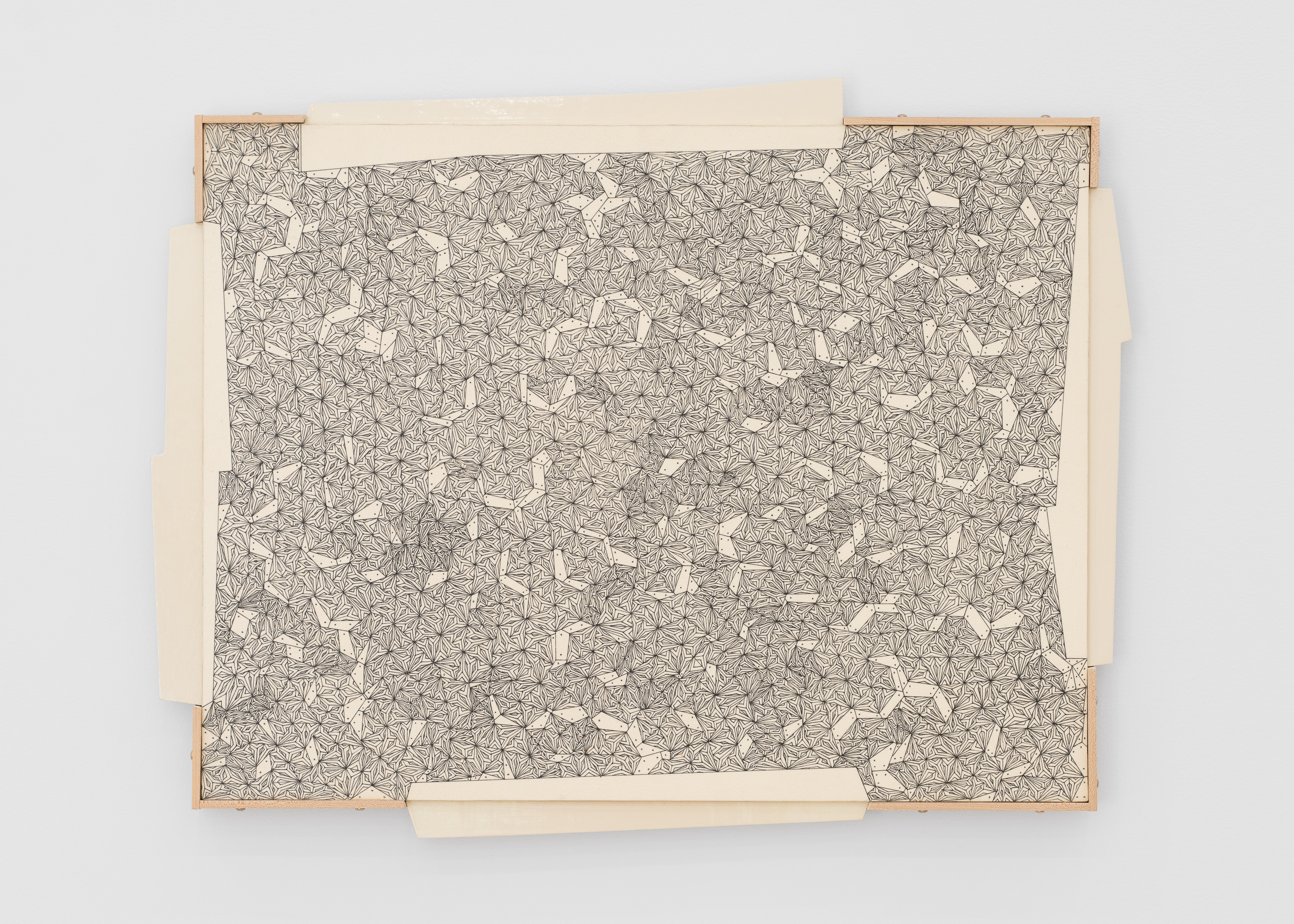
This attention to the cellular is on spectacular display in “Division Piece #74,” in which Lynch gouged an intricate, lacy pattern into melamine, inked it and wiped off the excess, leaving a resolutely abstract geometric work of stupefying detail.
The rest of the show focuses on his “Divided Man” paintings and ink drawings. The largest, an oil-on-canvas titled “Divided Man 32 — Earthly Only,” layers three patterns atop each other to depict a male figure who appears to be made of little more than an almost transparent filigree. Several gouache-on-paper versions (my favorite is “Division Man 26” for its particular mix of patterns and its palette) seem to imply human existence as something locked in a universal matrix of some sort.
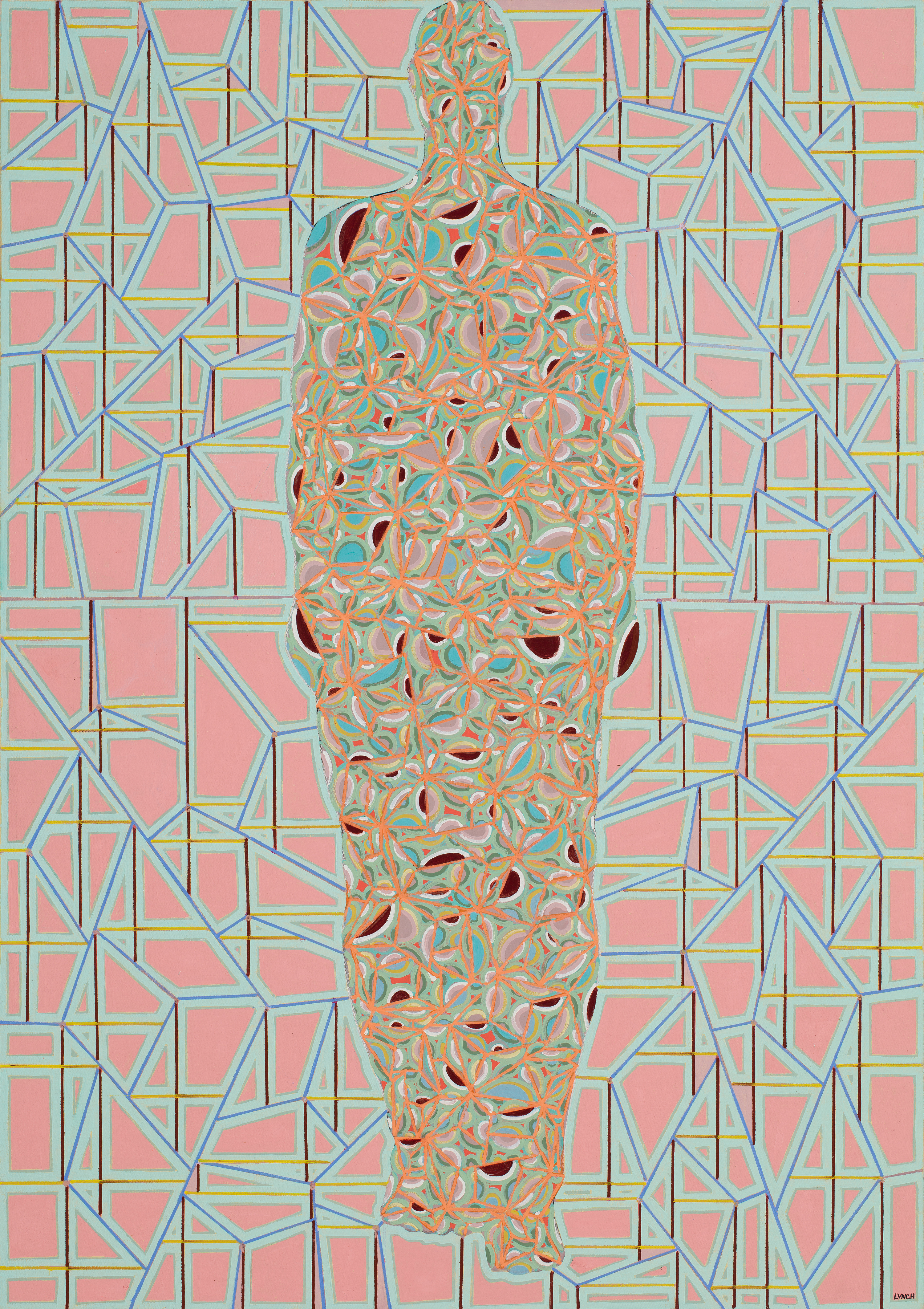
By the time Lynch moves to ink on paper in three self-portraits of 2016, the year he died of cancer, he has become the matrix itself, as if he has absorbed it into his body, which in “Divided Man Drawing #8” and “Divided Man Drawing #3” seems to expand his human contours beyond their usual limits. We’re tempted, because of the timing of these works so close to his passing, to associate it with something mystical, such as returning to the oneness of everything, where there is no such thing as space or time, and no difference between our “self” and the universe.
Perhaps he was contemplating some larger metaphysical theme. But “Divided Man Drawing #9” reminds us that Lynch was a man with a sense of humor. In this work, his spectacles are free of subdivision and patterning. He looks more like the Claude Raines’s Invisible Man in the 1933 sci-fi film. It’s a work that is at once impeccably skilled and inevitably funny.
ALEXANDRE MAINE POP-UP
“Emily Nelligan” (through Aug. 16), Rockport, alexandregallery.com, 203-219-6615
You could hardly get more hyper-specific than Emily Nelligan (1924-2018). She worked only June through October, the period of each year that she spent with her husband, artist Marvin Bileck, on Great Cranberry Island. She worked exclusively in charcoal. Her only subject matter was the island and the surrounding sea.
In a sense, if we believe art arises at least in part from the innermost expression of the artist’s soul, the Nelligan we know through her work shares similarities to Transcendentalists such as Henry David Thoreau and the Transcendentalist-adjacent poet Emily Dickinson. Both imposed strict parameters on their life and work —Thoreau had his Walden Pond, Dickinson her Homestead in Amherst, Massachusetts, and Nelligan her Great Cranberry Island. These proved to be beloved escapes from the frenetic world where they could experience silence, solitude and deep contemplation, and where they could work intensely.
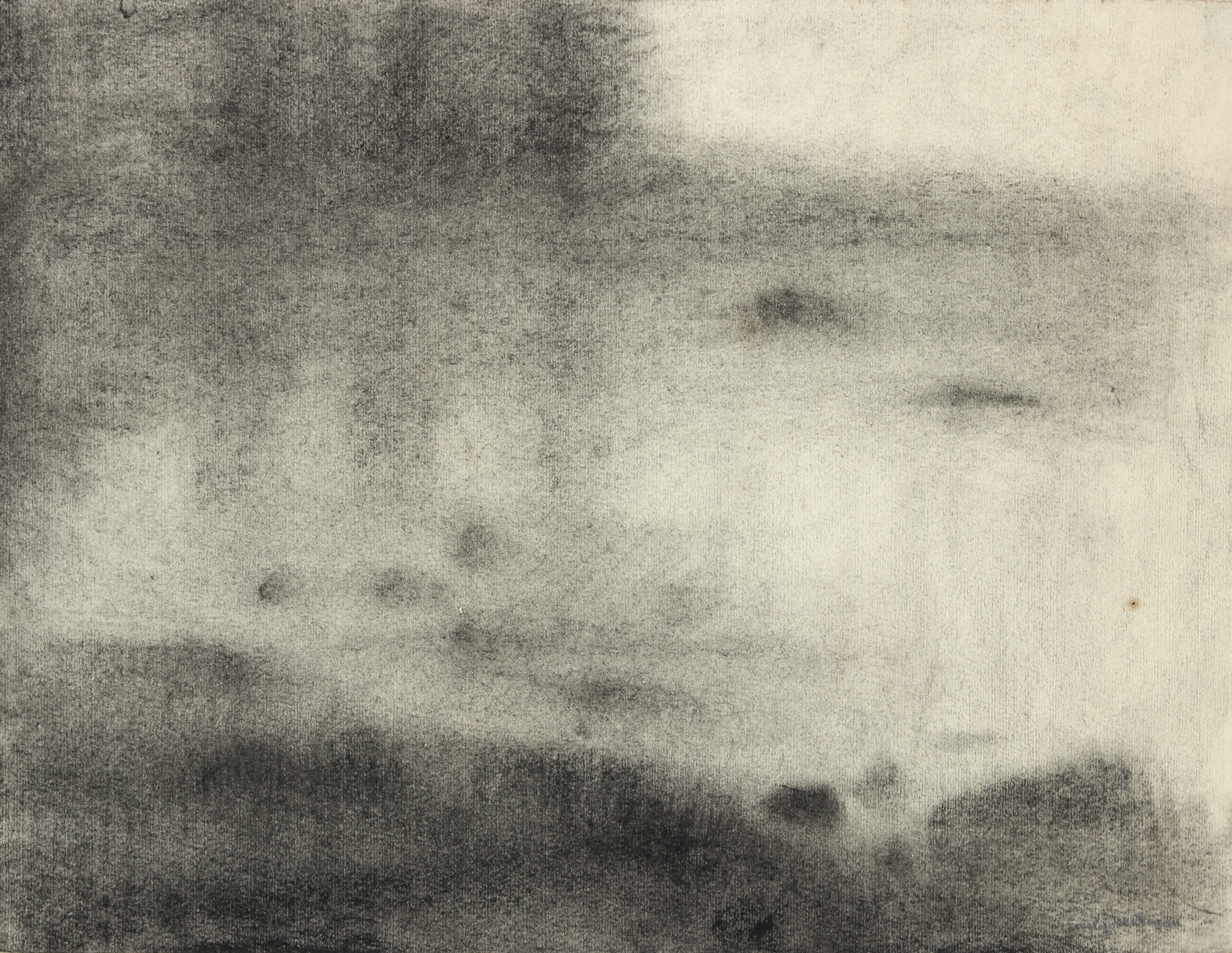
As “Emily Nelligan” proves, the charcoal drawings she produced in this place were transcendent. Like Thoreau and Dickinson, one of Nelligan’s most profound contemplations was about the ephemeral, specifically as it is expressed through qualities of light. I am not aware of any other artist who explored the full chromatic range of this medium so thoroughly.
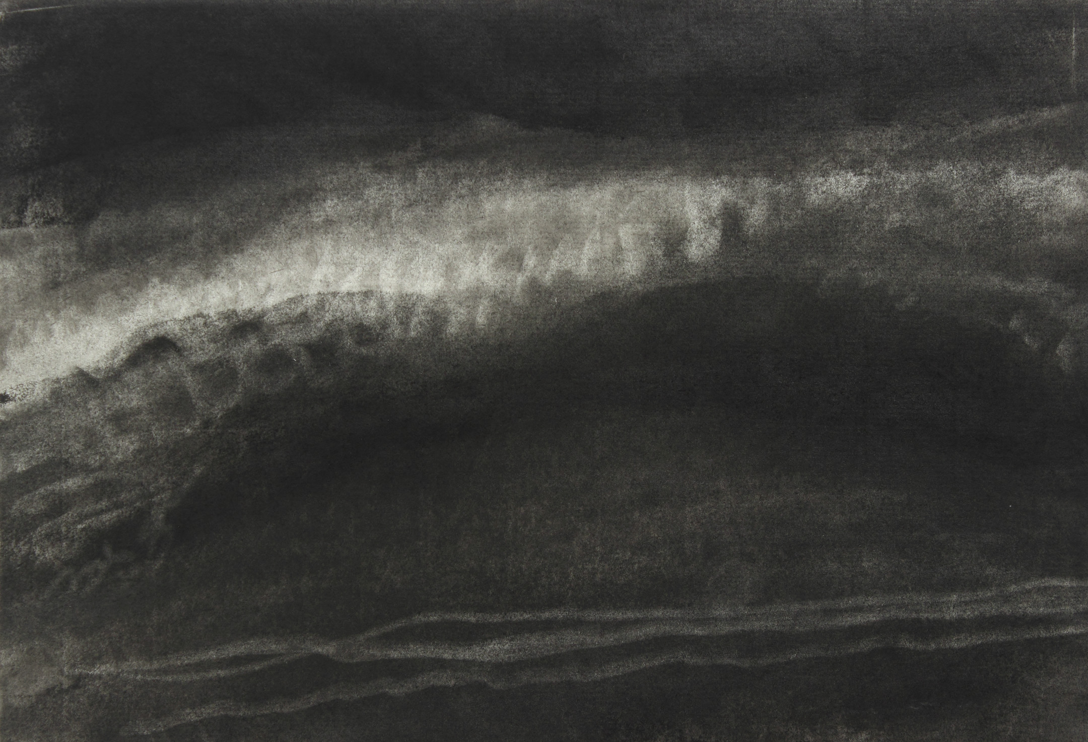
Just consider two works: “14 Oct 01(1)” of 2001 and “Untitled Maine” from the 1960s. The former is a dark, moody rendition of a roiling wave under a night sky. Most of the work is steeped in an inky blackness. Across the upper third, however, we see the wave’s whitecaps as they begin to break. Using only charcoal, this work fully conveys the qualities of a moonless night, the sense of rushing forward movement of the wave, the frigid temperature of the water. It is extraordinary.
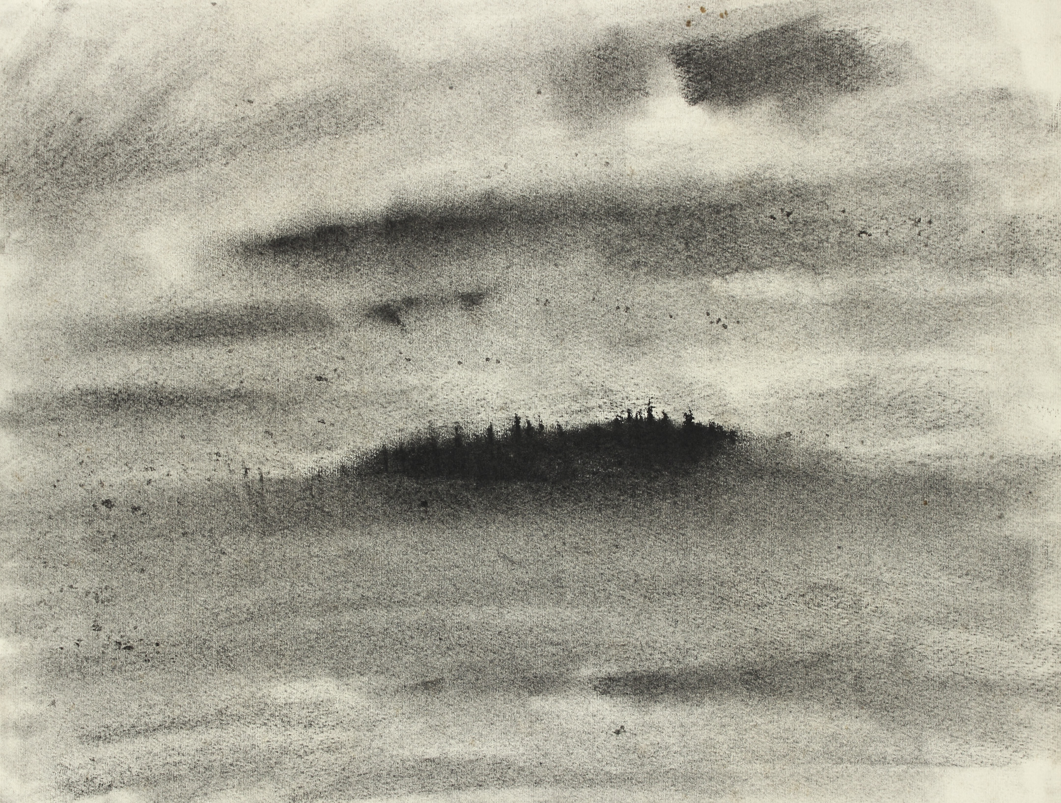
Conversely, “Untitled Maine” depicts an evergreen tree-rimmed meadow in hot, blazing sunlight. Again, the sensations evoked — the scratchiness of the meadow grasses, the heat, the pine scent — it’s all right there, alive and palpable through a simple gradation of black, gray and white. In other works, we perceive fog (either an island emerging from a blanket of mist, or a long view being obscured by curtains of it). There are beaches with overcast skies, moonlight and dark clouds.
All these works evolve through Nelligan’s profound knowledge of her medium—how hard she presses down, how light her touch, whether the charcoal is applied with a pointed end or with the stick being dragged across the paper on its side, how much is erased or smudged with her finger, what is left blank. There are hundreds, if not thousands, of painters who, working with a full range of colors, convey less. Nelligan’s charcoal drawings, not unlike Dickens’ poems, are distillations of a feeling or state.
Jorge S. Arango has written about art, design and architecture for over 35 years. He lives in Portland and can be reached at [email protected]. This column is free to access through support by The Dorothea and Leo Rabkin Foundation.
We invite you to add your comments. We encourage a thoughtful exchange of ideas and information on this website. By joining the conversation, you are agreeing to our commenting policy and terms of use. More information is found on our FAQs. You can update your screen name on the member's center.
Comments are managed by our staff during regular business hours Monday through Friday as well as limited hours on Saturday and Sunday. Comments held for moderation outside of those hours may take longer to approve.
Join the Conversation
Please sign into your Press Herald account to participate in conversations below. If you do not have an account, you can subscribe here. Questions? Please see our FAQs.