

I recently conducted an experiment with fifth-grade students in Yarmouth. I asked them to draw the current Maine state flag from memory.
Some were able to recall a few of the flag’s elements correctly, but many noted: “Our flag has too many details.” When I showed the students our current flag, they also found fault with its use of the Latin word “Dirigo,” which “only a few understand.” Why, they also wondered, are there no girls or women on the flag? A further objection: “The moose … looks more like a bunny.”
When I showed the fifth-graders a previous version of Maine’s flag, one that was adopted in 1901, they could draw it with ease and instinctively understood its symbols. They were impressed by its simple beauty and thought it would be fabulous for us to change the flag back to its original look for our state’s 200th birthday.
If you close your eyes and try to describe our current flag, most of you know it is primarily dark blue with a cluster of symbols in the center. Beyond that, it is a blur. That is because, even from a short distance, the center is full of competing details.
Look closer, and you will see two men, one a farmer holding a scythe and the other a fisherman leaning on an anchor. Their clothes date from about the time the design was chosen, 1909. Lying between them is a moose, which frankly looks nothing like any moose I have ever seen. There is a squat pine tree and a star, with lines intended to indicate it is shining. At the top, there is the word “Dirigo” (Latin, variously defined as “I lead” or “citizens’ guide”) and, at the bottom, the word “Maine.” The state’s name and motto are the only details that distinguish our current flag from many other state flags.
Flags have an emotional resonance far beyond their design qualities. Our citizens have died to protect the American flag, and many are still prepared to do so. A truly great flag needs both meaning and good design to be an inspiration to people. The American flag is a good design. Why? It is simple. It only has three colors, its shapes hold specific meaning known to all citizens and it is simple enough that a child can draw it.
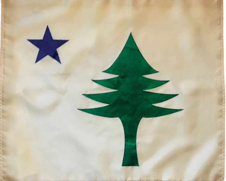
In 1901, more than 80 years after Maine separated from Massachusetts, the Legislature decided we ought to have our own flag. The origin of this banner’s design is lost to history, but it is a beauty.
On a buff background, it has a green pine tree and a blue five-pointed star. That is all. However, in its simplicity, it is also full of meaning. The star symbolizes the Polar or North Star, a reference to “Dirigo,” our state’s motto, and it is a symbol for the brightest light in the sky, which has led mariners, runaway slaves and other lost souls to safety. The pine tree, of course, is a reference to our state’s nickname and our stunning natural environment.
There are a number of reasons why Maine should re-adopt its original flag from 1901. It is simple and distinctive, whereas the current flag is very similar to 25 other state flags. Compared to our current flag, the original flag is easier to identify from a distance, and it carries more historical significance. George Washington specified buff, the background color of Maine’s original flag, as one of the colors for his troops’ Revolutionary War uniforms. Maine’s militias also used a version of the original flag after Maine became a state.
Changing back to the original flag will not cost the state anything if we phase them in as the old flags are retired. Finally, the original 1901 flag is a better and more identifiable flag, evidenced by the fact that children can reproduce it easily.
Let our children lead us into Maine’s next century. They know a good flag when they see it and, as the Yarmouth fifth-grade class titled their essay, “Everything Old is New.”
Copy the Story LinkSend questions/comments to the editors.

Success. Please wait for the page to reload. If the page does not reload within 5 seconds, please refresh the page.
Enter your email and password to access comments.
Hi, to comment on stories you must . This profile is in addition to your subscription and website login.
Already have a commenting profile? .
Invalid username/password.
Please check your email to confirm and complete your registration.
Only subscribers are eligible to post comments. Please subscribe or login first for digital access. Here’s why.
Use the form below to reset your password. When you've submitted your account email, we will send an email with a reset code.