

A painter I know recently said that Sandra Quinn’s paintings fall flat when they aren’t about anything.
It’s a strange comment, because her work is abstract. Yet I completely agree with it.
Additional Photos
If art is a regular part of your world, you take it for granted that paintings have meaning in the sense of cultural or psychic value. Is that presumptuous? Try asking any Red Sox fan (like me) to explain the psychic value or meaning of baseball. It’s never easy to explain the meaning of culture.
Let me be clear: I like most of Quinn’s paintings, and her new show at Greenhut Galleries in Portland is loaded with many fine works. I like that her paintings sometimes fail precisely because she doesn’t rely on some tried and true formula by which she can crank out one after another with predictable success. Too many painters think they need to find a successful formula and ultimately wind up painting out of unchallenged habit.
Modernism has generally taken a self-aware (therefore spiritual) tack (as opposed to Post-Modernism’s system-oriented meta-critical “this is how it works” approach), and Quinn is a Modernist through and through. She doesn’t try to outsmart you. She works very hard and with a serious commitment to technique so that we experience a sense of respect for the audience. Her work is personal but personable, and her ethic is humble and polite.
At least, it has been for quite some time.
But let’s back up for a moment. The paintings I think fall particularly flat are Quinn’s “Solace” series. The most significantly emotive painting, on the other hand, is called “Bittersweet.”
I usually put less than zero stock in titles, but these are fascinatingly revealing. The word “solace,” after all, means relief from sorrow. It is about denying an emotion. “Bittersweet,” on the other hand, means feeling both the positive and the negative. It’s no surprise, therefore, that “Bittersweet” is a gorgeous, tortured painting. It looks as though Quinn literally took a flail to the thick, white gluey encaustic paint that almost flows down the surface like white-icing tears.
I associate “bittersweet” with those conflicted memories of significant loss when love and happiness are churned together with pain and grief. This fantastic painting, with its scarred white layers over wounded blue, is brutally clear.
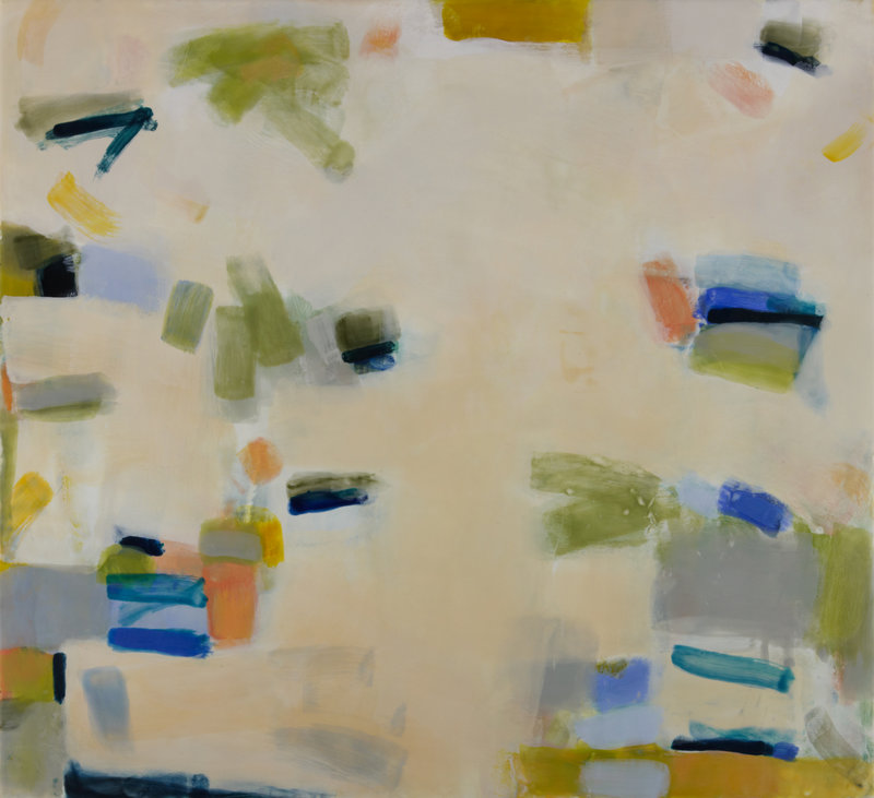
“Bittersweet” is also the exception in the exhibition. The work is otherwise luscious and largely upbeat. Quinn has really mastered encaustic as a medium (wax with varnish) to the point where she can think fluently in the medium instead of being limited by it.
She layers color over translucent color and often employs large, quietly soft areas of neutral colors in the center of her paintings. Many of her marks are colorfully tonal with lilting gestures floating them up through misty fields of encaustic.
In the “Solace” paintings, Quinn balances areas of circling gestures (dressed up with an added drop shape at their tips) against burnished monochrome fields of metallic pigment. While the metaphor sounds rather obvious, the emotional investment simply isn’t there, because there’s not enough human presence in the ostensibly-dripped swirls or the monochrome elements.
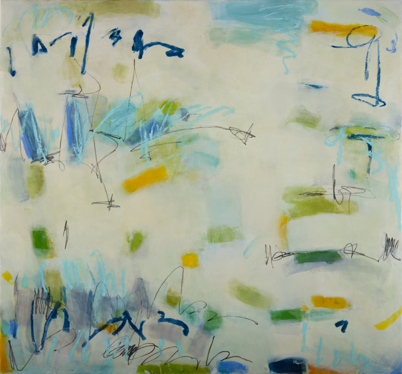
In many newer works, however, pencil and paint stick marks flitter about a bit on broad fields of neutral colors. The marks have script or doodle-like qualities that are inherently personal.
Oddly enough, this directly ties them to Surrealism — which was originally based in automatic writing (think Andre Masson) rather than the theatrically-scripted weirdness of Dali or Magritte. Freudian-fueled Surrealism then begat American Abstract Expressionism: The source of Quinn’s idiom.
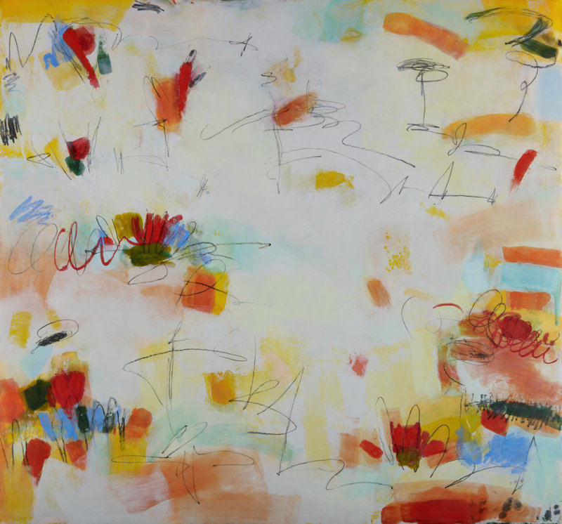
Quinn’s “Summer Solstice” is neither humble nor polite. It’s an exuberant party that dances around the surface. The corners have denser colors, but bits of them jump around everywhere — flashy reds, hot ochres, intense yellows, pinks, reds, blues and oranges.
But most exciting are the graphite scribbles, which are loose and unguardedly brash. Quinn is now comfortable with breaking paints or crazing, and she keeps these in her deliciously smooth mat surfaces. Libido, she seems to have realized, isn’t just something to be controlled but celebrated sometimes. (The “Time” of the title, perhaps?)
Having considered the entire show, the transitional pieces (with feet in both worlds) like “Balancing Act” became much more interesting. I like the unfettered freedom of the liveliest works such as “Up-Down Turn Around” and especially the relationship between the scribbled paint stick and the pencil. In fact, such echoes of Cy Twombly largely define her new work.
I don’t think Quinn can go much farther with her joyously newfound freedom, but it’s clearly a place she needed to go. She has also opened the door to being more purely emotional instead of relying on the refined sensibilities of structure.
While this makes it easier for the average viewer to connect with her work, ironically, it has also opened a door for Quinn’s content in terms of narrative and conceptual possibilities. I look forward to seeing where that door will lead.
Freelance writer Daniel Kany is an art historian who lives in Cumberland. He can be contacted at:
dankany@gmail.com
Copy the Story Link
Send questions/comments to the editors.

Success. Please wait for the page to reload. If the page does not reload within 5 seconds, please refresh the page.
Enter your email and password to access comments.
Hi, to comment on stories you must . This profile is in addition to your subscription and website login.
Already have a commenting profile? .
Invalid username/password.
Please check your email to confirm and complete your registration.
Only subscribers are eligible to post comments. Please subscribe or login first for digital access. Here’s why.
Use the form below to reset your password. When you've submitted your account email, we will send an email with a reset code.