Walking into Susan Maasch Fine Arts often requires a double take. The gallery plays with aesthetics in a way that at once jars and invites the visitor.
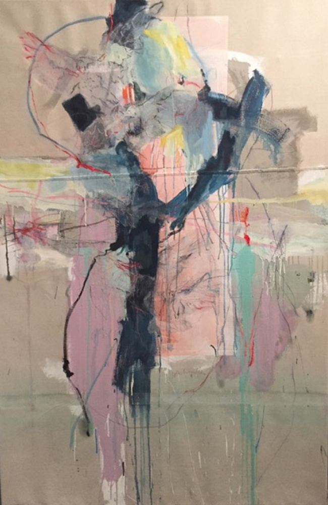
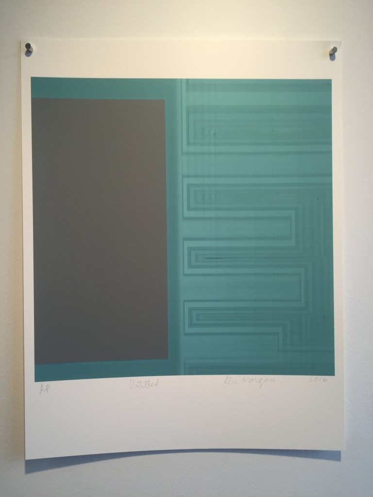
Viewers entering the current exhibition are greeted by a line of Ken Morgan’s severe, computer-generated and geometrical prints. Yet a turn of the head reveals a gallery installed as beautifully as a gallery can be installed. Walls featuring small, linear shows of prints by Jeanne Wells and paintings by Buzz Masters open to the left and right while the center, back wall is deliciously punctuated by a large painting by Louis-Pierre Lachapelle.
Maasch similarly places a single large, abstract painting by Sarah Slavick at the front of the gallery. But whereas Slavick’s watery blue and green swirls look comfortably toward the decorative appeal of fiber (think patterned cloth), the Lachapelle offers a burst of nuanced gestural expressionism to offset an installation otherwise guided by a rigorous aesthetic: Maasch’s rows are even and well-lit. They breathe. And an updated accent wall of whitewashed brick adds visual texture to the space.
Considering we are ostensibly in the age of the curator, I am surprised more is not made of exhibition design and its active engagement with decorator techniques. I hear this kind of talk in the galleries at least as much as discussions about the conceptual content of the work. And while many critics and theory hounds dismiss it, the key content of much contemporary art is its self-conscious relationship to aesthetics – beauty, style, hipness, anti-aestheticism (Art Brut is one of the most important and least appreciated post war art currents), design and, very importantly, decoration.
Slavick’s work, for example, is a hip-appearing visitation of fabric-oriented system decoration. It looks to important post-war American artists such as Gabor Peterdi and Jackson Pollock in terms of rhythm and form, but it’s self-consciously retro so that we will be able to associate its decorative strategy with hipster ethics.
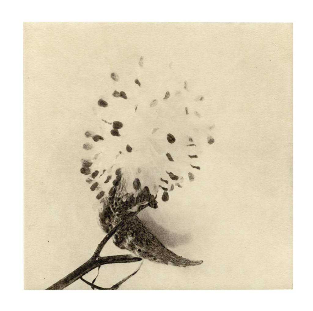
As single-form florals on Chine-collé mounted on etching paper, Wells’ prints take a high-craft aesthetic route. The creamy yellow rectangle of the Chine-collé on the white paper invests the images with aged aesthetic that looks to earlier art photography. It’s a savvy move that puts it in a separate league from, for example, Mary Woodman’s work now on view at Elizabeth Moss. As straightforward, black-and-white, centered photography, Woodman’s image-oriented single-object shots feel too much like commercial product photography while the imperfect paper presence of Wells’ work more easily keeps much of our focus on the art object itself.
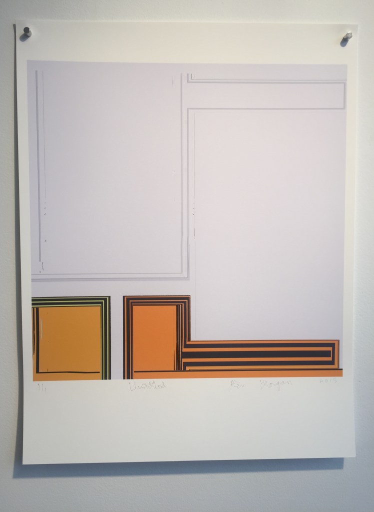
Morgan’s prints may sound like they do not belong in a conversation dedicated to appealing aesthetics – they are, after all, hard-edged one-off abstractions that succeed best when the printer fails to fully control its inky deliveries. But the hip hanging by high-design tacks in their upper corners feeds off of the small-image on-a-large-sheet look that is so clearly associated with ambitious printmaking. Moreover, hard-edge geometrical abstraction – particularly in black and white – has never resisted taking itself seriously.
To be sure, Morgan’s work is subtle and sophisticated. One mostly white piece with a pair of yellow, rectangular forms at the bottom presents an extraordinary interaction between a few flickered lines within the colored fields and the similarly scribbly “1/1” edition note in the bottom margin of the sheet. Morgan’s script is so wobbly that this notation would dissolve to hand-drawn echoes if the other prints weren’t present for context.
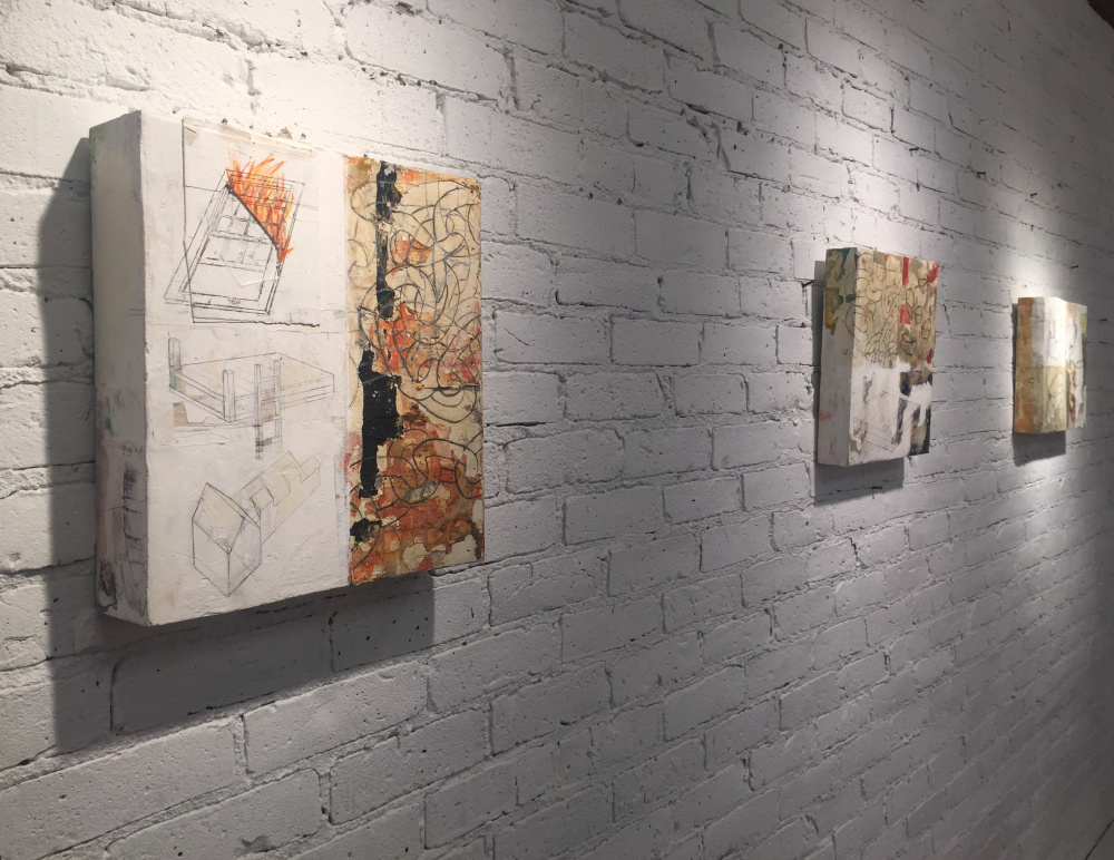
Masters’ brick-thick object-solid paintings quietly knit the entire show together. Her paintings break down into sections demarcated by rectangles of paper (Lachapelle’s painting also uses monoprinted tracing paper images of birds) or thickly painted rectangles of color. Masters distresses and works the surfaces so that the paintings have the feel of heavily-handled and experienced objects. Like Wells, Masters uses single images in her scenes, but instead of leaves or plants, Masters’ objects follow a path of domesticity: a dock, an ironing board, a shirt, a window, a house and so on. Her drawing, however, is axonometric – architectural design style in which lines can be measured and there is no single point perspective. Such geometry tethers itself to the feel of rigorous, formal design in work like Morgan’s.
The look of things – aesthetics – is a far richer field than the topics of beauty and visual appeal. We read into craftsmanship, expressiveness, technique, clarity, design, minimalism, space, efficiency, decoration and so much more. Attitude and ideology are not less important than our ideas about whether art should primarily be smart, accomplished, pretty or something else. Galleries often (or even usually) choose art that looks good, but then we expect importance from art in museums. Expectations are fine when it comes to standards like ethics and excellence, but sometimes we have to remember to open our eyes a little wider and question our assumptions. If an artwork is beautiful, it isn’t necessarily vapid. And if a gallery installation looks great, that doesn’t mean it is merely decoration.
Freelance writer Daniel Kany is an art historian who lives in Cumberland. He can be contacted at:
dankany@gmail.com
Copy the Story LinkSend questions/comments to the editors.


Success. Please wait for the page to reload. If the page does not reload within 5 seconds, please refresh the page.
Enter your email and password to access comments.
Hi, to comment on stories you must . This profile is in addition to your subscription and website login.
Already have a commenting profile? .
Invalid username/password.
Please check your email to confirm and complete your registration.
Only subscribers are eligible to post comments. Please subscribe or login first for digital access. Here’s why.
Use the form below to reset your password. When you've submitted your account email, we will send an email with a reset code.