

Now on view at the Dorothea and Leo Rabkin Foundation in Portland is an exhibition featuring 20 works from eight of Maine’s artist-endowed foundations. Not only is it a worthy introduction to these institutions, it is a fascinating and beautifully installed exhibition.
The space at 13 Brown St. may be familiar to many as the erstwhile Museum of African Art and Culture which went virtual in 2016. The new iteration of exhibition space is undoubtedly less familiar to the public because it is generally open by appointment only (but the hours are broad, and the staff is friendly and welcoming, so make that call to 536-1686).
Art Review
WHAT: “Celebrating Maine’s Artist-Endowed Foundations.” Artists include Joan Marie Beauregard, Bob Crewe, John David Ellis, Joseph Fiore, Beverly Hallam, John Heliker, Robert LaHotan, Kenneth Noland, Stephen Pace and Leo Rabkin.
WHERE: Dorothea and Leo Rabkin Foundation, 13 Brown St., Portland
WHEN: 9:30 a.m. to 3 p.m. Monday to Friday, and by appointment. Through June 29
INFO: 536-1686, rabkinfoundation.org
REPRESENTED FOUNDATIONS INCLUDE:
* Ellis-Beauregard Foundation, Rockland. ellis-beauregardfoundation.com
* Surf Point Foundation, York. No website provided.
* Joseph A. Fiore Art Center, Jefferson. mainefarmlandtrust.org/public-outreach-new/jaf-art-center
* Heliker-LaHotan Foundation, Cranberry Isles. heliker-lahotan.org
* Bob Crewe Foundation, Falmouth. crewe.foundation
* Kenneth Noland Foundation, Port Clyde. kennethnoland.com
* Stephen and Palmina Pace Foundation, Stonington. stephenandpalminapace.org, meca.edu/info-for/alumni/alumni-opportunities/grants-residencies/pace-house-residency
* Dorothea and Leo Rabkin Foundation, Portland. rabkinfoundation.org
For starters, the body of work as a whole is sleek, smart, handsome and compelling. Several of the artists are quite well known, such as Kenneth Noland, Stephen Pace, Beverly Hallam and John Heliker.
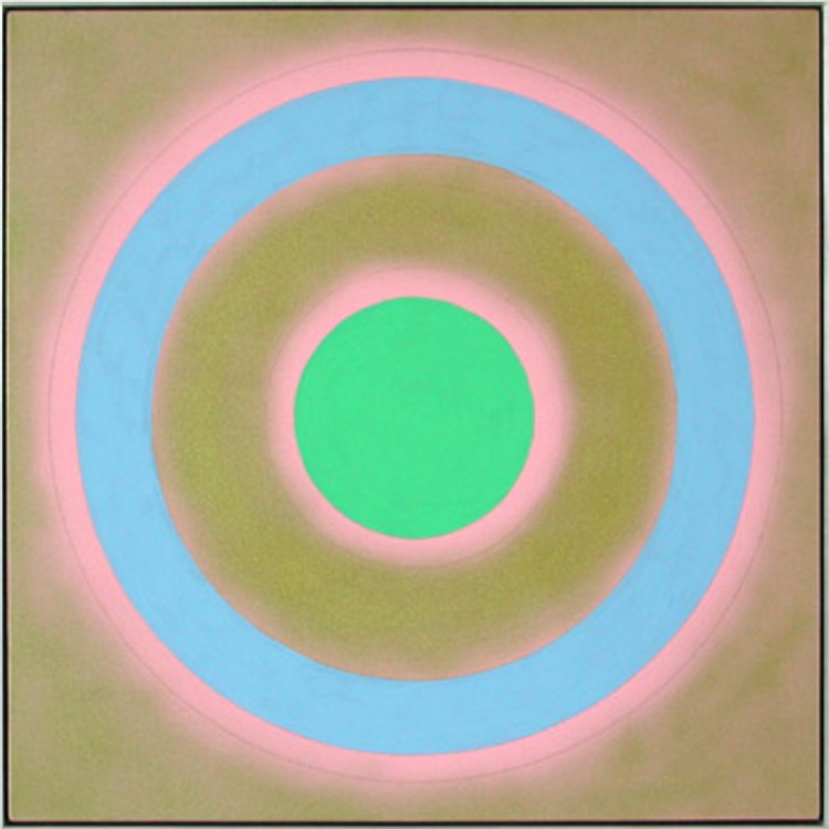
Noland is represented, for example, by a signature-style target painting: A Kelly-green circle occupies the center of a square canvas with a gold ground; after a ring of the gold ground, a powder blue ring orbits the center. Both the green circle and the blue ring have glowing pink halos which destabilize the clear physical presence of the paint. What defines the painting relates directly to what Michael Fried wrote about Noland in the seminal 1965 catalog text for “Three American Painters”: Noland’s work shifts from featuring the literal paint (the gold, for example, appears up close as a mineral presence and we can see a pencil line) to a shallow-depth visual experience Fried referred to as “opticality.” A companion work is softer and friendlier: a pair of blue handmade pulp paper circles on square grounds under the same float frame.
John Heliker, “Mountains of Acadia From Cranberry Island”
Heliker is also represented by a highly recognizable canvas: “Two Bathers in a Misty Landscape” is a low-contrast (and characteristically blue) 1976 painting with two basic but beautifully drawn figures in a featureless, even-toned banded landscape of blue, white, blue, light blue with a flat green strip of foreground.
Heliker’s “Mountains of Acadia From Cranberry Island” alone is worth the visit. It’s a watercolor that ties Heliker to Homer, Marin, Hopper, the Wyeths and Abstract Expressionism in one simple-seeming gemlike image. Under a subtle gray scrub of sky, a swatch of blue-scrabbled mountains is separated from an ochre whisper of beach by the rhythmically dark dots of trees; almost from amid the mist, the ocean flows down in front of us, barely becoming material through a pair of liminally perceptible viridian bands.
Pace is also well represented by a similarly scaled watercolor. But Pace looks through a window to mediate the scene as an image rather than a reachable, physical object. In plain blue washes, we see a framed vertical window with a single top-to-bottom muntin. A porch railing crosses the image, rising up to the left. On a hill that bends down to the right, a same-blue pine rises up in the left pane like the Nutcracker Christmas tree, just touching the upper edge of the dark, framing blue stroke. His “Woman Shelling Peas,” a 1962 oil, represents Pace at his best: charming, smart and economical.
Stephen Pace, “Woman Shelling Peas”
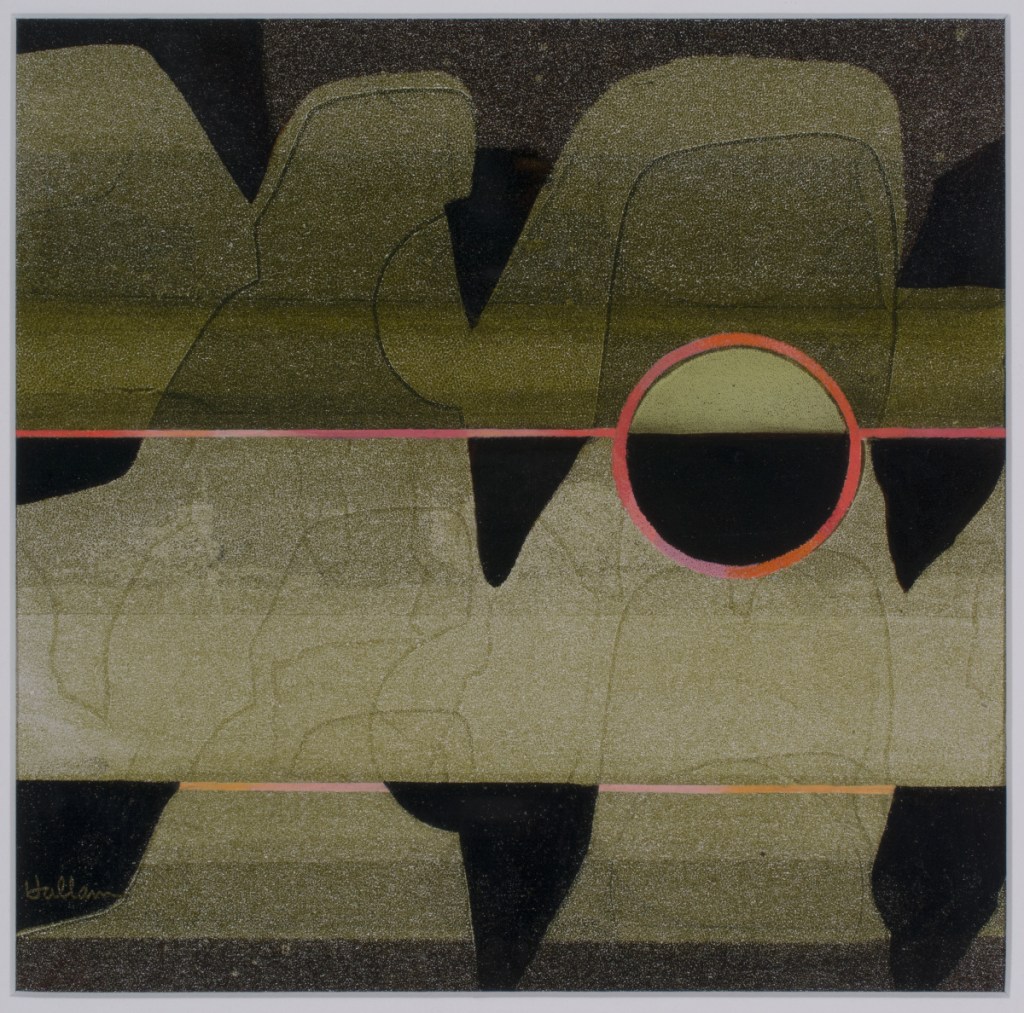
Beverly Hallam is probably best known for her pioneering use of airbrush, particularly her large, close up florals, but later in life she was a leader in espousing digital art techniques. Her legacy also includes the relatively new Surf Point Foundation in York. At the Rabkin, Hallam is represented by an exquisite pair of images in more traditional media on paper: a jaunty abstracted 1980 floral pastel with a Picasso vase and a small oil from 1976. “Edge View” includes a pair of thin red horizontal lines set on an atmospherically moss-green ground. Black, almost stalactite-like black forms hang from these lines and the upper edge. The image comes into focus with a half-black, half-green circle rounded in red and bisected by the implied flow of the red horizon line. It is a work of extraordinary accomplishment and nuance.
To be honest, I was surprised at the even-handed excellence of all the work. John David Ellis’ merry modern abstraction “Untitled” greets viewers most powerfully, like a large and colorfully playful offspring of Miro and Calder. Bob Crewe’s undated “The Knockout” is a spare purist-style intaglio painting with white washed over the textured dark surface. In Maine, of course, it’s hard not to see Cassius Clay’s (better known as Muhammad Ali) first-round knockout of Sonny Liston in 1965 in Lewiston. Either way, the energy of the image is elegant and understated. Joseph Fiore’s “Vernal Equinox II” is an oil from 2000 that echoes energies of postwar American painters of the New York School like Richard Pousette-Dart, who mined the form and feel of elemental symbols for deeper powers. Fiore’s canvas is compartmentalized into areas of yellow, blue and orange, and each is loaded with almost hieroglyphic-like forms. Part calendar, part computation, the work is like a battery for ideas.
Leo Rabkin, “224 D’s & a C”
Although there is a wisp of home-field advantage, Leo Rabkin’s constructions form the exciting backbone of the show. Rabkin might be among the least known to the local audience of the leading artists in the show, yet his work is included in many of America’s leading museums, including The Museum of Modern Art, the Metropolitan Museum of Art, the Whitney Museum of American Art, the Smithsonian and the Guggenheim. Rabkin’s work ranges, but he comes to into focus as the maker of playful lucite boxes. Some of his works are spare and geared to a reductive, optical experience while many are wittily playful. One untitled sculpture from the late 1960s, for example, is a vertical pink and orange box. Seen from the front, it glows with a soft but colorful elegance. From the side, however, we see the systems logic behind Rabkin’s approach: colored half-tubes snake back and forth on either side of a centered sheet of transparent orange. One small clear box, a gift for his wife Dorothea, features a wire grid holding 224 “Ds” and just a single “C.” It is the exception, he reminds us, that challenges the rule. It’s a hilarious bit of subtle, ironical wit. Rabkin had an exceptional sense of material on a jewel-like miniature scale. His work will make you want to return.
To its credit, the show doesn’t pretend to go into didactic depth or try to be anything other than a display of welcoming solidarity. This simplicity helps the very strong work make a great first impression for anyone who is not familiar with this leading group of artist-funded foundations.
Freelance writer Daniel Kany is an art historian who lives in Cumberland. He can be contacted at:
dankany@gmail.com
Copy the Story LinkSend questions/comments to the editors.

Success. Please wait for the page to reload. If the page does not reload within 5 seconds, please refresh the page.
Enter your email and password to access comments.
Hi, to comment on stories you must . This profile is in addition to your subscription and website login.
Already have a commenting profile? .
Invalid username/password.
Please check your email to confirm and complete your registration.
Only subscribers are eligible to post comments. Please subscribe or login first for digital access. Here’s why.
Use the form below to reset your password. When you've submitted your account email, we will send an email with a reset code.