

Don’t be surprised if you think you hear strains of Mozart’s “Don Giovanni” as you near 100 Fore St., the address of the new Old Port outpost of Elizabeth Moss Galleries.
Moss doesn’t actually stream the opera into the gallery. But there is no need. The paintings in “Lynne Mapp Drexler: Orchestrations in Color,” through Friday, provide the soundtrack. Drexler was an ardent classical music fan, and many of her abstract paintings of the 1950s and ’60s were visual interpretations of music she experienced at Carnegie Hall, which she channeled into sketches she drew from her seat during performances.
Back in her studio, she would use them as jumping-off points for intensely colorful compositions, densely layered with idiosyncratic combinations of marks: the stippling of Seurat and Pissarro, the thickly impastoed swirls and stabs of Van Gogh, the more defined geometric shapes of Hans Hofmann (one of her most influential teachers, along with Robert Motherwell), the quick, rhythmically applied jots of Cézanne.
Mentioning all these stylistic influences in no way diminishes the individuality of Drexler’s oeuvre. When asked by her friend Tralice Bracy to define what makes a good artist, Drexler replied, “Someone who’s got a vision of their own and a commitment and sticks to it … and doesn’t sell out.” Drexler, who died on Monhegan Island in 1999, was unquestionably such an artist.
It was, in fact, her commitment to her art that led to her voluntary exile from New York in 1983, when she decided to ditch an art scene she felt had become shallow and commercial to live year-round on Monhegan.
She and her husband, fellow painter John Hultberg, had purchased a home there and spent many summers painting en plein air. By the 1980s, her measured early success – always overshadowed by the male-dominated American Abstract Expressionist movement – had waned, and a new school of painting, Pop Art, had eclipsed Ab Ex as the “it” genre.
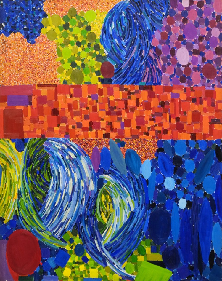
What most immediately hits you is Drexler’s palette. It is a confident, no-holes-barred eruption of deeply saturated pigment, and it’s laid on in thick, brash gestures. “Eclipse,” for example, is a complexly constructed painting that ripples across the surface with tangerine and spice oranges, citrine and golden yellows, scarlet and vermilion reds, cobalt and cerulean blues, violet and plum purples, tawny and umber browns.
Most of the paintings in this show are spectacularly polychromatic in this way. “Bubbled Pink” is a fugue that ranges from rose to fuchsia to crimson. “Celestial Division” is a kaleidoscopic sampling of so many shades it would take several paragraphs to discuss here.
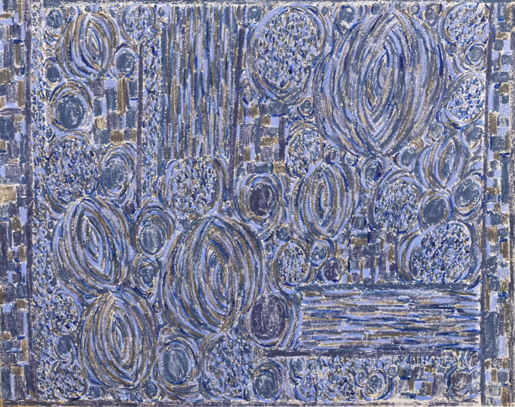
Lynne Drexler, “Paperwork 190”
Even with works that appear initially dark and monochromatic, such as “Paperwork #190,” “Paperwork #191” and “Thematic Repeat,” close inspection reveals many subtle variations of hue within a theme.
The earliest paintings here are various works on paper Drexler made in 1959. They’re emblematic of Motherwell’s belief that an artist should approach a surface with no preconceived notions of form or composition. The emphasis should be on process and expression. Using a rainbow of colors, Drexler created multiple layers of brush strokes that look like the tesserae of mosaics. They seem to be streaming out like confetti from some imperceptible existential void deep within the paper.
The sense of creating something out of nothing by progressively building up a surface with repeated markings would stay with Drexler her whole life. Some have cited Gustav Klimt as a possible source as well. But for Klimt, these markings, derived from Art Nouveau motifs and erotic allusions, were highly decorative. In Drexler’s work, markings – at least until late in her life – became the actual material of manifestation. Autonomic gesture replaces subject matter, regardless of whether a painting was inspired by a concerto or a landscape.
As her style matured, the vocabulary of markings grew. She never abandoned Hans Hofmann’s theory of push-and-pull, which posited that effective pictorial space depends on a tension between neatly articulated planes of color and a more gestural, expressionistic field of overlapping forms. She just kept adding to that stylistic lexicon.
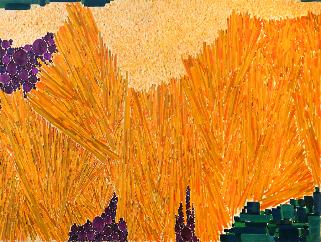
Lynne Drexler, “Heat Nostalgia”
Push-and-pull is clearly visible in “Heat Nostalgia,” the latest painting in the show, dated 1980. Green rectangles and squares, and purple circles around the border, contrast with the stipples and slashes that dominate the painting. They are even more pronounced in “Radiation,” from 1977.
Sometime in the late 1960s, Drexler had begun gravitating toward more representational subject matter, primarily landscapes of Monhegan. Though highly stylized, “Heat Nostalgia” is clearly a view of grasses and lupines across a meadow, likely the same meadow that stretched from her house toward the cottages lining the rocky shore of the island.
“Winter Serenity” of 1976 is almost surely a woodland scene, probably also from Monhegan. But even without knowing the title of “Sunset Sea” (1969) the wavy markings and primarily blue palette make the subject matter clear.
Eventually, Drexler felt she’d exhausted the possibilities of abstraction and turned to painting still life compositions of flowers in vases, dolls and clothes on a line, flapping in the breeze. The markings – particularly the tesserae-like rectangles and squares – interestingly moved into the background as in Klimt’s paintings, though they still served a function beyond decoration: that is, articulating a depth of space.
None of these later paintings are in the show. The reality is that, though they did feel uniquely hers in some way, they were not Drexler’s best works. This show – whose run is far too brief, so hurry to see it – proclaims the singular voice she carved out of the Ab Ex movement. You know a Drexler when you see one, both because her style was so personally hers and because she had no imitators. Witnessing the lushness and visual power of these paintings makes the way she was passed over in her lifetime feel like a grave injustice.
Yet, though it might be tempting to think of her withdrawal to Monhegan as a retreat of sorts, I prefer to think of it as an act of defiance and liberation. From the beginning, Drexler refused to conform to fashion, which for me indicates her isolation as a display of extraordinary will, clearly motivated by the importance she placed on her art and the self-assurance that what she was doing mattered a great deal.
At her death bed, surrounded by friends, the painter Alice Boynton put on “Don Giovanni” to accompany Drexler into the afterlife. Boynton recalls that Drexler, who was perhaps overly fond of Jack Daniels, drew her last breath, appropriately, during the opera’s champagne aria. “Orchestrations in Color” has a similarly celebratory feel to it. In a way, it is a well-deserved toast to a great artist.
Jorge S. Arango has written about art, design and architecture for over 35 years. He lives in Portland. He can be reached at: jorge@jsarango.com
Copy the Story LinkSend questions/comments to the editors.

Success. Please wait for the page to reload. If the page does not reload within 5 seconds, please refresh the page.
Enter your email and password to access comments.
Hi, to comment on stories you must . This profile is in addition to your subscription and website login.
Already have a commenting profile? .
Invalid username/password.
Please check your email to confirm and complete your registration.
Only subscribers are eligible to post comments. Please subscribe or login first for digital access. Here’s why.
Use the form below to reset your password. When you've submitted your account email, we will send an email with a reset code.