

Harlan Crichton, “Tethered Aerostat Radar System/Empty Urn Behind Prada Marfa, Texas” Image courtesy of the artist
Now and then, it’s worth wandering off the beaten art path. Two galleries located in not-so-obvious locations in Portland have interesting shows up at the moment.
“That Was Fun” (through July 15) is an experimental photography show at the recently opened 49 Oak Gallery, around the corner from the Maine College of Art & Design (MECA&D). “Excerpts: the view from here” (through Aug. 4) is a group show at Zero Station on Anderson Street, in a corner of the East Bayside neighborhood.
In February, and with zero fanfare, MECA&D students and faculty collaborated with Artists at Work – a career development program of the school – to open 49 Oak. Though it’s in the center of what is known as Portland’s Arts District, the long narrow space’s low-profile position on a side street between Congress and Free means you could easily walk by it without noticing.
During the year, the gallery is given over to student-driven exhibition space, pop-up shops and other projects that amplify the art curriculum. During the summer months when school is not in session, the plan is to offer it, via juried entry process, to alumni. Currently, Harlan Crichton, class of 2012, is occupying the gallery.
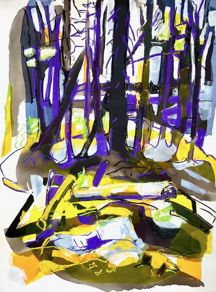
Crichton has primarily pursued portrait photography. But the pandemic years propelled him into a more self-reflective and creative process of play and experimentation. Bored and frustrated with the medium’s traditional forms, he began using expired large-format slide film, which he removed from cardboard holders and double exposed while projecting a laser through the slides. The laser light traverses prisms or crystals, and portions of the film itself are often partially obscured by found objects or parts of Crichton’s body.
Harlan Crichton, “Roadside memorial and an oil storage tank” Image courtesy of the artist
There is no way to know, until he sees the results on his computer screen and either creates inkjet prints of them or sets transparencies within handmade lightboxes, what is going to materialize. Often, these can be totally abstract. Other times we can make out recognizable forms: architecture, rock formations, people. Of the latter, the inkjet print “Tethered Aerostat Radar System/Empty Urn Behind Prada Marfa, Texas” has a 1950s military surveillance photography feel to it because Crichton’s process yields an image that looks as though it was covertly shot from a distance.
The lightbox work “The sky 1.3 miles from the site of 1947 Roswell Incident” taps into the conspiracy theory atmosphere and fear of extraterrestrials that surrounded the alleged “flying disc” UFO debris that many speculated the military was covering up in New Mexico. The laser and double exposure conjure eerie, inexplicable flashes of light in the sky.
That debris collected by the military in the desert has since been verified to have been from a top-secret nuclear test surveillance balloon. But against the background of a plethora of contemporary conspiracy theories – about COVID vaccines, Princess Di’s death, Biden rigging elections, the Jan. 6 rioters actually being members of antifa – the photo points to something deeper about human nature: not only our penchant for fantasy and mistrust, but a very contemporary problem of a divided public working from divergent sets of so-called “facts.”
And that’s Crichton’s deeper aim with this body of work. He is considering the human condition amid more universal cycles of life, death and rebirth. The incontrovertible reality is that these cycles will repeat themselves infinitely through time. Yet humans have a peculiar way of trying to manipulate that reality, deny it, deal with their fear surrounding it … and on and on. If we could all just relax into the inevitable and embrace reality’s inherent unpredictability, might we actually be able to look with wonder – instead of suspicion – at the surprises we encounter during our time on Earth?
NATURE OBSERVED
Zero Station’s beautiful show mostly presents views of Maine’s landscapes as seen through the very personal, curated perspectives of the artists and their processes. Jennifer Brou, for example, uses ink on paper to record meticulously observed branches and the lace-like patterns they form. We recognize what we are looking at, and their small scale (5 1/2 by 8 1/2 inches) compresses them in a way that intensifies our intimacy with them.
But squint a bit to blur your view and you may detect something beyond mere representation that is hinted at in her title for the series: “Cold Air and Empty Space” (Nos. 3, 7, 8 and 9). That is, at a fundamental level we are perceiving her appreciation of positive and negative space. Additionally, Brou sometimes gives palpable materiality to the “cold air” negative space by populating it with hundreds of tiny vertical jots.
Jennifer Brou, “Cold Air and Empty Space,” 2022, 5.5″ x 8.5,” ink on paper Image courtesy of the artist
Whereas Brou’s works are detailed and minute, landscape designer Mitchell Rasor’s monochromatic grayscale watercolors feel expressively minimal, like Chinese ink landscape paintings. One of his marsh paintings is nothing more than two gray land masses, yet in its sublime simplicity, it evokes an entire geography. They are watery and ethereal and invite us to silently contemplate something more essential about what we’re looking at than the specifics.
I sort of wish Brou’s and Rasor’s works would have been isolated together on one wall, as they have a quietness to them that seems, even with their very different approaches, complementary. Instead, we move from Rasor’s wispy, whispery work to the charged colors and energy of landscapes by Emily Leonard Trenholm.
Emily Trenholm, “Forest Color Study 3,” 2023, ink flashe, pastel on arches, 30” x 22” Image courtesy of the artist
It is a single work by Trenholm – “Forest Color Study 3” – that is featured on the birch wall at the back of the gallery. This was probably wise, considering the intense pastel and ink flashe (a deeply saturated flat resin paint) palette of purple, yellow, blue, green and gray.
Trenholm compellingly paints the forest around her studio, bringing infinite variety to the familiar scenes through this intensity of color, which reflects the constant variation of light filtering from dawn to dusk through the density of trunks and branches. But she also juxtaposes that color with a boldness of thick line that electrifies her surfaces, conveying a kind of animist spirit that emanates from her subject matter.
Other times she cuts paper shapes, paints them in a variety of watercolors and piles them on top of one another to collage together rock formations such as “Stover’s Point.” Again, we feel this animist essence, but with a more concrete sense of dimensionality.
Liz McGhee, from the series “untitled/blueberry barrens” Image courtesy of the artist
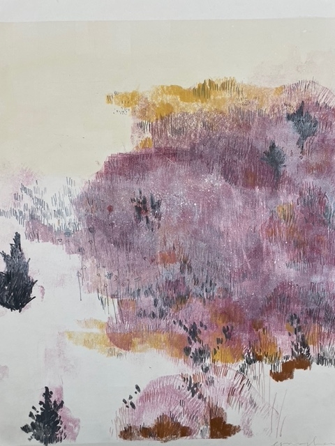
Liz McGhee presents two bodies of work: lovely monoprints (sometimes with drawing) and prints on U.S. Geological Survey maps. The latter have an attractive flat, graphic quality, the topographical map lines achieving some of the same underlying energy of nature and its rhythms. But I was more drawn, from across the room, to a trio of monoprints in pinks and purples.
What I like about them is that they look as though McGhee was perceiving the scenes through unfocused vision, representing the flora of the landscapes as monolithic fields of color. Like Brou’s mark making, McGhee has also used hundreds of tiny vertical jottings to imply the plants, trees and shrubs, but also to give the color washes a kind of physicality that belies the flatness of the print medium. The contrast is effective and creates an interesting tension between abstraction and representation.
Last, but by no means least, is the work of Juliet Karelsen. Hers are the least “landscapy” of the works in the show. By now, the idea of female artists creating art out of what was traditionally considered “women’s work” (needlepoint, crochet, embroidery, etc.) is far from new. But somehow Karelsen always seems to give it a unique, fresh twist.
Juliet Karelsen, “Forsythia on Blue 1” Image courtesy of the artist
Here she prints cyanotype “shadows” from her garden developed onto antique linen placemats. The cyanotypes, in their ghostly silhouettes, elicit the memory of flowers rather than the flowers themselves. Then she uses colorful yarns to embroider new flowers atop the shadows. We end up with layers and layers of evocative memory.
The old-fashioned linens themselves and their lacy needlework call to mind a bygone time, possibly memories of grandmothers or aunts patiently pushing and pulling a needle through fabric. This imbues them with a sense of comfort and home. There is the memory of the expired flowers of the shadows, which seem to have passed into another dimension. But they are brought back to flower (or life) by the colorful new “blossoms” Karelsen embroiders onto them.
These processes imply whole cycles of living and dying and rebirth. Interestingly, it’s similar to Crichton’s goals at 49 Oak, though achieved through radically different media and techniques.
Jorge S. Arango has written about art, design and architecture for over 35 years. He lives in Portland. He can be reached at: jorge@jsarango.com
Send questions/comments to the editors.

Success. Please wait for the page to reload. If the page does not reload within 5 seconds, please refresh the page.
Enter your email and password to access comments.
Hi, to comment on stories you must . This profile is in addition to your subscription and website login.
Already have a commenting profile? .
Invalid username/password.
Please check your email to confirm and complete your registration.
Only subscribers are eligible to post comments. Please subscribe or login first for digital access. Here’s why.
Use the form below to reset your password. When you've submitted your account email, we will send an email with a reset code.