

Groups shows can feel disparate – with no clear connections among the multiple media, genres and intentions on display – no matter what the grand unifying themes curators dream up to give them a cohesive rubric or context. Two shows currently on view in Portland approach this conundrum in different ways: “The Portland Show 2024” at Greenhut Galleries (through Apr. 27) and “Manifold” at Cove St. Arts (through May 25).
A third show, “Dance of the Untamed,” also at Cove St. (through May 18), represents the polar opposite – a solo exhibition so single-mindedly focused on one theme and color palette that the fascination revolves around the infinite variations it can embody.
TALES OF THE CITY
This is the 12th biennial run of the popular Portland-themed show at Greenhut. Predictably, it ranges stylistically far and wide and features diverse media, including fabric, painting, found materials, digital montage and paper. The city’s waterfront features prominently, often zeroing in on the life of a working port.
Chris Beneman offers the collage-like acrylic painting “Around Town,” which recalls the foreshortened, flat perspectives of artists like Romare Bearden and Stuart Davis (particularly the latter’s cubist city paintings). By using an irregular grid to stack building silhouettes, cranes, an anchor, a dry-docked boat, masts and, at the top, the distant islands of Casco Bay, Beneman captures the bustling energy of construction and commerce clustered along the Old Port.
Two artists present another feature of the waterfront that no longer exists: the Million Dollar Bridge connecting Portland and South Portland, which opened in 1916 and was replaced by the Casco Bay Bridge in 1997. Tina Ingraham’s oil-on-linen version feels romantic, its harder materials (steel, concrete) given a soft-focus treatment that make them feel of a piece with the water underneath and the sky above.
C. Michael Lewis indulges in what he calls a “capriccio.” That is, a reality-based fantasy depiction of the arches underneath the same bridge. Adopting a photo-realistic style, his acrylic on panel is less nostalgic than Ingraham’s. It is presented as a man-made structure in decline, overgrown with weeds, metal posts rusting and covered with graffiti, old bridge parts discarded underneath it.
Bridge imagery abounds, in fact. Among the most beautiful is Dean McCrillis’ dramatically cropped, lusciously saturated red and purple “Bridge Up.” But Lewis’ “capriccio” hints at one of the most interesting aspects of the show this year: the way it tackles a host of contemporary issues. His painting conveys the human impact on nature. In Alison Rector’s “Two Portlands 2,” the subject is homelessness. It portrays an encampment under the Casco Bay Bridge (“Two Portlands 1,” by contrast, shows a large luxury cruise ship entering the harbor).
“Water Level” by Roy Germon Courtesy of Greenhut Galleries
Three “Water Level” paintings by Roy Germon seem innocent enough. His initial intentions were to record the contrast between the heavily shadowed spaces under the waterfront’s wharves with the colorful fish shacks and maritime gear atop them. But as he was painting this series, storms brought record high tides that swept away or damaged many of these structures along the coast, and gave his title a slightly ominous cast.
“Fast Dealing Property Trading Game” by Jim Flahaven Courtesy of Greenhut Galleries
Commenting on escalating rents and real estate prices that are driving less affluent Portlanders off the peninsula, Jim Flahaven presents “Fast Dealing Property Trading Game,” a map of Portland made of cut up Monopoly boards. Ryan Adams may be talking about this same phenomenon in “Profit and Loss” with a painting that partially obscures the phrase “Worth the Cost?” But this could just as easily be addressing other effects of urban development, such as the lack of diversity it can cause as underserved communities are also displaced.
“A View from Above” by Diamond Duryea Courtesy of Greenhut Galleries
All these co-exist with art devoid of subliminal messaging, such as street scenes by Sean Ware, Tom Paiement (of Greenhut itself), Alison Goodwin and Diamond Duryea’s “A View from Above,” a cityscape that captures the red haze of traffic lights on Deering Avenue (though the enigmatic presence of embroidered squares floating in the sky above might be hinting at some extraterrestrial presence). There are idyllic beach scenes by Margaret Lawrence, Kate Emlen, James Mullen and Alec Richardson. The overarching theme of almost 70 works in this case reveals the tremendous variety of topographies and experiences Portland offers.
TRIPLE HARMONIES
The interesting thing about the title of the show “Manifold” is that it acknowledges upfront the reality of difference represented in the juxtaposition of works by George Mason, Paul Heroux and the late Harold Garde (1923-2022), then sets out to articulate the considerable synergies among them. This is one of the most subtly harmonious and elegant shows ever presented by Cove St. Arts (“Kindred” was another).
“Manifold” brings together the Strappo prints of Garde (a method he developed of painting on glass then lifting the image once it dries and transferring it to paper or canvas), the soda-fired stoneware of Paul Heroux and the two-dimensional wall sculptures of George Mason, which are made from hydrocal plaster and burlap.
Each media and artist’s work are interesting in their own right: Garde’s for its innovative printing technique as well as its psychological probing of the human condition, Heroux’s for its mastery of form and glazing techniques, and Mason’s for its color harmonies and material presence, which recalls quilts and tapestries.
Yet a lively dialogue transpires among the artists. Most obviously is the emphasis on color that permeates all three artists’ works. Less apparent until we look closely are the relations they share in terms of compositional adjacencies, texture, pattern, content versus no content and figuration versus abstraction.
By compositional adjacency, I mean that all three artists created work that is segmented into panels that juxtapose colors, images and patterns. Garde’s work is often in triptych or diptych form, each section containing a different image (usually figurative). He was enamored with the construction of kimonos, and several of the Strappos on view take that form, dissecting the garment into parts – the left sleeve is one quadrant, the right another, and the middle is split between upper and lower sections.
A wonderful example is “The Shape of the Silk Kimono,” one of two Strappos in which the sleeve quadrants feature human faces (one hatted and looking content; one more intense and dark – perhaps representing extremes in the gamut of human emotional states). In the middle are what look like two aerial views, the upper resembling a landmass bordering a body of water, the lower a kind of tidal eddy.
To its right is Mason’s 13-foot-long “Bright Companion,” a composition in blues that relates directly to the blues of Garde’s work. But, also synchronous here are the ideas of draping and pliability inherent in both Garde’s kimono form and Mason’s physical method of draping his plaster-soaked burlap strips over the top of his frame, letting them fall at different levels.
Paul Heroux, Folded Vase 2 (2023) Courtesy of Paul Heroux
To the left and slightly in front of Garde’s work is Heroux’s “Folded Vase 4”; its folded form picks up the notion of pliability from Garde and Mason. It is decorated with panels placed side-by-side (like Garde), which we view in sequence as we circle the vessel: a panel of what look like gingko leaves next to a brown-black metallic section, next to a Moroccan-style star, next to grassy plant forms and so on. Heroux’s work also contains figures, thus further tying it to Garde’s. Finally, among the many patterns embossed on the plaster-dipped burlap sections of Mason’s work are some that recall ceramic glazes such as crackle and salt glazing or raku firing, bringing this work into intersection with Heroux’s vessel as well.
So it proceeds throughout the show, creating a sensation of fluid convergence of elements and ideas among all the works. That sensation, at least for me, resonated in the heart as a continuous flow occasionally diverted into separate streams that nevertheless kept converging again further along their course.
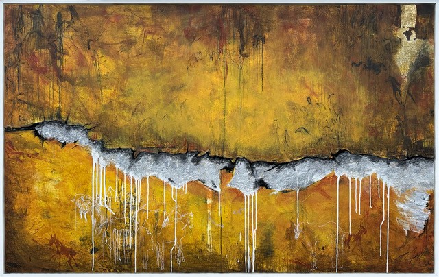
Dance of the Untamed 14 (2024) Artist Carson Jackson. Cove Street Arts. Eric Snyder Photography
A HORSE OF A DIFFERENT COLOR
I’ve written about Carson Jackson’s Dance of the Untamed series of paintings before. They all feature horses as symbols of muscularity and resilience in the face of difficulty, as well as the innate wildness of spirit natural to all beings. They are also all painted in a palette of yellow, gray, black and white. So, unlike “Manifold,” Jackson’s “Dance of the Untamed” show hits you immediately with a sense of consistency and oneness rather than leaving you to discover it gradually.
Variety comes mainly in the perspectives from which Jackson paints these animals, sometimes cropping into the horse’s flank or face, other times pulling back to see the entire equine and, occasionally, a rider. There are also several simple line-drawn images reminiscent of petroglyphs found at ancient sites like Lascaux in France’s Dordogne (the first known horse painting), Africa, Spain and Indonesia.
The most surprising paintings here are “Dance of the Untamed 14” and “Dance of the Untamed 15.” Both signal a new development in Jackson’s work. They are, for one thing, quite large. But “14” marks the inclusion of molding paste into his materials, which gives the work an intriguing new dimensionality. It can appear like the whole top half of the painting is lifting off the surface, exposing a dark crevasse. This void actually is the outline of what began as a mountain range but progressed into something more mysterious. The painting reads as more of a landscape, even though the presence of horses within it remains.
As for “15,” it too feels like landscape, but goes monochromatic on a large scale. Several smaller monochromatic paintings on the opposite wall are either all white, all black or a mix. These look like singular, quickly executed gestures. But “15,” which is basically all grayscale, feels expansive.
Jorge S. Arango has written about art, design and architecture for over 35 years. He lives in Portland. He can be reached at: jorge@jsarango.com
Copy the Story LinkSend questions/comments to the editors.

Success. Please wait for the page to reload. If the page does not reload within 5 seconds, please refresh the page.
Enter your email and password to access comments.
Hi, to comment on stories you must . This profile is in addition to your subscription and website login.
Already have a commenting profile? .
Invalid username/password.
Please check your email to confirm and complete your registration.
Only subscribers are eligible to post comments. Please subscribe or login first for digital access. Here’s why.
Use the form below to reset your password. When you've submitted your account email, we will send an email with a reset code.