

Henry Isaacs’ island landscapes are recognizably bright and colorful. Large elements such as mountains, the sea or the sky are constructed from patches of color. Shapes and their borders are created not by solid colors, but groups of similar values.
Here and there, Isaacs’ palette flashes into high contrast, but inevitably to emphasize the color palette rather than any isolated object. At a glance, Isaacs seems to have a light touch and a firm grasp on making merrily simple paintings.
Additional Photos
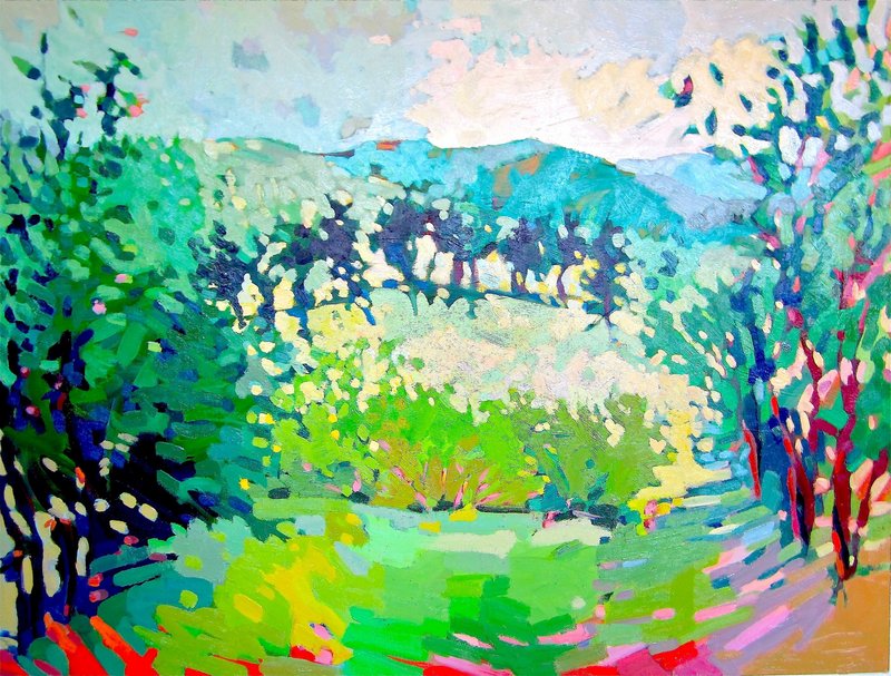
Yet they are very far from being simple paintings. Still, I think it’s a refreshing bit of confidence to welcome the viewer with a first impression of aesthetic good cheer. Isaacs’ paintings may not aggressively challenge the viewer, but they nonetheless possess a deep back end of sophisticated color and surface complexity.
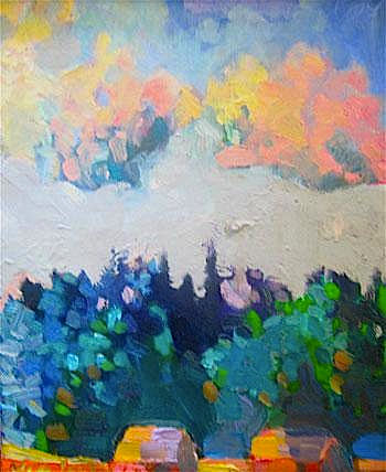
At 10 inches square, “Porpoise Island, Maine” is one of the smaller pieces in the show. It is a seascape with a band of ground along the bottom of the image, an island peaking in through the middle ground from the left and a sliver of land reaching almost completely across the canvas that marks the horizon.
The scene is rendered in brushy blocks of autumnal tones punctuated by bits of blue. While thick strokes of color are piled on top of each other in the foreground, thinner patches are laid out next to each other in the sky so that darker underpainting is revealed between the forms.
The handling of the paint owes an unapologetic debt to the chunky boldness of the early twentieth century Modernists like the Fauves. The brushwork is strong, but primarily dedicated to its job of pushing the paint around on the canvas — an activity that Isaacs clearly enjoys. The quick strokes visible on the surface propagate a sense of spontaneity that humbly veils the copious time that Isaacs must spend mixing paint on his palette.
The quick layers of paint we see on the surface are in fact sitting on many other layers. “Porpoise Island” has far less glazing than most of the paintings in the show, but it still features many layers of warm and cool colors placed over or next to each other by a measured hand and an experienced eye. The seemingly neutral sky features dozens of pigments among the whites. Even a quick glance at the smeary stand of trees in the middle ground reveals at least five layers of paint.
“View from Thrumcap” is a much larger painting (4 by 5 feet), but the style and subject are absolutely within the same idiom. What that is, however, is less clear than what a quick glance would have you believe. While Isaacs starts his paintings as plein air landscapes based on nothing but direct observation, he finishes them all in the studio. At some point Isaacs switches gears from painting a place to making a strong painting. His surfaces indicate Isaacs spends the vast majority of his time in the studio mode — mixing paints and working his surfaces with strokes and glazes.
“Thrumcap” is a structurally simple coastal landscape. It has the land where you stand at the base of the image, then the sea, a horizon band of verdant shore before rounded bounding hills about one-third of the way up the canvas, and then a whole bunch of quilt-patchy Maine August sky. Although it reads as a neutral whole with an open blue center, the amazing sky has innumerable wisps of yellows, pinks, purplish grays and even greens among the countless whites and blanched blues.
Isaacs’ approach to color is based in balancing warm and cool tones. He does this brilliantly with his ubiquitous whites and neutrals, and with his brighter colors as well. Like the French Impressionists, he doesn’t use black.
Yet, in combination with his insistent glazing (as opposed to scumbling), this ironically puts him at odds with the Impressionists, insofar as Isaacs’ works are not light-based but rather dedicated to color. This is extremely unusual for an artist whose primary vehicle is a palette of whites — and it defines Isaacs as an artist.
One of my favorite paintings in the show is the atypical “Summer Storm,” which, over a band of orangish beach and a streak of blue sea, shows almost nothing but the bloated sky of a coming summer storm. A close look reveals a massively built-up surface of glazes that might have taken as much time as anything in the show. It’s a great painting.
I like seeing echoes of great colorists throughout the show. “Rolling Hills” proves Isaacs understood the Fauves. “Duck Islands” salutes the nighttime silver-gray shadows of Homer. “Nubble Light York Maine” jauntily tips its hat to the Luminists. “Baker and Duck Islands” channels the patchy machinations of Marin. “Island Houses” features a luscious palette indulgently reminiscent of Wolf Kahn. Yet despite so many clear engagements, Isaacs is always recognizably himself.
Isaacs works his paintings until they succeed. He is willing to take the time to mix countless colors and glaze layer on layer. He clearly likes complex neutrals and the buildup of textures by putting one stroke over another. His surfaces are amazing. He is my favorite colorist in the state.
I may be a sucker for painterly Modernism and Maine seascapes, but “Lessons from an Island” really makes a case for Henry Isaacs.
Freelance writer Daniel Kany is an art historian who lives in Cumberland. He can be contacted at:
dankany@gmail.com
Send questions/comments to the editors.

Success. Please wait for the page to reload. If the page does not reload within 5 seconds, please refresh the page.
Enter your email and password to access comments.
Hi, to comment on stories you must . This profile is in addition to your subscription and website login.
Already have a commenting profile? .
Invalid username/password.
Please check your email to confirm and complete your registration.
Only subscribers are eligible to post comments. Please subscribe or login first for digital access. Here’s why.
Use the form below to reset your password. When you've submitted your account email, we will send an email with a reset code.