

Matt Blackwell and Kathi Smith might seem an unlikely pairing, but their paintings work together satisfyingly well.
Blackwell is a painterly wit. He lets it fly both in terms of his brush and his content. We might see a devil grumbling, a Venus skinny-dipping or a woman shaking out the contents of her purse with a scratched note in Spanish pointing out that the purse contains (or did) everything in the world. In short, Blackwell is high-energy fun.
Smith is an emerging artist worth watching. Her work is much closer to what we think of as traditional Maine painting: landscapes painted with the muscular urgency endemic to experienced artists working en plein air.
The common strand here already is the energy and boldness of the approaches of both painters. But there is more. The visual thread is that the two use somewhat similar palettes, and in particular, both have a rather chalky sense to their paint, an effect common to painters who use titanium white paint as a vehicle for color and lighting. Titanium is the most opaque pigment, and so it has a few qualities resulting from using it as an artist’s choice for lightening, etc. First of all, the paint on the surface is flat and opaque, almost like gouache. Then there is a slightly chalky texture that viewers generally assign to the entire surface of the painting rather than any given patch of color. There is also then virtually no glazing or effects of transparency. This might sound like a simplifying factor, but it also pulls the viewer’s eye in closer to see what’s going on with any bold stroke, particularly one made with a “loaded brush” that includes multiple pigments. To a certain extent, this also ties any given painting to the tradition of Impressionism: Instead of glazing, colors and light are scumbled (i.e., placed next to each other; red next to blue, for example, from a distance looks like purple). And this is one reason why the strokes of both Smith and Blackwell are interesting just for themselves.
Matt Blackwell, “Girl ‘n’ Goat,” oil on panel, 40 by 32 inches.
Blackwell’s work is exciting in terms of color, brushwork, composition and narrative. It exudes a cartoonish immediacy that implies action but also legibility. This last bit, however, is a sort of feint: We “read” Blackwell’s paintings with the expectation of a story, but what we get is a wacky bit of absurdism, or, possibly, an art-history joke dressed up in a Surrealist party suit. “Girl-n-Goat,” for example, is not an art-history cliche, but it is the kind of classical-flavored thing Picasso would do. But here, Blackwell’s “girl” is pretty and effervescent, and based on advertising drawings from the 1970s: leggy and slender. But she is also classically posed and sophisticatedly contrapasto: Her weight is on her forward right leg, her left hip is drawn back, and it is shifted on a different plane from her shoulders. Blackwell clearly knows what he’s doing. And he even plays with ideas about history and proportion in unlikely places: The circles around the goat’s ears are undoubtedly references to nimbuses, the flat halos in religious paintings, but also to proportion: Think da Vinci’s “Vitruvian Man” in his sweeping circle.
Still, Blackwell won’t give it all away. Above the couple is what could be the moon or a cloud or, possibly, a white handbag. It has a handle. (Or is that a smile?) It has an arrow (Cupid’s?) in it, and it’s dripping something. But we aren’t intended to worry about it; we don’t need to get every detail to understand this is real-time fun, not some joke we have to follow in order to “get it.”
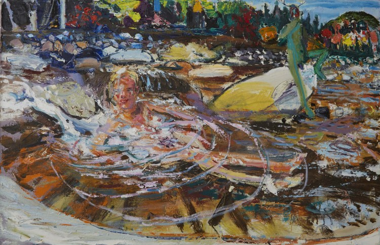
I particularly like Blackwell’s skinny-dipping images. They set an indulgently fun mood that delivers Dionysian classicism (Apollo was the uptight ordered one; Dionysius, the god of wine, was the inspiration for Bacchanalian classicism so popular with its nymphs and satyrs). “Venus and Green Man,” for example, features a bubbling blonde in a rippled pool with her green satyr friend in the background, horned and red-faced with a stroke of purple … manliness. What makes it particularly fun is the Katahdin-esque landscape: dense, rocky and very much the stuff of Maine.
Kathi Smith’s energy lies not in any narrative – her scenes are people-free coastal landscapes after all – but in her execution. Her marks are varied but with preference for boldness over bravura. She will often use the knife to apply paint or scrape her surfaces down. Sometimes she works on site, while sometimes she works from memory in the studio. These two modes largely divide her work both in terms of approach and paint application. The plein air work is direct in both observation and painting, often with unmitigated and unmixed color. The memory pieces are more poetic and varied; they are more likely to be scraped down, tonal and atmospheric.
Kathi Smith, “The Old Spurling Dock – Great Cranberry Island,” oil on panel, 24 by 30 inches.
“The Old Spurling Dock – Great Cranberry Island” is an example of Smith’s plein air work. The sturdy old dock juts out on its pilings under a periwinkle white sky reflected in the water, the horizon line marked by the sliver of Little Cranberry in the mid-ground. The dock and foreground beach matter (rocks and seaweed) are solid and satisfyingly present. The boldness of their application pulls in the viewer for a closer look, and there the foreground completely falls apart as an almost arbitrarily abstract cacophony of thick strokes and solidified pulls of the palette knife. It is indulgently impressive.
Kathi Smith, “Pier – Memory,” oil on panel, 16 by 14 inches.
Smith’s “Pier – Memory” is a very different kind of painting, far more textural and atmospheric. We’re led up the stairs from the floating part of the dock in a far wetter world. The sky is purple, and soft greens surround. But the passage to the right of the steps both undermines the solidity of the scene and sets its stage. Smith has scraped vertical lines into the wet paint with the heel of her brush. These rhythms are like rain, but they also enliven the scene as a passage of poetic urgency, however softspoken. Smith’s memory pieces are dreamy, poetic and even a bit nostalgic in their soft pining for moments or places past.
What ties Blackwell and Smith together in an apparent way is their shared propensity for lively marks and paint that is very much present on the surface of their works. But underneath both of their approaches to paint application is a sophisticated indulgence that exudes a rather Dionysian joy. The world, as they both show it to us, is a dynamic place. It can be dreamy and sweet at times (think of Poussin’s Bacchanalia), but ultimately it is vibrant and joyously alive.
Freelance writer Daniel Kany is an art historian who lives in Cumberland. He can be contacted at:
dankany@gmail.com
Copy the Story LinkSend questions/comments to the editors.

Success. Please wait for the page to reload. If the page does not reload within 5 seconds, please refresh the page.
Enter your email and password to access comments.
Hi, to comment on stories you must . This profile is in addition to your subscription and website login.
Already have a commenting profile? .
Invalid username/password.
Please check your email to confirm and complete your registration.
Only subscribers are eligible to post comments. Please subscribe or login first for digital access. Here’s why.
Use the form below to reset your password. When you've submitted your account email, we will send an email with a reset code.