

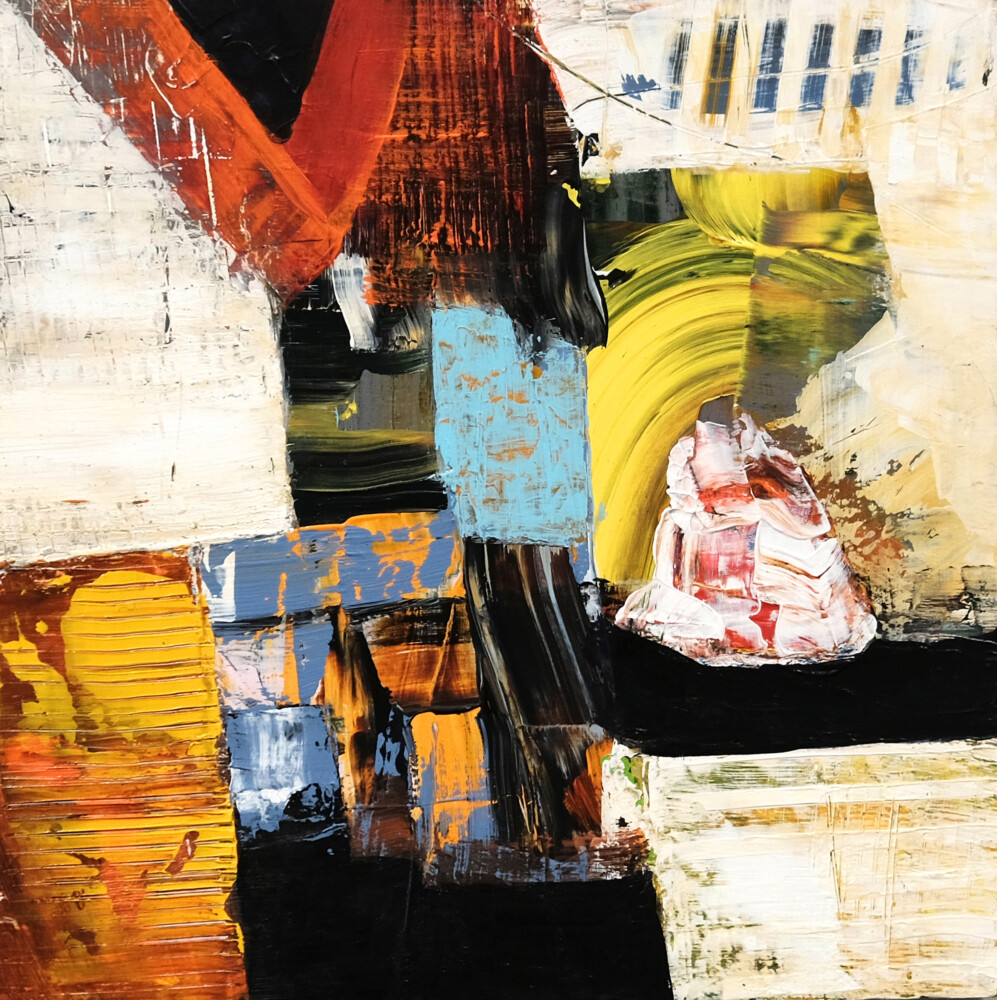
Jaap Helder, “Renegade” Photo by Craig Becker
Looking at the paintings in “Jaap Eduard Helder: New Visions, New Rhythms,” currently hanging at Elizabeth Moss Galleries in Falmouth (through April 10), I kept thinking about the way the vocabulary of abstraction continues to evolve. Specifically, what interested me was the function of gesture in abstraction, rather than the cooler geometric form of abstraction or the fluid, often dreamy qualities of color-field painting.
When most of us think of abstract expressionism, we generally invoke the energetic, whole-body gesturalism of Willem de Kooning, Jackson Pollock, Franz Kline and other action painters. The canvases are large, the paint gestures sweeping and emotionally charged. But during the 1940s when this kind of art was in its heyday, a short-lived co-emergent movement stirred in Europe. Called CoBrA (an acronym for the cities from which its founders hailed: Copenhagen, Brussels and Amsterdam), it rejected both abstraction and naturalism per se, yet incorporated elements of both. This was combined with an unrestrained use of strong color and a deep appreciation for the art of children and people with acute mental health issues. It arose from an impulse to dismantle establishment art forms in the wake of the horror and inhumanity of World War II and reinvent painting with purity and innocence.
Dutch artist Karel Appel is arguably the most well-known of the CoBrA group, and clearly exerted some influence on Helder, who also grew up in the Netherlands and experienced the popular re-evaluation of CoBrA in the 1960s. Helder and his father took some watercolor courses during his youth, mostly plein air painting and portraiture. But otherwise, Helder is largely self-taught. His work adopts Appel’s startlingly vivid palette and, like the CoBrA artists, retains a connection to the representational, though it won’t likely be apparent to most viewers without knowing a bit more about Helder’s inspirations. That is because the connection to subject matter is almost completely suffused in abstraction, though unlike de Kooning, Pollock, Kline, et alia, it is a uniquely controlled and intimately scaled gesturalism.
Helder grew up along the ocean – the North Sea during his childhood and time spent in Ireland later on, the Mediterranean during a stint in Israel in his early 20s, and the Atlantic Ocean for most of his adult life here in Maine, near Damariscotta. He is fascinated by the stratification of colors that occurs on the sides of boats: the tiling, chipping, flaking and bubbling of paint distressed by saltwater and extremes of temperature. The textures are often evoked by multiple layers of paint that is troweled on and scraped off to reveal colors beneath each.
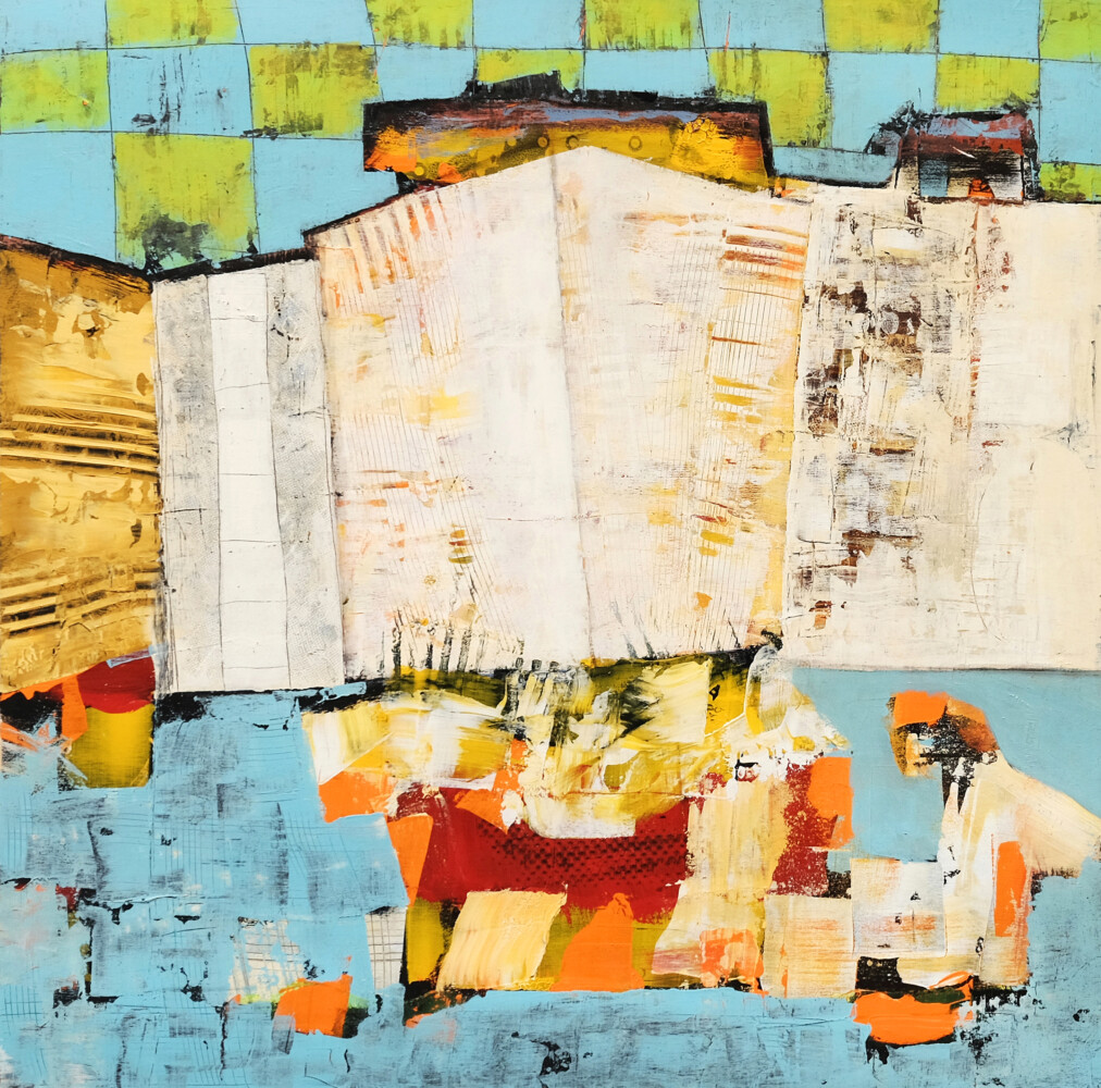
Jaap Helder, “Azualado” Photo by Craig Becker
In paintings such as “Float” and “Azulado,” Helder also uses grid and mesh patterns scratched into these layers with some pointed tool, which might call to mind fish nets or lobster traps. In the latter work, there is also the suggestion of a figure on the lower right, which for me alluded to a fisherman pulling in his nets or traps. A central volume in “Azulado” might also suggest the prow of a boat. Raked patterns in many of his paintings could be stand-ins for an essential clamming tool.
And then there are the gestures. In “Unfolding,” a red comet-like streak rises from the middle left of the panel (all the paintings are acrylic on birch panel). Above it arches a graceful swoop of ivory paint that pulls with it some of the golden-brown underneath. In “Renegade,” a tight bend of citrine emerges from near the middle of the composition and disappears under layers of white at the other end. In “Summer Journal,” a short, thick streak of cerulean slashes diagonally across the center of the painting.
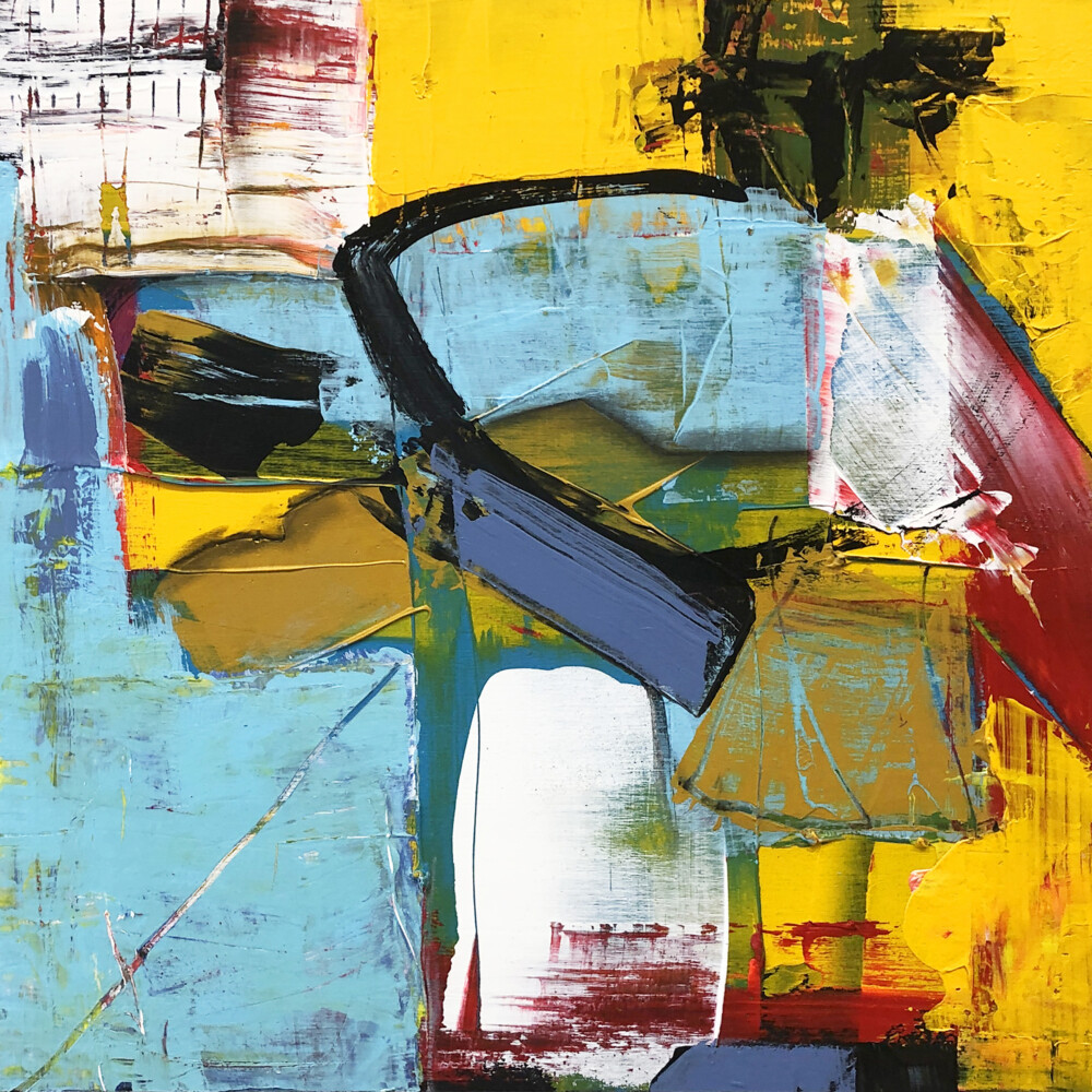
Jaap Helder, “Summer Journal” Photo by Craig Becker
The function of these gestures feels new in the sense that they reveal themselves as bursts of freedom within an ordered whole rather than dominate the canvas. In a way, Helder flips the formula of another gestural abstract artist, the great German-American painter Hans Hofmann. Hofmann brought focus and order to his canvases by superimposing neat squares on seething, wild fields of colorful gesture. But much of Helder’s work has a blocky sense of order. Witness the squares and rectangles of “Piazze,” the square shapes of “March” (a title that could refer to the month or to the way these squares progress methodically from lower left to upper right), or the central grouping of geometries in “Remember the Moment.”

Jaap Helder, “March” Photo by Craig Becker
All of these include gesture, but it is often boxed in so that it feels like a flutter of excitement (and excitability) within a densely and deliberately composed framework. It’s not unlike the movement of the heart within our carefully crafted personalities. This is likely not Helder’s endgame. He is also inspired by jazz, which could make these more akin to the improvisational quiver of a saxophone. But these little gestures can nevertheless be experienced as quiet flashes of emotion or grace.
Unlike the loud, spectacularly outsized Abstract Expressionism that has hoarded attention for decades, Helder’s is subtle, quiet and intimate. In fact, the paintings that are most effective are those done in a small 12-inch-by-12-inch format. “Vector” has a kinship with British painter Howard Hodgkin, who often uses gesture to squarely frame some inner depth at the center of his canvases. But Hodgkin’s paintings are large and suck you right up into them. Here, the small format compresses the geometry and gesture, giving it a surprising impact for its diminutive proportion.

Jaap Helder, “Vector” Photo by Craig Becker
Every one of the 12-by-12 works – “Vector,” “Enfolding,” “Summer Journal,” “Renegade” and “Duende” – vividly conveys a different mood that speaks, through the tightness and succinctness of their compositions, more eloquently, clearly and convincingly than larger panels. “The Visitor,” “Azulado” and “Pavilion” measure 36-by-36 inches. While beautiful in their own way, they feel less focused and cohesive, their power diffused across a broader expanse of space. “The Visitor” comes closest to echoing the subtle vigor of the smaller works thanks to the tension inherent in its tightly puzzled-together components.
There are just 15 paintings in the show, and they’re hung opposite the work of Hunt Slonem, whose color, thick impasto and flora and fauna subject matter detract a bit from Helder’s pieces. Best to come in, mentally block out what’s on the right completely and immediately veer left to immerse yourself without distraction in Helder’s exquisite oeuvre.
Jorge S. Arango has written about art, design and architecture for over 35 years. He lives in Portland. He can be reached at: jorge@jsarango.com
Send questions/comments to the editors.

Comments are no longer available on this story