

Most people probably don’t devote much thought to how an exhibition is curated beyond the title, which supposedly encapsulates the organizing principle(s) behind it. But two current shows at the Center for Maine Contemporary Art in Rockland are interesting not only for the works on display, but the way they present two different approaches to curation.
“Good Morning Midnight | Sam Finkelstein & Duncan Hewitt,” curated by Hilary Irons, is sharply focused, while Tessa Greene O’Brien’s “Let the World In” casts a much broader net. Both are on view through May 5.
The title of Irons’ show presents us with what we might view as a contradiction by juxtaposing of the words “morning” and “midnight.” Of course, earliest morning is still dark and, so, considered nighttime in our physical perception of it. This is exactly the point. Irons bases the central concept on a quotation from Russian Formalist theorist Viktor Shklovsky’s 1917 essay “Art as Technique.”
It reads, in part, “The purpose of art is to impart the sensation of things as they are perceived and not as they are known … Art is a way of experiencing the artfulness of an object: the object is not important.” So, even though, scientifically speaking, we know midnight is the beginning of morning, we perceive it empirically as night. Facts versus the actuality of perception.
This apparent conundrum is at the heart of Finkelstein’s and Hewitt’s work. Both sculptors create objects of varying degrees of verisimilitude – Finkelstein uses rock, Hewitt carves wood – that force us to question what exactly we’re seeing. We are asked to reconcile the dichotomy between understanding (perceiving) something familiar through our memory of it with a material representation of it that renders it not that thing at all.
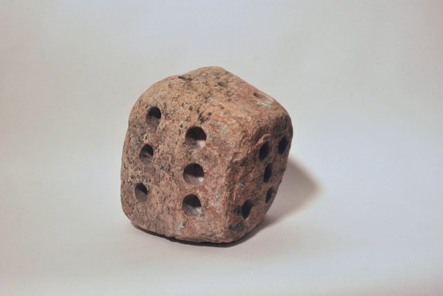
Sam Finkelstein, “Threes,” 2023, foraged Adirondack granite, 7.25 x 6.25 x 8” Photo courtesy of the artist
Finkelstein, for instance, gives us “Threes,” a sculpture of a dice made from foraged Adirondack granite. We know it is not an actual dice, yet the recollection of dice is what allows us to make an association that identifies it as a certain kind of object or gives it, if you will, object relevance. Yet the material it is made of clearly robs this object of any literal function, at least any we could ascribe to dice.
Hewitt does the same with a sculpture of ice skates that mimics textures of this footwear – its folds and creases, the floppiness of its tongue, the look of leather or plastic – as well as the “ice” it skates across. Yet they’re all carved wood, thus eradicating the function we associate with them.
These are not unlike painter René Magritte’s picture of a pipe, with the words “Ceci n’est pas une pipe” (“This is not a pipe”) written across the bottom of the image. The inscription reassures us that it cannot be an actual pipe because it is only a representation of one. A facsimile is not the real thing. Yet it evokes the real thing in a variety of ways. We can recall how a pipe feels, smells, etc.
Shklovsky called this “defamiliarization,” where the process of reconciling a thing’s reality with its unreality prolongs the perception of it and summons other senses to our body (the pipe’s feel and smell), thus adding palpable dimension and recollection to our experience of it. And that is what makes it art. Or, as Shklovsky describes the purpose of art, “to make forms difficult, to increase the difficulty and length of perception because the process of perception is an aesthetic end in itself.”
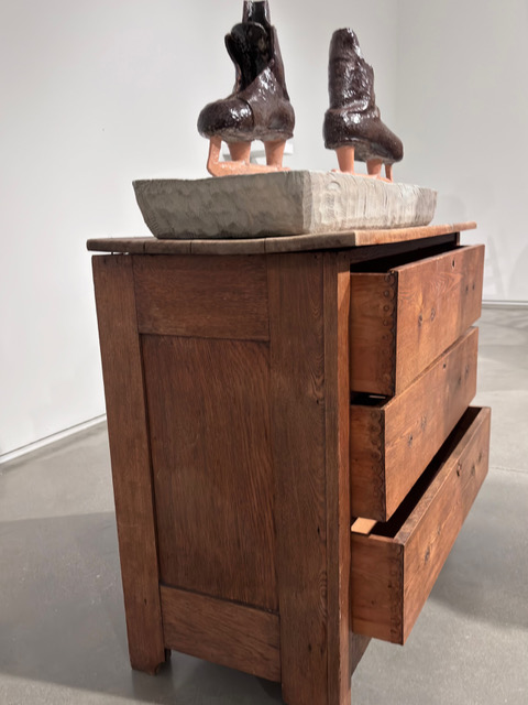
Ice skates by Duncan Hewitt. Photo courtesy of CMCA
From Finkelstein, then, we get shelves protruding from walls that recall ledge mushrooms, a perfect sphere with beautiful graining that looks like a weathered cannonball, and so on. From Hewitt, we get what looks like a piece of folded cardboard leaning against a wall (still my favorite), or mittens. Both artists stop short of completely realistic representation and, in so doing, ramp up the “defamiliarization” stakes.
This space between real and simulation is an interesting one to dwell in and can elicit contradictory sensations: wonder (at the craft of it), befuddlement, humor, physicality (you want to touch some of these). Not to mention the momentary disorientation caused by trying to resolve the pieces in our minds despite their essential illogic. The show, because it concentrates single-mindedly on one idea (and its implications), feels remarkably of a piece.
THE WORLD AROUND THEM
“Let the World In,” on the other hand, is necessarily more dissipated in a sense. It features work by artists exploring the concepts of “openness, observation, and material integration,” reads the explanation. “Going beyond the surface binary, these artists are directly referencing the world around us through process, material specificity, and rendered imagery, reproduced and re-presented to reflect the unique relationship that each artist has with their subject matter.”
Of course, the various realities and environments these artists are responding to, and the personalness with which they do it (in their imagery, material selection, thematics, etc.) determines a highly individualized diversity of aesthetics and concerns. So, the consistency we intuit in Irons’ approach evaporates here, except at a subliminal level that requires us to keep in mind the thread if we are to make connections amongst the multifarious styles and genres on display.
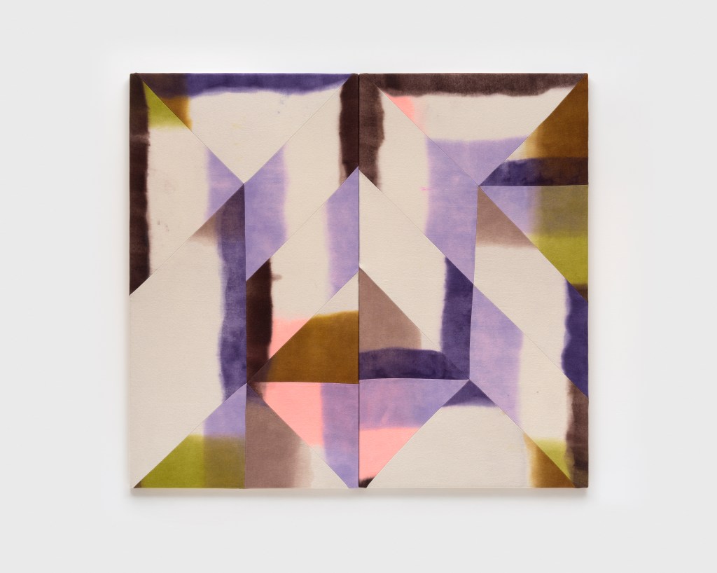
Wilder Alison, “a cat occurs /n curse: hel/otrope shades—curls—,” 2023, dyed wool & thread, 55.1 x 60.6 x 1 in, 2023 Courtesy of Gaa Gallery
Or we could, as I did, just jettison the idea of a consistent theme and immerse ourselves in the individual visions of each artist. The dyed wool works of Wilder Alison are among the most interesting and personal of these. Alison, a Vermont-based queer artist, dips blankets in dyes that bleed colors in soft, merging pools, then cuts them up and sews them back together in ways that fracture the continuity of color.
While the effect is sublimely beautiful, Alison is, in fact, interrogating the primarily male construct of language as it refers to women. Titles like “a cat occurs /n curse: hel/otrope shades—curls—” and “sl/pped—green—f/st ÄformayaÄ dr/psdry” have to do with what Ksenia Soboleva identified in “Hyperallergic” as “visually dissecting Monique Wittig’s novel ‘The Lesbian Body,’ which theorizes the split subjectivity women experience in language.” The slash stands in for “i” and, also, refers to the violence of slashing canvas (think Lucio Fontana). By resewing her pieces together, Alison implies a more healing, or coming-together, of that split subjectivity.
I would also submit that Alison’s paintings, whether consciously or not, confront the awkward view of nonbinary identity imposed by society and, until 1987, the Diagnostic and Statistical Manual of Mental Disorders (DSM). The American Psychogical Association’s reference tome classified people as “ego-dystonic” whose sexual-orientation ran counter to their idealized sexual identity (read: society’s idealized sexual identities).
Sewing together pieces in a way that interrupts their original color flow, Alison presents a different – as opposed to “disordered” – way of being in the world. Visually, what we feel, even without all this background, is a sense of harmony and resolution of parts rather than anything “dys” (as in abnormal).
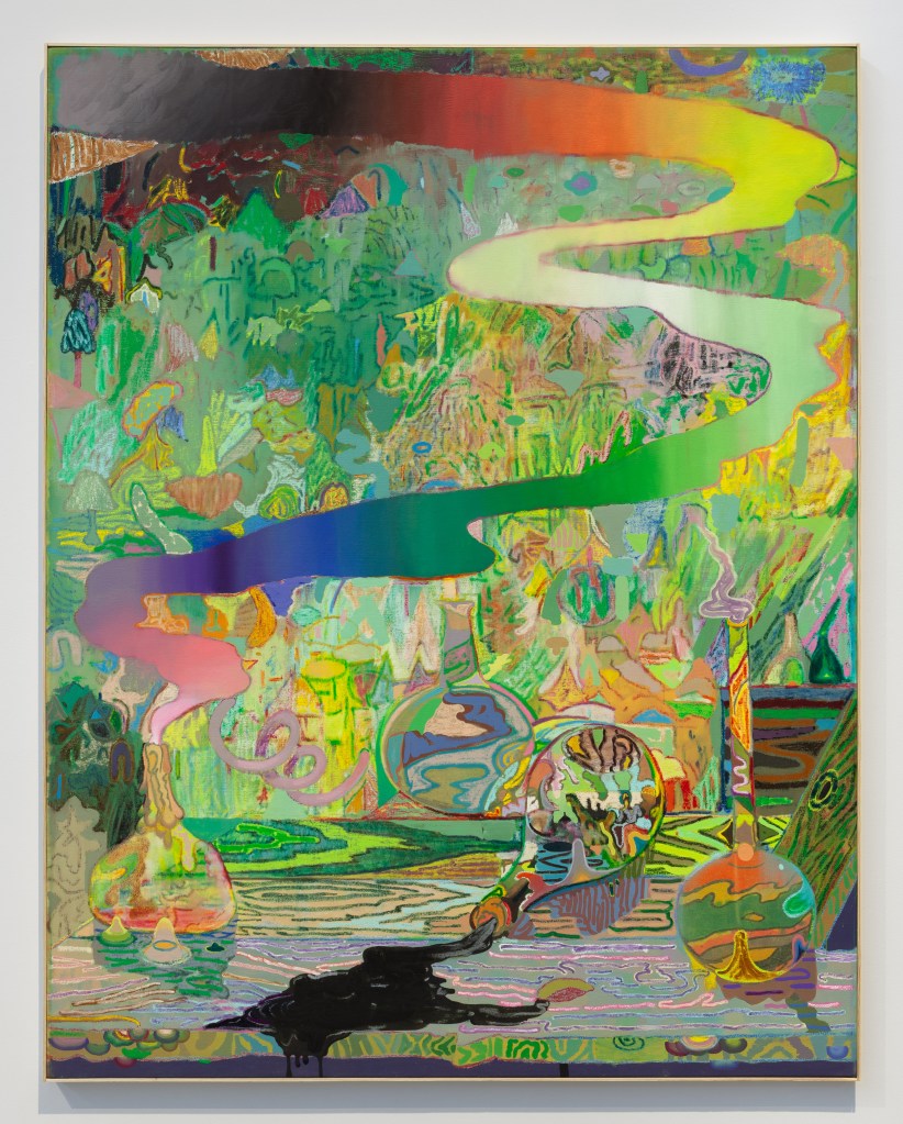
Leon Benn, “Un/Lucky Charms,” 2024, oil, oil stick, acrylic, and fabric dye on linen, 77 x 61 inches Image courtesy of Grant Wahlquist Gallery
Leon Benn’s “Un/Lucky Charms” is an extraordinary painting of an environment that is at once wondrously psychedelic and dangerously toxic. In the foreground are various bottles or what look like, even more disturbingly, lab flasks. We’re not really sure whether they contain magic potions or forever chemicals. My bet is the latter, since one spills black goopy sludge onto a surface. Two others look to be releasing gases into the air, one turning into a river of rainbow colors that trails off into the distance. Liquids bubble and fume.
Yet we can also glimpse figures and animals inside one of the bottles – a domed structure (mosque, stupa, Capitol building?), two figures on an animal that looks like a camel and, off to the side, a figure reminiscent of the Black woman in Manet’s “Olympia” proffering the nude subject of the picture flowers). Two other bottles seem to contain lunar landscapes. It’s all very weird and wild and enigmatic. But it is fabulous painting you want to lose yourself in.
Hong Hong, “Peninsula,” 2023, foliage, water, sun, dust, mulberry bark, pigment, hand-formed paper, 91” (H) x 124” (W) Image courtesy of the artist & Tom Peckham (Tusen Takk Foundation)
Facing each other across the gallery are two works by Hong Hong: “Peninsula,” which is made from foliage, water, sun, dust, mulberry bark, pigment and hand-formed paper; and “Home,” made of some of these ingredients, plus puff paint, pigment and feathers. These are large works and so, all encompassing. One has the sensation of immersion into Hong Hong’s world. And I mean that literally. She is pulling materials directly from the environment around her and creating an enveloping world that we are invited to step into. I went willingly.
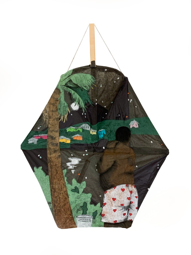
Jordan Carey, “Laundry Day,” 2024, paper, charcoal, wood, 23 x 30 x 6 inches Image courtesy of the artist
There’s more, of course: Jordan Carey’s lovely, textural paper kite works recalling scenes from his native Bermuda, Carol Eisenberg’s digitally manipulated photographs, Diana Cherbuliez’s chronicle of building her Vinalhaven home rendered in old Carhartts and Sachiko Akiyama’s slightly surreal sculptures.
Jorge S. Arango has written about art, design and architecture for over 35 years. He lives in Portland. He can be reached at: jorge@jsarango.com
Copy the Story LinkSend questions/comments to the editors.

Success. Please wait for the page to reload. If the page does not reload within 5 seconds, please refresh the page.
Enter your email and password to access comments.
Hi, to comment on stories you must . This profile is in addition to your subscription and website login.
Already have a commenting profile? .
Invalid username/password.
Please check your email to confirm and complete your registration.
Only subscribers are eligible to post comments. Please subscribe or login first for digital access. Here’s why.
Use the form below to reset your password. When you've submitted your account email, we will send an email with a reset code.