

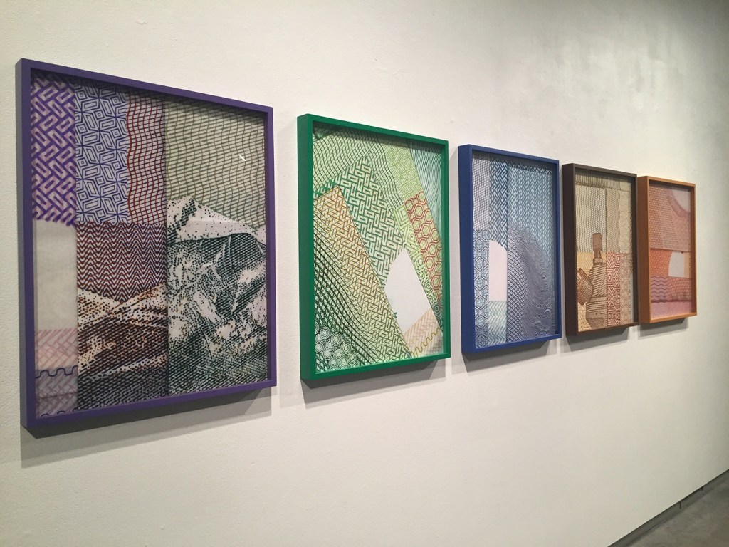
Now hanging on one wall of the Institute of Contemporary Art’s main gallery is a suite of five 25- by 20-inch prints by Karen Kraven that are part of her exhibition “Razzle Dazzle Sis Boom Bah.” They show what looks like corners of Japanese origami paper, folded, layered and laid down flat to be photographed on a copy stand with a close-up lens.
The five colorful images look much like local artist Alice Spencer’s “Yardage” paintings shown at the University of New England’s “Worldview” 2013 exhibition and elsewhere. So it makes sense to guess Kraven is taking on issues of cubism echoed by Spencer: decoration, legibility and visual art’s panoply of possibilities.
Additional Images
ART REVIEW
“RAZZLE DAZZLE SIS BOOM BAH” – Mixed media art by Karen Kraven, curated by Nicholas Brown
WHERE: Institute of Contemporary Art at MECA, 522 Congress St, Portland
WHEN: 11 a.m. to 5 p.m. Wednesday to Sunday, until 7 p.m. Thursday; through April 5
HOW MUCH: Free
INFO: meca.edu/ica, 775-3052
But we have to rethink all of that from the ground up because Kraven is Canadian.
The paper in the photos is actually Canadian money. And Americans are generally unfamiliar with the decorative edges of Canadian bills. Besides, we see the almighty dollar as extremely desirable, but pretty? Not hardly.
And what does Canadian money say to us? Is it a comment on capitalism or American provincialism? More important than the questions, however, is our response to a visitor’s art about money and culture. Many (possibly most) Americans may put up defensive walls, since we’ve practically developed calluses where most of the world has aimed its commentaries about the culture of American capital.
That would be misguided with Kraven. After all, it was the erstwhile director and curator of the ICA, Daniel Fuller, who saw Kraven’s work in Montreal and imported it to Maine. Intention is a tricky thing. We are reminded that, when we stand in front of a painting, for example, we bring at least as much to the encounter as the artist does; and the less we know, the bigger our part.
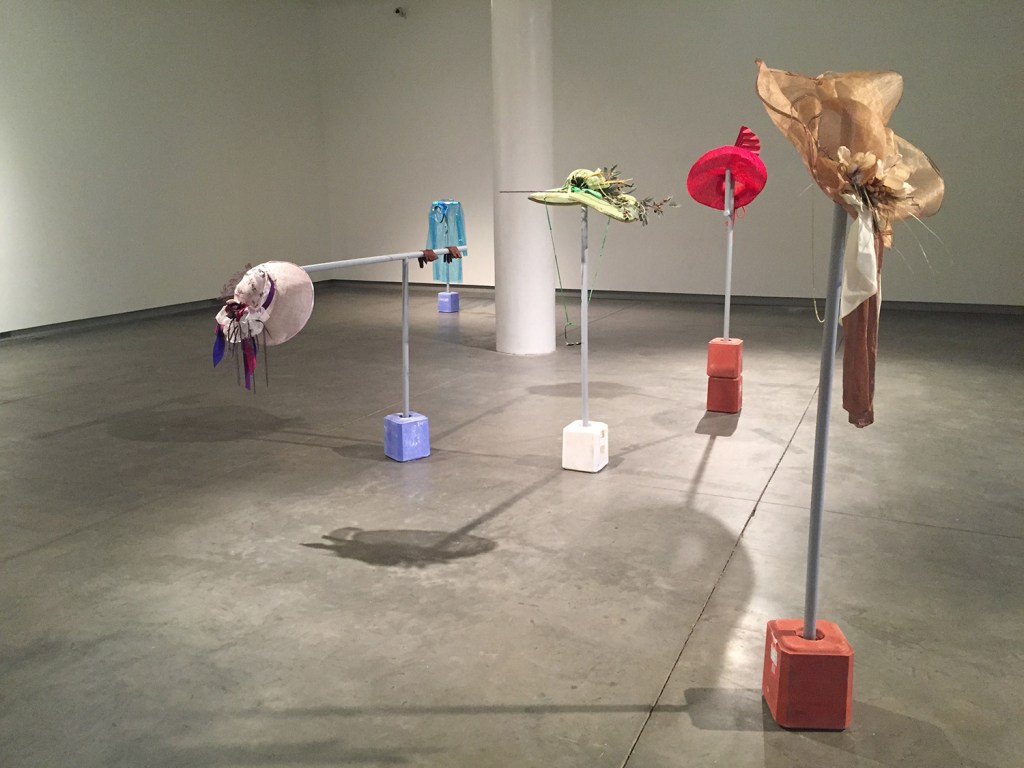
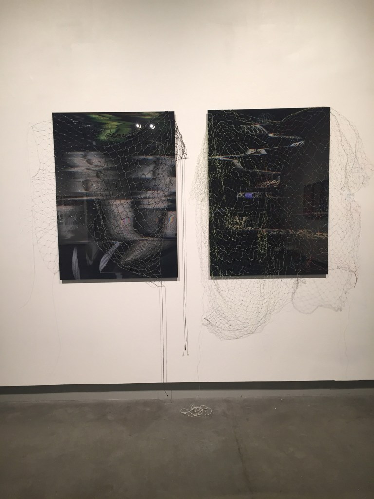
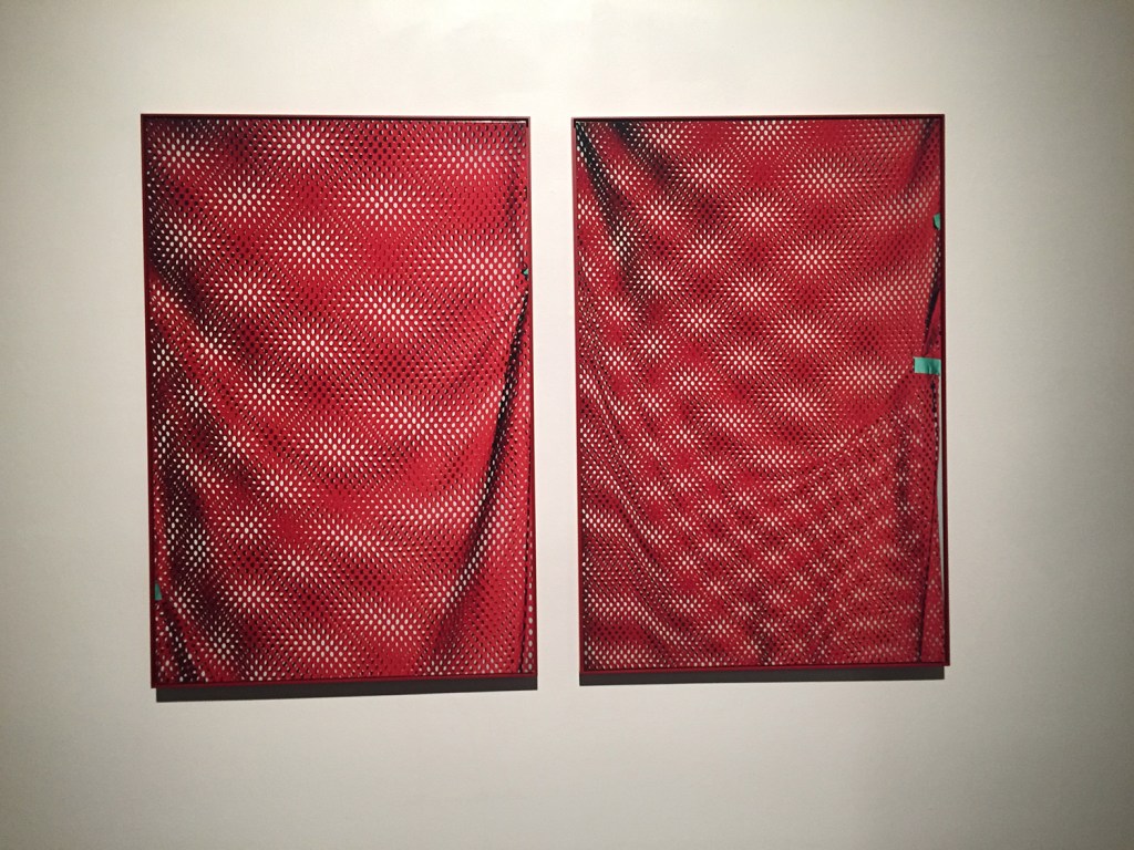
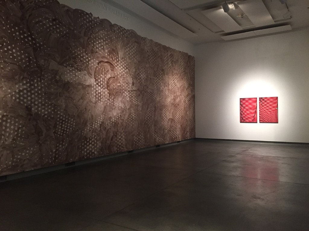
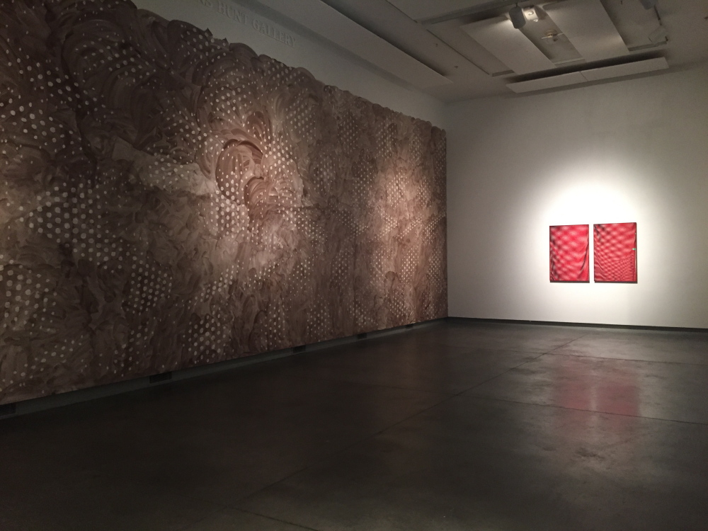
“Razzle Dazzle Sis Boom Bah” features about eight sets of works. In addition to the Canadian currency prints, there are similarly presented straight-on close-up photos of mesh sports bags and pinnies; a series of women’s carnivalesque horse racing spectator hats presented on stands with salt lick bases; flag-like gymnast leggings presented as sconces on television wall-mounts; fishing-net-covered prints of (unrecognizable) hunting decoys; a giant wall painted in lusciously swishy strokes covered in sets of painted dots; and a front installation with sports nets, horse race viewer hats, hand-made porcelain Canadian currency and some actual betting stubs from horse races.
Rather than any clear narrative or polemic, several themes grind into focus: moiré patterns, netting, camouflage, costume, competition, chance, identity, nationalism and pageantry.
The front installation, viewable from the street, initially presents itself like an edgy, political rebus fitting of the jargon-filled and self-aggrandizing “CURATORIAL STATEMENT” by Nicholas Brown. Brown is listed as the curator of the show, but with installation art, it would be interesting to know what his complete role is, other than penning nuggets like this one: “Shifting and mutating in various guises, (Kraven’s codified motifs) collapse upon one another, mesmerizing us as they reappear enlarged, divided, transubstantiated, inflated and flattened.”
But as we move through the show, Kraven’s themes begin to assert themselves and we quickly realize her work has little of Brown’s swollen pretension. There is nothing preachy in her work. She doesn’t try to outsmart us. On the contrary, Kraven exudes one of the most appealing aspects of painting: She helps us empathize with her open-minded fascination. She doesn’t have an answer for the crazy hats that women wear to the races; the practice simply intrigues her. The interaction between the moiré (interference) patterns of two layers of mesh and how it relates to the single-point perspective function of a camera’s lens intrigues her, and her presentation focuses on how photography catches this with expanding layers of systems that we can’t help but see as we get closer or back away from the photos. (Brown seems overly caught up in the art’s role as decoys and simulacra – basically what art has always been – while Kraven’s work seems more about perception, perspective, systems, identity, legibility and taking sides in games.)
In turn, perspective and identity come forward as important players in the show. We start to perceive a delineation between women’s costumes and the camouflaging hunting apparatuses associated with men (decoys, salt licks, fishing nets, etc). Kraven’s soft touch prevents the work from falling into an over-determined partisan polemic. She lets us choose if we even want to draw conclusions (e.g., the comparison to bird coloration) since she appears to have let the work and the viewers create their own meanings.
The “dazzle” of “Razzle Dazzle” is a reference to a type of early 20th-century camouflage that was intended not to hide ships but to make them harder to target by painting them with geometric shapes intended to confuse anyone trying to calculate their movements (imagine “Cabinet of Dr. Caligari” meets “H.M.S. Pinafore”). Picasso even claimed credit for dazzle camo, claiming it was fundamentally a cubist conception. This rather ironically refreshes the Spencer painting reading of Kraven’s work as laden with late cubism ideas about decoration, system and an encyclopedic enthusiasm for possibilities of legibility (and therefore, as cubism insisted, the ability to mislead).
Other than the front gallery, “Razzle Dazzle” is a beautiful show, after all. “Fine Cotton & Bold Personality” (named for the Clairol hair dye used as the paint) is no less handsome than it is powerful and fun. Moreover, next to the two handsome photos of red mesh game bags, it conveys considerable conceptual heft as its painted white dots echo the moiré patterns of the photos (and ultimately, we are led to imagine, with the printing and computer pixilation of the photo).
While the show would read much more comfortably if it began with the main gallery’s hats on stands placed before a pair of sports mesh photos, Kraven’s work comfortably shares the elegance of the ICA’s large Lunder Gallery. “Blue Bonnet,” in particular, takes advantage of the quiet space: It is a transparent blue plastic raincoat with a transparent blue cap smartly sitting atop a salt lick stand (and we know what salt does in the rain). The singular spot-lit projected shadow of “Blue Bonnet” is not only gorgeous, but gives us further information about the object and the theatrical perspective of its light source.
Brown unintentionally gets to the point of “Razzle Dazzle” when he writes, “We the savvy viewers know better than to trust the appeal of an available reading.” For Brown, “savvy” reveals insecurity about being wrong or getting caught without an answer. But Kraven’s savvy seems to be something quite different: She is drawn to unfamiliar paths and complex systems whose possibilities cannot be encompassed in a sound bite. Rarely does great art come in the form of a solvable rebus. The invitation to explore requires no less confidence but a lighter touch, and Kraven has a feel for open-ended appeal.
Freelance writer Daniel Kany is an art historian who lives in Cumberland. He can be contacted at:
dankany@gmail.com
Copy the Story LinkSend questions/comments to the editors.

Success. Please wait for the page to reload. If the page does not reload within 5 seconds, please refresh the page.
Enter your email and password to access comments.
Hi, to comment on stories you must . This profile is in addition to your subscription and website login.
Already have a commenting profile? .
Invalid username/password.
Please check your email to confirm and complete your registration.
Only subscribers are eligible to post comments. Please subscribe or login first for digital access. Here’s why.
Use the form below to reset your password. When you've submitted your account email, we will send an email with a reset code.