

“Sometimes times: Prints and poem” is an exhibition of 24 prints by Terry Winters, including a fresh new suite of 20 prints made through a back-and-forth collaboration with Maine poet Mark Melnicove. The exhibition is on view at Able Baker Contemporary in Portland, but it was initiated by the Colby College Museum of Art and curated by Elizabeth Finch, the museum’s Lunder Curator of American Art.
Winters is a leading Brooklyn-based artist whose career soared from his first solo exhibition of paintings at Sonnabend Gallery in 1982. By the time Winters had a major solo exhibition at the Whitney Museum of American Art a decade later, prints had become important to his work.
Generically, Winters is an abstract artist: His work is based in systems rather than illusionistic space. His imagery in “Sometimes” employs dots, grids and forms more akin to math books than daily life. The major subject of the show is the aesthetic of physics math and our representation of it.
“Sometimes” relies on a dialogue between Winters’ abstract modernist imagery and the (more literal) process by which the work was made.
Along with the suite of 20 prints accompanied by poems, Winters shows four large black, white, gray and silver prints from his “Atmospheres” series in which his systems logic is apparent. In one, a series of thick black dots could be the structural points of a cathedral’s rounded chapel, but a series of gray lines moves in from the top (not unlike football diagrams). The numbers “1,2,3,4” appear across the top of the image. This is a bit distracting at first if you simply want to enjoy the interaction of forms. But it works. It forces us to think in terms of systems, classes and distribution — logic. By shaping his content to echo the viewer’s cognitive process, Winters makes the case that the philosophical mechanisms of Modernism are very much alive and relevant to a post Einstein-ian digital world.
For “Sometimes,” Winters made a drawing, digitized it and emailed it to Melnicove, who then wrote a poem about it. This inverts the common notion of illustration. (Or, one could argue, the poems illustrate the images rather than vice versa.)
Riveting and strong, Winters’ prints are the star of the show. They seem simple enough: Sharpie-thick black lines with unfussy screenprinted planes of the printing colors, cyan, magenta, yellow and black. The forms seem very loose at first, including dots, curves, grids and framing rectangles, but they come into focus as astrophysics forms. It isn’t necessary to recognize them to get the idea of logic, math and theoretical systems.
This is where Melnicove comes in. His poetry tends to leap at a word for the “thing” he sees in the image, such as a shell, and sometimes he too literally labels the images with overdetermined terms like “space-time” or “spooky” (as in Einstein’s “spooky action at a distance”). Whereas Melnicove represents Winters’ swollen grid of black squares as a building with “blackened windows” in which he senses “viruses with skyscraper-sized appetites,” I see the distortions of physics – like the warp of gravity – and the “pinch” effect in Photoshop. Nonetheless, the texts I read out loud held up well as verse, despite their propensity for nerdy non-poetic vocabulary.
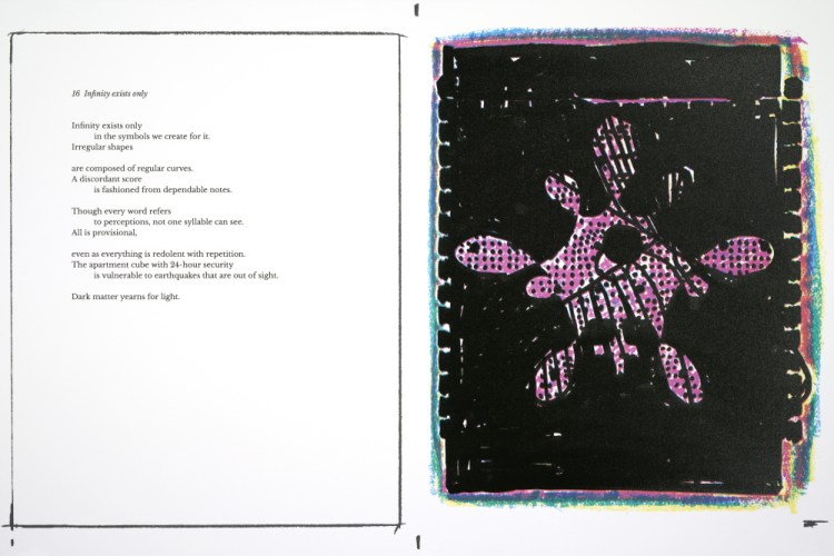
Winters’ drawings, however, are the true fuel. His lines pop and jump with a spring-stepped looseness. His use of the print primary colors is similarly energetic. The colors do more to echo lines, forms and framing than to define shapes. An exception that helps define the rule is the pink pentagonal splatter of “16” – which Melnicove, apparently inspired by the flat color to see it as a recognizable convention, describes as a symbol for infinity.
The strongest images include “17: Sometimes everything joins together,” a purply honeycomb grid that brilliantly opens on the right toward the viewer with the linear elements of three-dimensional curves (hyperbolic paraboloids to my fellow nerds). “06: Compared to water” looks like a blue-tinged black hole. Winters’ black is ink made for braille so its depth is syrup-thick and luscious. “20: When I felt my body” is like looking at a de Kooning painting through a silhouetted chain link fence covered with wind-blown leaves.
Only a few prints fell flat for me, such as the agonizingly titled “01: I shall not attenuate the nature of circularity,” a pink-slice of radar over a gravity wave rippling through a grid of black dots on a yellow ground. But even where it looks like he should fail, Winters can succeed. His watercolored working proof of one of the “Atmospheres” (the displayed edition works are the “BAT” – bon à tirer – the accepted proofs) takes the same dots over yellow as a stage for an awkward black form (a three-ringed mushroom cloud or a stack of wide-brimmed ladies hats: take your pick). It’s as though Winters took my three most disliked foods and from them made a delicious stew.
Winters’ work follows math and information systems to the core of Western philosophy: Aristotelian logic, specifically categorical syllogisms.
A syllogism is a reasoned argument in which a conclusion is drawn from a pair of propositions. For example: All prints are on paper; all of Winters’ works are on paper; therefore some of Winters’ works are prints.
This example is a reminder that not all syllogisms are valid. Aristotle mapped 256 permutations of syllogisms, but his system was refined by a pair of 19th century logicians, including John Venn, who invented the Venn Diagram. Venn looms large here because his system gave visual life to categorical syllogisms. (If you draw circles representing the classes in the example syllogism – a Venn Diagram – you will see it is not valid.) Winters challenges us to make sense of the information he imparts with his varied visual systems: color/black, positive/negative, math/modernism, and so on. This is how he is able to use the printing process along with the image and systems content (which we typically see as math) in ways that seem to function, or not, quite differently. (And when they don’t, we see those breakdowns as conflict narratives.) Our process of looking thereby becomes a process of reasoning. Undoubtedly, this complicated Melnicove’s task, but in following him, we more easily understand our own responses to Winters’ information-soaked systems.
This self-aware approach is sympathetic to painterly modernism. And everywhere, particularly in the “Atmospheres,” we see Winters’ reminding us about framing and edges, perceptual facts and their boundaries. Many of Winters’ best passages, like the frosting-bold white on the larger works, are outside of the framing devices (prints tend to float rectangular images on paper), and his insistence on including his own printer’s marks and text boxes wittily subverts the behind-the-scenes logic of such forms.
“Sometimes” (note the title’s syllogistic flavor) is a weird show insofar as it is billed as “a collaboration between Able Baker Contemporary and Two Palms” (the print shop) that was “initiated” by Colby and curated by one of Colby’s curators using the college’s display tables. Usually, academic art museums don’t work so closely with commercial galleries. (The work is for sale.) But with the 100 or so curators of the Print Council of America convening in Maine next weekend for the group’s annual trip, it’s easy to see the benefits for Colby, Finch, Winters, the gallery – and the public. And Winters has made a valid argument for his graphic work.
Freelance writer Daniel Kany is an art historian who lives in Cumberland. He can be contacted at:
dankany@gmail.com
This review was corrected at 5:40 p.m. on May 1, 2017, to provide the correct name of the exhibit: “Sometimes times: Prints and poem.”
Copy the Story LinkSend questions/comments to the editors.

Success. Please wait for the page to reload. If the page does not reload within 5 seconds, please refresh the page.
Enter your email and password to access comments.
Hi, to comment on stories you must . This profile is in addition to your subscription and website login.
Already have a commenting profile? .
Invalid username/password.
Please check your email to confirm and complete your registration.
Only subscribers are eligible to post comments. Please subscribe or login first for digital access. Here’s why.
Use the form below to reset your password. When you've submitted your account email, we will send an email with a reset code.