

Eliot Porter (1901-1990) was one of America’s greatest photographers. Although he grew up in a Chicago suburb and ultimately settled near Santa Fe, Porter was educated (including a medical degree) at Harvard and maintained a New England connection for his entire life. His family, among them his well-known painter and critic brother Fairfield Porter, summered on Great Spruce Head Island in Penobscot Bay.
Many of Porter’s best-known images, including works in “Eliot Porter’s Nature” now on view at the Portland Museum of Art, include images of Great Spruce Island.
ART REVIEW
WHAT: “Eliot Porter’s Nature”
WHERE: Portland Museum of Art, 7 Congress Square, Portland
WHEN: 10 a.m. to 6 p.m. Wednesday, Saturday and Sunday, 10 a.m. to 8 p.m. Thursday and Friday; through March 18
HOW MUCH: $15 adults, $13 seniors, $10 students with ID, free 14 and younger; free after 4 p.m. Friday
INFO: 775-6148, portlandmuseum.org
ALSO: Talk with staff from Maine Audubon, who will facilitate an exploration of the images and their impact on conservation, noon Jan. 26.
Porter became not only a renowned photographic naturalist, but possibly the leading pioneer in color photography as an aspect of the photographic arts in America; his career dovetails with the history – and the end of – dye transfer printing.
Alfred Stieglitz offered Porter his first major show at the former’s New York gallery, An American Place, in 1938. The exhibition of black-and-white works established Porter’s reputation as a photographic artist, but Porter almost immediately moved to color. The dye transfer process was new in the 1930s and was quickly popularized by Kodak in the 1940s. (Eastman Kodak stopped producing materials for the process in 1994.) In a world dominated by black-and-white, Porter was working against the grain. But in exhibitions like “Eliot Porter’s Nature,” we can understand why: Porter was a colorist.
Color underlies Porter’s quiet aesthetic. He blends physical textures with color, atmospheric effects with color, and even tonal rhythms with color. Typically, to speak of tonal logic in the world of photography surrounding Ansel Adams (which, indeed, is where to place Porter) is to speak of clear sets of light/dark values in black and white photography. But Porter’s tonal sensibilities align more with the painterly logic of palettes. A quick comparison with his own brother’s 1961 oil “Harbor at Great Spruce Head Island,” hung just around the corner from “Nature,” illustrates this: Fairfield’s scene uses a limited palette of opalescent grays, beiges and greens – all blended with white for a more even, chalky texture. In plein air painting, after all, the goal is to unify the scene with an atmospheric evenness of light. Limiting the palette makes doing so easier and more effective.
Eliot’s approach is very similar, but by relying on ranges of nuance among a single set of colors as, say, in his “Lava and Ash Talus,” an earthy red pile shot on the Galapagos in 1968, we can better see the role of the color print. Or scrutinize Porter’s 1968 scene of spruce trees in Clingmans Dome (in Tennessee), then look to your right to compare it with a great David Driskell painting of a Maine pine from 1971. The extent to which the two tonal images relate aesthetically is almost uncanny: evening blues and greens – wispy, brushy and windswept.
Porter’s virtuoso ability with the dye transfer process is what sets him apart (and above) most other color photography, but it’s rarely obvious in his work. “Whiteface, New Hampshire” (1956), a quietly gorgeous image led by the purple and gold sheen on the glassy water, is an outstanding exception.
The comparison with digital photography makes Porter look even better. Around the other corner hangs a pair of impressively scaled digital photographs. But the James Welling 2006 floral feels almost garish after you’ve spent time with the Porters, and Clifford Ross’s 2009 hurricane-inspired wave feels drained of all color – and life.
Porter first found great success with the Sierra Club’s 1962 publication of “In Wildness Is the Preservation of the World,” which combined his color photographs of the New England woods with the words of Henry David Thoreau. Sure, Porter’s resume includes some impressive highlights, such as his 1980 exhibition at the Metropolitan Museum of Art – the museum’s first solo exhibition featuring the work of a color photographer.
But Porter’s artistic success remains with his work. Fundamentally, he was an aesthetic photographer who honestly followed his own sensibilities. He is at his best with quiet details. His 1962 “Apples, Great Spruce Head Island, Maine,” for example, can be seen in terms of limited but rich painterly tonality – reaching from still life detail to the indulgent hues of decorative arts; because it leans on accessible genres of painting, it requires no explanation. The aesthetics are enough. Similarly, “Aster and Raspberries, Oak Island, Maine” (1973), is rich and lush, presenting the complex flora of the forest floor not as chaos, but as a coherent visual texture – like a textile.
Porter carefully matched his subjects to the dye transfer process. His reds are not the scorching reds of, say, Christmas, but the iron-edged organic reds of nature. A reproduction of his 1973 “Bracken and Hawkweed, Michigan,” might hint of holiday greens and reds, but the print itself is subdued and biologically compelling, hardly the stuff of the commercial season.
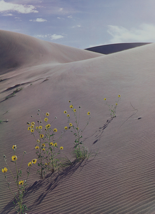
Porter’s 1959 “Sunflower and Sand Dune,” at first glance, seems more obvious than much of his other work: a small group of green-stemmed sunflowers in the desert should be a high contrast image of life versus dessication. But the success of the image in fact relies on the puce swell of the dune, with the life, almost, of a heaving breast under the dry blue sky.
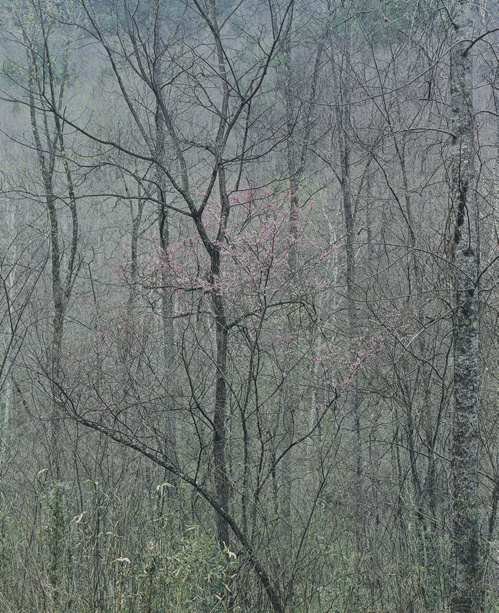
In general, my favorite works in “Nature” are the most subtle. “Grass in Snow, Shelburne Pass, Vermont” of 1957 is a simple shot of a few strands of grass in snow, but if you look at the work in terms of color, it’s a masterpiece: Against the white, the reds, purples, greens and golden yellows start to sprout in the colors of spring. “Redbud Tree in Bottom Land, Red River Gorge, Kentucky, April 17, 1968,” is a view into an almost physically impassable but visually atmospheric forest. The scene is ghostly, so pictorial that it lacks a physical presence. Like an apparition, a misty cloud of pink buds sprouts in the central space. It’s a soft splash of pretty in an otherwise unworldly scene.
Eliot Porter is often overshadowed by his more famous brother, Fairfield. That situation could change. Eliot’s role in photography will only become easier to see and appreciate. “Eliot Porter’s Nature” certainly helps further his case.
Freelance writer Daniel Kany is an art historian who lives in Cumberland. Contact him at:
dankany@gmail.com
Copy the Story LinkSend questions/comments to the editors.

Success. Please wait for the page to reload. If the page does not reload within 5 seconds, please refresh the page.
Enter your email and password to access comments.
Hi, to comment on stories you must . This profile is in addition to your subscription and website login.
Already have a commenting profile? .
Invalid username/password.
Please check your email to confirm and complete your registration.
Only subscribers are eligible to post comments. Please subscribe or login first for digital access. Here’s why.
Use the form below to reset your password. When you've submitted your account email, we will send an email with a reset code.